Interview with Hannah Perry Saucier

We sat down with Hannah Perry Saucier about her solo show The Chip, currently on display at the gallery.

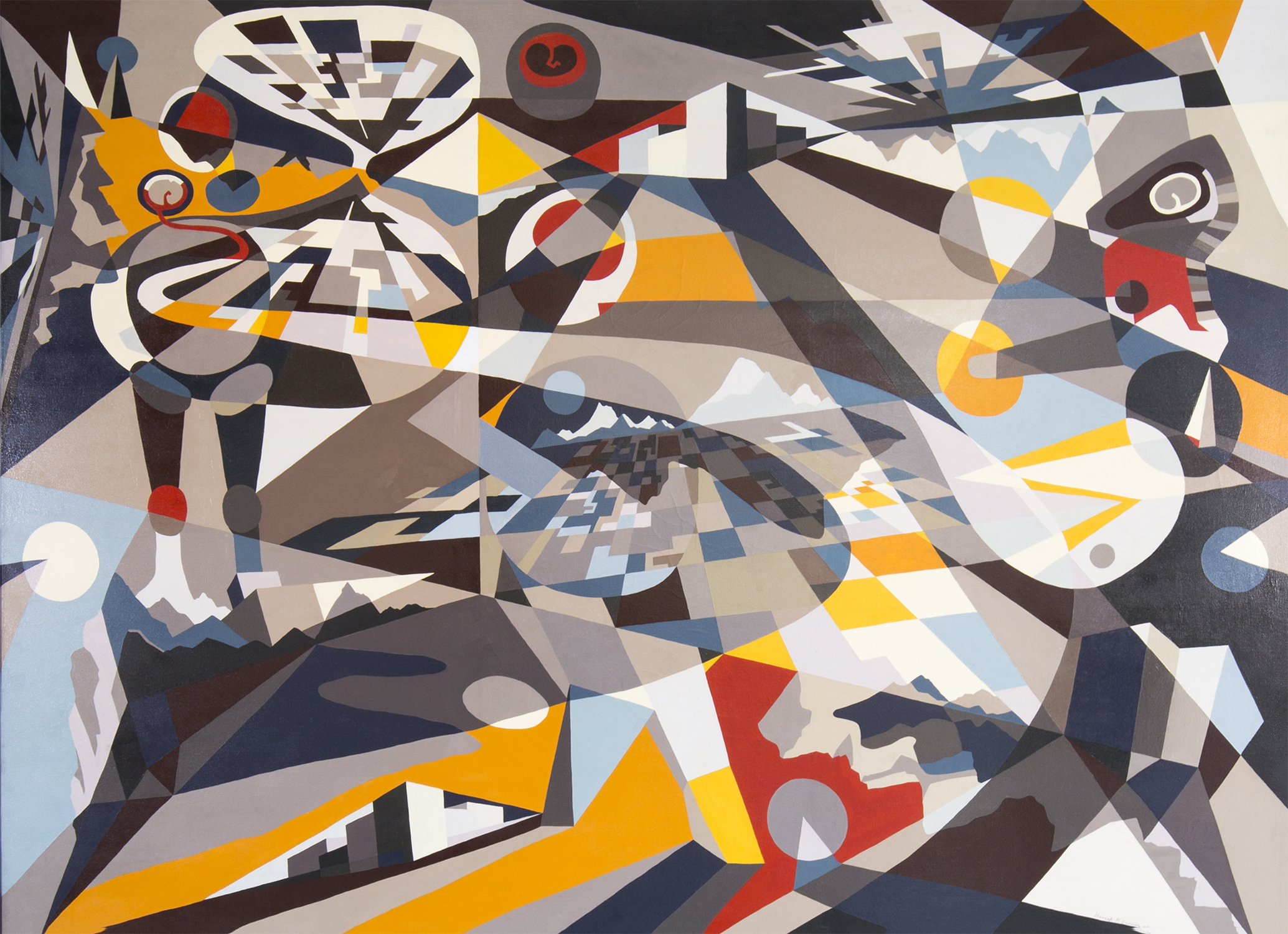
Shapeshifting by Hannah Perry Saucier, 2014. Oil on canvas, framed. Image courtesy of the gallery.

Shapeshifting by Hannah Perry Saucier, 2014. Oil on canvas, framed. Image courtesy of the gallery.

MATTHEW RACHMAN GALLERY: How do you think about landscape?

HANNAH PERRY SAUCIER: Everything is fragmented for me. I fracture things in my mind [as opposed to] seeing them as one, singular being. I really love the geometry I find when looking at things. I don’t always find this kind of geometry around me, but light and dark spaces are particularly suggestive of value—in my way of painting, I see similarities in landscape and portraiture.

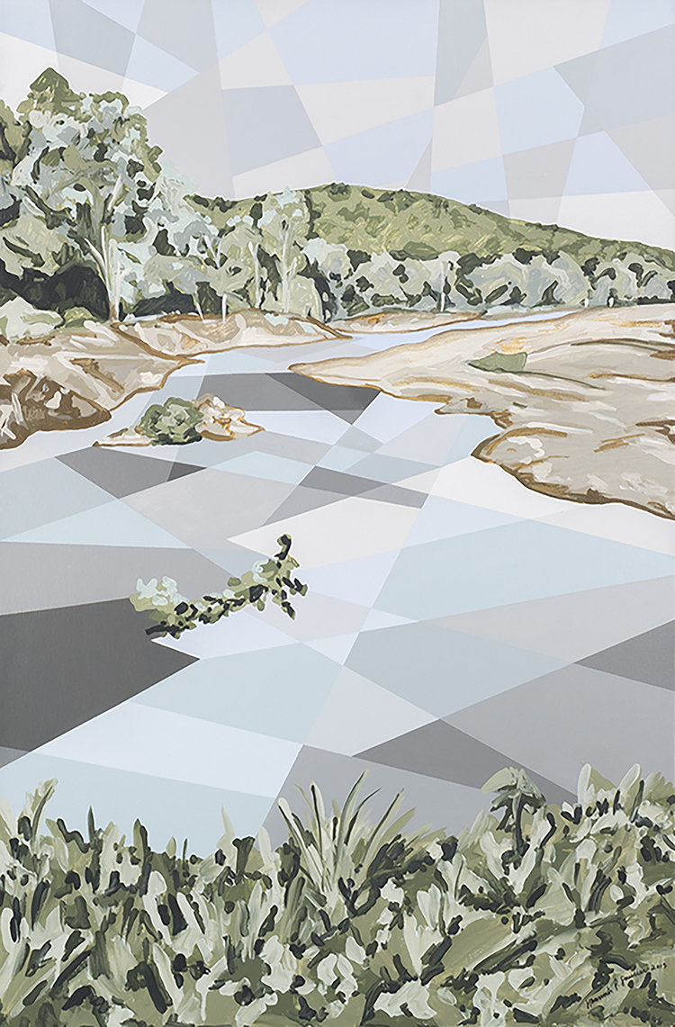
   The newer landscapes I’m doing nowadays still have geometric elements such as a geometric sky or water, but [they are now] combined with more traditional painterly effects. I wanted to start blending the two together to have a juxtaposition of the organic forms with geometric ones.

Current of Niangua by Hannah Perry Saucier. Acrylic on canvas, framed. Image courtesy of the gallery.

Current of Niangua by Hannah Perry Saucier. Acrylic on canvas, framed. Image courtesy of the gallery.

MRG: I was actually wondering about the relationship between the organic and geometric in your work. Your paintings have very flat and graphic elements, but they are combined with organic and primal shapes.

HPS: I have a tendency to over-calculate in my work. Before I set out to paint, I sketch everything out and have everything set in place. The applying of color changes elements here or there, they will shift in the process. Nonetheless, I would be filling in my initial composition.

   I felt that I needed to find a way to break out of this tendency. One direction I took was to do one section of a given painting in a very solid, graphic manner while doing another part, like the trees and grass, in a very fluid and playful manner.

   Untitled is an example where the improvisation comes with through the forms themselves, although they retain their graphic flatness.

MRG: Your use of color is very bold. Your color choices make me think about how I remember things. I feel like because memory can heighten or over exaggerate the certain aspects of a given recollection—there's a certain brightness, vividness to those specific parts. Do your colors have any relationship?

HPS: Color, for me, is very intuitive. I dream in color; my memories are in color. My sense of sight above the other senses is much stronger as well, but I think, particularly, in the way I see colors.

   Shapeshifting is a representation of a past, present and future self; there’s three selves embedded within the landscape, and the landscape, in turn, is embedded in the figure. We’re inside the landscape physically, and the landscape is inside our minds. We’re perceiving it at all times. The present self is moving [in the work], and above the self's head there’s a little orb, containing a thought inside of it. The thought is red. For this one element, the use of color was very intentional. Anxiety of being in the present moment, moving through thoughts which can be stressful or painful.

   I use color in the way it comes to me. I try to balance color in terms of value and tone to create a sense of rhythm. Nowadays I’m simply drawn to colors. I mix all of my colors. I don’t use anything from tube; I mix until I get the colors I want. I’ll shift my colors a bit as I'm applying them on canvas, once I see how the colors are responding to one another.

MRG: What is memory for you?

HPS: Everyone has a plethora of memories, even a person who’s lived in the same place all their life is going to have a wealth of experiences, things that have happened to them. I’ve lived in five different countries in my life so far, and done a lot of traveling.

   This body of work comes from a sketch I made for a class where we had been prompted to make a self-portrait. At that point in my life, I was thinking a lot about all the experiences I had accumulated from living in places that were all so different from one another, and how, despite all of this, I was still one person. I felt very fragmented in certain ways. I would go into certain situations, and find myself in a certain role for a little while before having to shift mentally when going back to another culture, job, school.

    The work for the project was originally more symbolic. Made out of orbs, I had a figure connected together with lines. Inside [each orb] there was an image representing a fragment of a place I had lived in, or, a feeling I had felt at the time. It was a meditation into the relationships these fragments had to one another. Eventually, I turned the sketch into a painting where all these different orbs with their contained imagery became connected geometrically. I think all you’ve done or experienced in life is somehow always within you. Depending on what you’re focusing on or where you are, different aspects of your being are much stronger and present than others; but everything still is embedded in you somewhere.

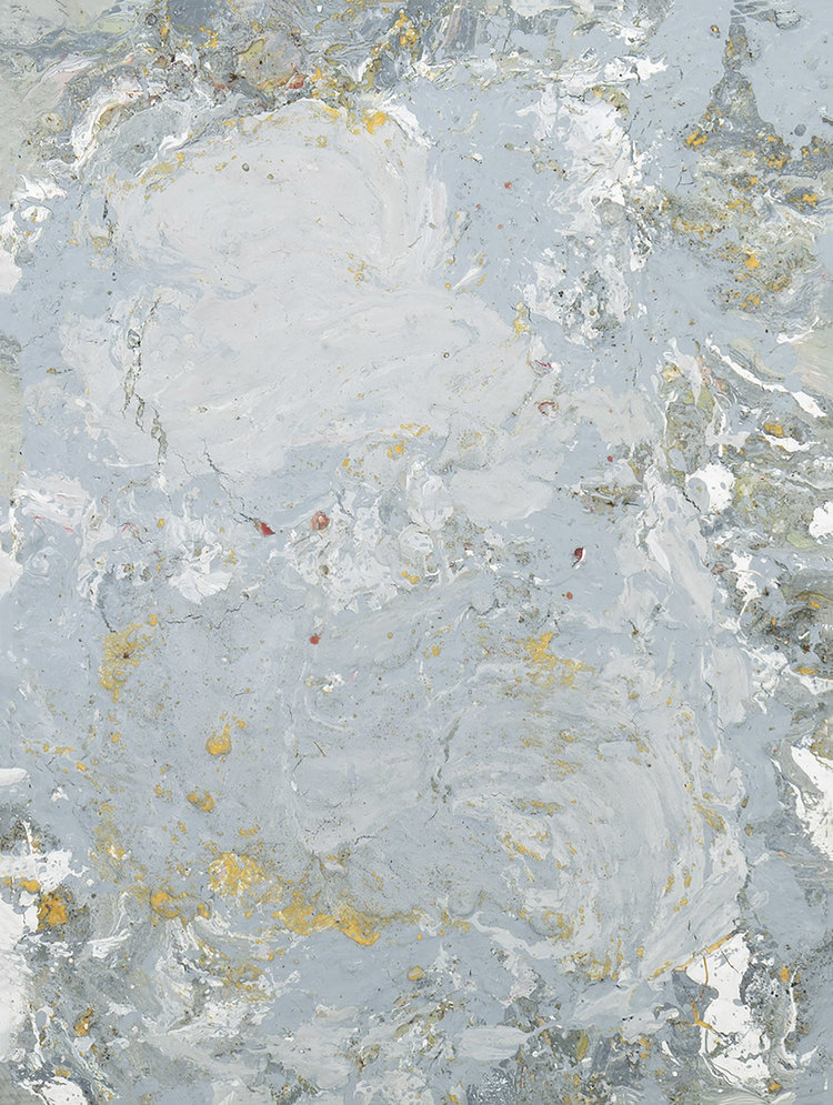
   When I made the move from symbolism to abstraction in my work, I started thinking about how certain memories begin to fade. You either completely forget about them, or you begin to remember only certain aspects of the memory. The specific symbolism is gone; the forms become more and more abstract until, eventually, they are reduced to pure form.

Eye of the Moon Storm by Hannah Perry Saucier, 2015. Mixed media on canvas, framed. Image courtesy of the gallery.

Eye of the Moon Storm by Hannah Perry Saucier, 2015. Mixed media on canvas, framed. Image courtesy of the gallery.


When I made the move from symbolism to abstraction in my work, I started thinking about how certain memories begin to fade. You either completely forget about them, or you begin to remember only certain aspects of the memory. The specific symbolism is gone; the forms become more and more abstract until, eventually, they are reduced to pure form.


MRG: Does scale influence the way you work?

HPS: The truth, if I could, I would be working large scale pieces all the time. It's not always possible to be working on multiple, giant pieces at the same time with the space I have, so I end up having to work smaller. With that said, though, each individual [geometric] piece in each painting is a smaller piece of work in itself. The little details, even in their flatness, become their own environment.

    Untitled, Shapeshifting and Wiggle World (The World is Wiggly), mostly layered oil paint pieces, are all completely painted by hand—without the help of tape. Untitled has a bit of acrylic in it, but this is indiscernible because of the paint's matte quality. You need to look at the work very closely to see the little details of the brushstroke, texture of the canvas. In my smaller works, these details create far more intimate spaces. Whereas looking at Shapeshifting each fragment is much larger—there’s more going on within [that] given section. This creates a different experience for me and the viewer. When I’m creating smaller works, I’m more enclosed in them and with bigger works, the process feels far more physical.

MRG: A lot of aspects in your work suggest total control: you’re mixing your own colors, making your own frames. You stretch your own canvas. There’s a lot of self-agency in your work.

HPS: I think you’ve picked up on a big aspect of my personality, my trying to control things… which is why, (laughs), in my newer works, I’ve been making an effort to let things go, to make more improvisational works. The Wiggle World (The World is Wiggly) is reflective of my trying to let go. I had initially sketched it out as I usually do with my works, but in the process of filling it out, I started to create some impromptu forms— I was no longer figuring it out in a strictly mathematical way. •

The Chip, Paintings by Hannah Perry Saucier, runs through to September 17, 2017 at Matthew Rachman Gallery.

ABOUT THE ARTIST: HANNAH PERRY SAUCIER RECEIVED HER BFA FROM THE SCHOOL OF THE ART INSTITUTE OF CHICAGO, AND HAS STUDIED IN ISTANBUL, TURKEY (HISAR EGITIM VAKFI, 2008-2009), PRETORIA, SOUTH AFRICA (THE UNIVERSITY OF PRETORIA, 2012), SAUGATUCK, MICHIGAN (OX-BOW SCHOOL OF ART, 2013), AND FURTHERED HER WORK IN BANGKOK, THAILAND. SHE CURRENTLY LIVES IN BARCELONA, SPAIN.
Guest User
FEATURED IN AUGUST

SET OF JENS RISOM LOUNGE CHAIRS

Take special notice of the frames of these lounge chairs, as Jens Risom was one of the first designers to bring Scandinavian design into American furniture. The rich plum velvet would serve well in a living room needing dark color.

SET OF DCM CHAIRS

Introduced in 1946, the DCM chair by Charles and Ray Eames is easily an archetype of American design. The seat and back of chair easily mold to fit the contours and angles of any body, providing comfort without the addition of upholstery. This design eliminates bulky detail and creates a smooth, elegant and versatile chair that is equally at home in a dining or a conference room.


VICO MAGISTRETTI MARALUNGA CHAIR + OTTOMAN

Winner of Italy’s Compass D’Oro award for Industrial Design in 1979, Vico Magistretti’s Maralunga chair and ottoman set for Cassina is a striking blend of functionality and beauty. Magistretti’s chair features an adjustable backrest for two very different looks and comfort. The juxtaposition of the dyed cowhide and patterned cotton provides this set with a range of texture and a bold color scheme that makes for the quintessential statement piece.

Guest User
FEATURED IN JULY
Lewis Butler Coffee Table.jpg

LEWIS BUTLER COFFEE TABLE

Designed for Knoll, this table showcases the power of a classic black and white color scheme. Oozing modern from the seams, this would be a great piece to add into an office or occasional room.

SET OF JENS RISOM LOUNGE CHAIRS

These chairs are reupholstered in shoe leather, the natural leather has a wonderful patina highlighting and showing imperfections in the hide such as scars and range marks. An ethereal and beautiful vintage look is born, and the orange color gives the chairs a modern edge.

UNTITLED BY PETER MAX

Add a very historic work of art to your home! This print features a 10-cent postage stamp created by Peter Max, commissioned by the United States Postal Service, to commemorate the 1974 World’s Fair in Spokane, Washington. As an environmentalist, Max incorporates a seemingly spontaneous illustration of a landscape, in correspondence with the first environmentally themed world's fair.


Guest User
Spotlight On: Brynn Olson
 
Brynn Olsen Design Group
 

Built on a love for creativity and a desire for visionary design planned with precision, the Brynn Olson Design Group (BODG) is comprised of talent from differing creative backgrounds who all found themselves drawn to the art of the interior.  Based in Chicago and serving clients nationwide, the BODG team takes pride in bespoke design curated specifically for each individual client.

Photo courtesy of Brynn Olson Design Group

Photo courtesy of Brynn Olson Design Group

Trained as an artist from childhood, Brynn began her design career creating large-scale indoor and outdoor painted murals for commercial spaces and residences.  After attending Vanderbilt University and pursuing an academic-oriented career, her love for art and design re-ignited years later and she joined Nate Berkus Associates (NBA) in 2008.  She furthered her education in Interior Design at Harrington College of Design while working full-time with the NBA family and managed and designed projects for commercial and private high-end residential clients and celebrities featured on/in The Nate Berkus Show, The Oprah Winfrey Show, Elle Decor Magazine, CS Interiors Magazine, and Chicago Home + Garden Magazine.  She also assisted with development and rendering of original room designs for major publications and TV programs including Chicago Tribune, The Today Show, and Family Circle Magazine.  Her experience in the design process, project management and client relationships lead to the desire to open her own firm in 2012 under the belief that every environment should boast a timeless foundation infused with an edge that reflects the essence of each client.  Brynn’s credence, How you shape your space will shape your day,™ is the cornerstone to which each project is approached.  The power of a well designed interior is not only an immediate aesthetic transformation but also an incredible impact on the individual who lives, works or interacts with that space.

Photo courtesy of Cynthia Lynn Photography

Photo courtesy of Cynthia Lynn Photography

MRG: You began your career as a painter.  When did you first realize you wanted to be an interior designer, and how did you make that transition? 

BO: It's a running joke that I tripped and fell into interior design but the truth is that when I reflect back on every life path I've chosen to present day all signs point to here and now.  My mother was my first art teacher, so I was constantly creative as soon as I could hold a crayon in my hand.  I pursued art intently up through college and opportunities of executing large scale murals for interior spaces presented themselves and I accepted.  This lead to me working directly with interior designers and witnessing, first hand, the affect altering a space can have on an individual and family unit. 

It really wasn't until I moved to Chicago a decade ago, though,  that I found myself heading to flea markets and scouring vintage shops at every free moment to furnish my Lincoln Park brownstone that really gave way to that light bulb moment.  When I ruminate back to my childhood in the South, it's incredibly apparent the heavy cultural influence it had on me.  Entertaining is second nature to Southerners and their vessel in which they can share these experiences is their home.  Therefore, as a Southern artist I began to view the home as canvas ready to be filled with beautiful forms that function on my journey into this career. 

Even though it took a big regional move to discover this ultimate path, interior design as my vocation has become personally meaningful as I recently lost my grandmother everyone lovingly dubbed as my twin.  She was a spirited and determined woman who grew up in Chicago during the Great Depression with very little means, but a staunch Italian spirit.  Into her adulthood she became an interior designer running her own business in the city and its as though I'm bringing a part of my heritage full circle today.  So perhaps, it could be argued that design is in my blood...  

Photo courtesy of Brynn Olson Design Group

Photo courtesy of Brynn Olson Design Group

MRG: What are your favorite design trends you see for 2017, and beyond?

BO: While we tread lightly with the term trend having just returned from Market this year I can confidently report back on a few, fun recurring design patterns for 2017 that we're very excited about.  A crop of new businesses focusing on South African goods that are sourced responsibly were very present this year and we especially love the lighting made from horns and beautifully woven baskets. The use of strong gem-like geometric forms in furniture design is still thriving which is one of our favorites as we like to juxtapose that feature next to round and more soothing pieces.  Finally, the prevalence of taking abstract art off the canvas and onto other mediums such as fabrics and even furniture and accessories has been made possible through technology and is continuing to explode.  While our favorite kind of art is on canvas, we're really loving some of the new textiles using this artistic approach to create additional areas of interest in our designs with pillows that double as art.

Photo courtesy of Cynthia Lynn Photography

Photo courtesy of Cynthia Lynn Photography

MRG: From where do you draw your inspiration?

BO: Inspiration is literally everywhere and I'm constantly pulling from all facets of life from my international travels to shelter magazines to even sitting in a local restaurant admiring the details of the interior architecture.  On a personal level I am greatly inspired by my roots of Southern design and inherently fascinated by all things Art Deco.  From a team standpoint,  I am constantly preaching that we're only as good as our resources and one of the most important resources we have as designers is our problem solving eye - spatially and aesthetically.  In order to keep that eye fine-tuned and sharp, it's incredibly important that we're sourcing inspiration daily.  Due to the power of Pinterest, we've been able to utilize the internet as an essential tool to find new inspirations to catalogue our studies along the way.

Photo courtesy of Brynn Olson Design Group

Photo courtesy of Brynn Olson Design Group

MRG: How do you chose artwork for your projects?

BO: Art is such a personal item for our clients and we always start the process with understanding client tastes first and foremost.  The second most important driving factor is budget.  We love to educate, help and guide our clients on how to pursue and collect an art collection no matter where they are in the collecting game.  We love to dispel the myth that appreciating and collecting art is only for the incredibly wealthy or for a home with soaring wall space to display acquisitions.  We feel so strongly that art can make or break a room that we incorporate art in our design presentations to guide our schemes.  So, the result is keeping artwork in mind right from the start.

Photo courtesy of Cynthia Lynn Photography

Photo courtesy of Cynthia Lynn Photography

MRG: If you had to be trapped in one decade of design, which would you chose and why? 

BO: As mentioned, I have a natural attraction to (almost) all things Deco from fashion and decor to jewelry and architecture.  Take me back to the roaring 20s and I'd soak it all in...

Photo courtesy of Nathaniel Smith Photo

Photo courtesy of Nathaniel Smith Photo

MRG: As a designer who frequents Matthew Rachman Gallery, is there any piece of artwork in our gallery that you’re really into right now?

BO: We're big fans of Linc Thelen's abstracts and we've had our eye on his Lyrical Journey diptych for sometime.  This set would be an incredible asset to a space with it's rich yet soothing colors and textures.  If it were up to us we'd find the perfect focal wall to house this pair.  Perhaps, in an entry over a console with pair of beautiful X-base stools underneath or even split up and each hanging above nightstand in a Master bedroom for an unexpected display of color and layered sophistication.  

Matthew Rachman
Spotlight On: Marli Jones

Matthew Rachman Gallery is excited to introduce a new blog feature, called Spotlight On. Each month we will highlight a local area designer that we recognize for their exceptional talent, and give them the spotlight.

For our first Spotlight On feature, we chat with Rebel House Owner and Creative Director, Marli Jones, to discuss her early influences and current inspiration, behind her fresh, contemporary looks.


rebelhouse
Photography by Vince DeSantiago of NB.DY

Photography by Vince DeSantiago of NB.DY

Rebel House Interior Design is a Chicago-based firm that is quickly gaining attention for its unique talent for bringing art-centric, west coast vibes to the second city.

Specializing in couture environments, this boutique design house specializes in quality service - managing all details of each new construction or renovation project from concept through completion. The selective nature by which they accept their clients also allows them to ensure that each client gets the proper attention they deserve.

Before founding Rebel House in 2016, Owner and Creative Director Marli Jones started her career in the design forward city of San Francisco, where she received a master’s degree in Interior Architecture and Design with an emphasis in adaptive reuse.

Jones worked as a senior designer for prominent West Coast residential design firm Martha Angus LLC, before moving to Chicago, IL to be the senior designer for real estate development group AJ Capital Partners (AJCP). As such, she was part of a creative team that developed, designed, branded, and launched a collection of boutique hotels across the United States. While at AJCP, Marli also worked on the redesign of the rooftop bar J. Parker at Hotel Lincoln in Chicago and was the senior designer on the gut renovation of historic hotel Pontchartrain in downtown New Orleans.

Marli grew up in the art worlds of Chicago and Europe, and her parents are Atelier Neo-Medici trained photorealist painters. Her travels include multiple trips to France, Switzerland, and Italy to study fine art and architecture. Her exposure from a young age to a variety of well-crafted interiors sparked a passion for design.

Photography by Harry Sudman

Photography by Harry Sudman

MRGDo you recall when you first realized you wanted to be an interior designer?

MJMy parents are professional artists and my childhood memories are filled with travels across Europe and the US from galleries to museums. An artistic profession was always in the cards, but as a design-obsessed kid, becoming a designer was my small rebellion. I took to my driveway drawing large-scale floor plans in sidewalk chalk. Around age eight, I started rearranging my bedroom furniture each week, pulling pieces into different combinations. A visit to the Lake Forest showhouse taught me creating an interior is not only art, but a profession. My mom started giving me shelter magazines to study. I was fascinated to say the least. I filled countless pads of graph paper with home designs for family and friends. To this day, nothing brings me greater joy than working with my team to craft a custom environment.

MRGIf you had to be trapped in one decade of design, which would you chose and why?

MJ: Is it cheating to say right now? There are many exciting developments happening in design as we enter the latter half of this decade. We are moving away from the fast fashion influence of the early 2000s. Antiques are back in favor and artisans are in the spotlight for mastering their craft. Designing with a mix of old and new is quite fabulous. I am so excited to see galleries and makers unite. Right now, furniture is art!

Photography by Harry Sudman

Photography by Harry Sudman

MRG: From where do you draw your inspiration?

MJMy source of inspiration depends on the project. I am constantly digesting past and present design. A lot of my work is influenced by the years I spent living and working as a designer in San Francisco. West coast design sensibility focuses on pops of color and layering details and I have carried these characteristics into my work. I maintain close relationships with designers whom I’ve worked for and/or with over the years. We learn a lot from each other. This business is about pulling influences, knowledge, and the unexpected together to craft something new.

Photography by Harry Sudman

Photography by Harry Sudman

MRGHow do you choose artwork for your projects?

MJThe experience of growing up around artists taught me choosing artwork is a personal process. There is no right or wrong answer and acquiring art can take time. I talk with clients about their goals for collecting works, introduce them to artists, and guide them as they consider their investment. Once acquired, art can travel from room to room on rotation (as it does in my home) and a vibrant collection can be made from a mix of budding artist works, to prints, to blue chip pieces.

Photography by Aimee Mazzenga Photography

Photography by Aimee Mazzenga Photography

MRGAs a designer who frequents Matthew Rachman Gallery, is there a piece of furniture in our showroom that you’re really into right now? What do you love most about it, and can you give us some pointers on how you might style it?

MJI have a major thing for sculptural furniture and your gallery does such a great job curating pieces to fit that bill. The Domus Lux Lounge Chair by Ilmari Tapiovaara is my current obsession. The warm wood tone, curved back, and petite arms are divine. It is a unique find – and quite comfortable!

As for styling, I’d juxtapose the wood chair with a contemporary chrome side table (as pictured). The warm wood and cool chrome offer a nice material tension.

Add a finishing touch with a piece of art hanging behind the two – perfection.


Check out more pictures of Marli’s stunning projects and learn more about what the team at Rebel House Interior Design is up to, at www.rebelhousedesign.com, or follow them on Instagram at @rebelhousedesign.

Matthew Rachman