MIES VAN DER ROHE + INDIANA UNIVERSITY
5804-l.jpg
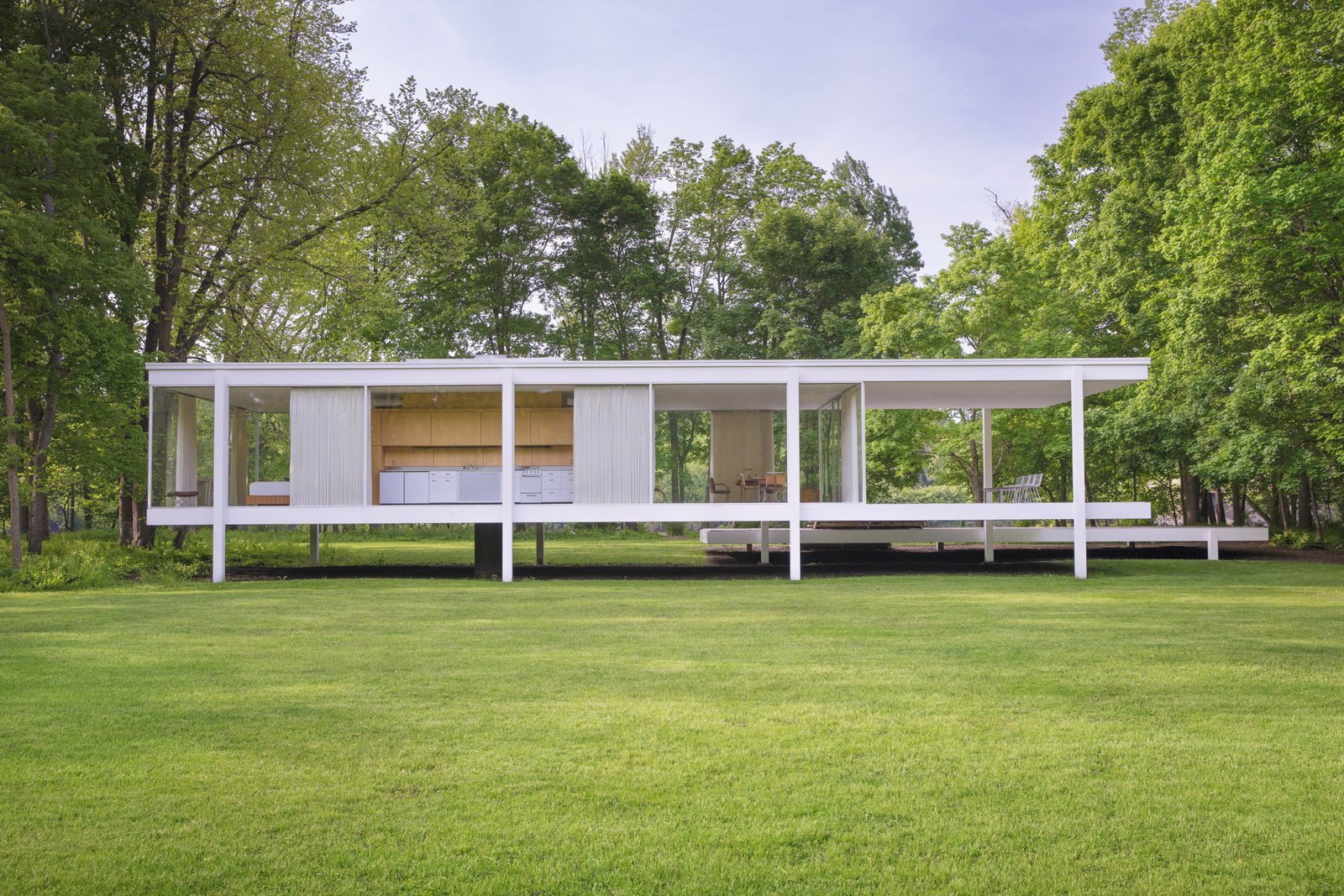
pictured-is-the-rear-of-the-farnsworth-house-designed-by-ludwig-mies-van-der-rohe-the-homes-structure-is-based-on-three-horizontal-steel-planes-lifted-out-of-nature.jpg

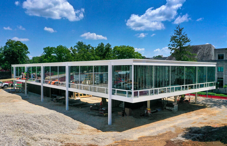
In 1954, Mies Van der Rohe, with former student and architect Daniel Brenner, designed a fraternity house on the campus of University of Indiana. These plans were not used, but were kept by Sidney Eskenazi, a member of the fraternity and current benefactor of the school. They are now being used as the basis for the design of a new building for the Eskanazi School of Art, Architecture, and Design, set to be completed in Summer 2021. Another set of drawings can be seen above.

Ludwig Mies Van der Rohe (1886 - 1969) was a pioneer of modernist architecture. He began his career working directly with designers in Aachen, Germany, his birthplace, and then Berlin. Following the first world war, people looked to dispel the old order that led to the war, searching for new ways to embrace the modern era. He joined these progressive efforts in creating and defining a new style of architecture. He was the last director of the Bauhaus, leaving Germany at the close of the school and the rise of Nazism. He emigrated to Chicago to become the head of the architecture school at Illinois Institute of Technology. His designs are iconic for their simplicity, restraint, and openness. He aspired to create the iconic style of his era, which he in many ways did.

Daniel Brenner (1917 - 1977) worked in Mies’ studio on the original designs. After graduating with his bachelors, he worked for Alfred Easton Poor in New York City. Inspired by people he met in his travels, he moved to Chicago to study under Mies at the IIT, where he would later teach. He worked in various firms throughout the city. In addition Brenner worked at the Art Institute of Chicago, designing exhibitions for permanent and touring shows. His drawings are now a part of the permanent collection. 

Sidney and Lois Eskenazi met at Indiana University as students, where Sidney also went on to study law. After graduating, Sidney began Sandor Development Co. and Lois worked as a medical and lab technician. The couple have made major gifts to the university and beyond, including to the Eskenazi Health System which was renamed for them, establishing a scholarship fund, and most recently their major gift to the school of art, architecture, and design.

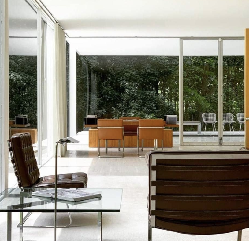
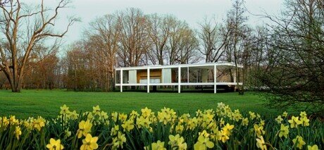
The design of the building resembles Mies’ other works with its glass and steel construction, most notably the Farnsworth House outside Chicago or Crown Hall on IIT’s campus. They have long, linear forms, comprised entirely of large planes of glass broken by the steel structure, and are mostly one level. The interiors are vaguely defined, if at all, creating wide open, adaptable spaces. The simplicity of Mies’ designs are notable, especially for the time, for their minimalist restraint and lack of ornamentation. This design was commissioned by a fraternity at the university but was never used. Another copy of these drawings exists in the Museum of Modern Art. This design was adapted and built by Thomas Phifer and Partners of New York. The building will be opened for use by students and staff in the fall of 2021.

fnf9ejshca_w768.jpg
MID-CENTURY MASTERS: PAUL MCCOBB

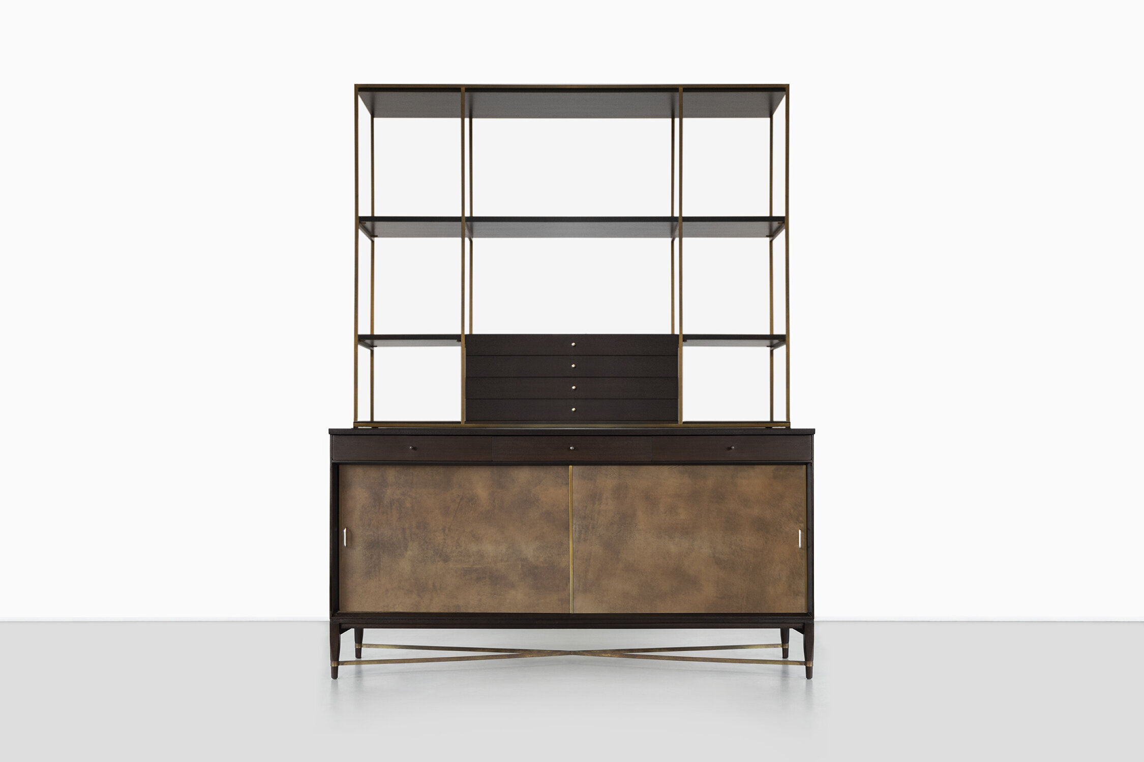
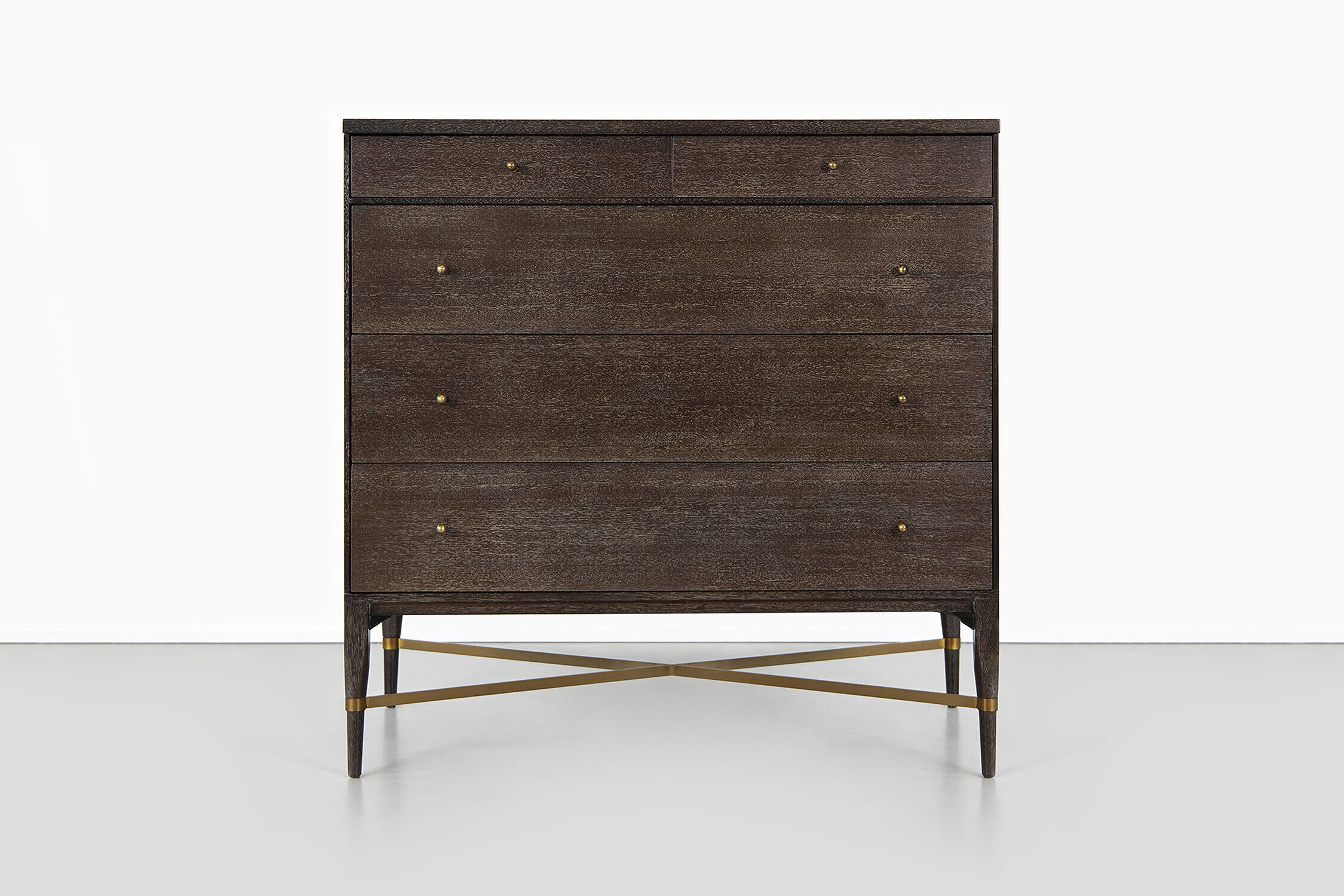
Paul McCobb (June 5, 1917 - March 10, 1969) is one of the most important and well known mid-century furniture designers. Born in Medford, Massachusetts, he studied drawing and painting at the Vesper George School of Art in Boston. Before finishing, he joined the army. He returned and began his career as a self taught designer, in 1948 joining Martin Feinman’s Modernage Furniture in New York City as a designer and decorating consultant. This is where he would meet B. G. Mesber who he would collaborate with for his Planner and Directional lines. While he is known for his furniture, he also designed radios, tv’s, hi-fi consoles, and household items. He went on to design lines of furniture for many companies, including Planner for Winchendon Furniture Company, Predictor for O’Hearn Furniture, multiple lines for Calvin Furniture, and Connoisseur Collection by H. Sacks and Sons. His Planner line was one of the best selling furniture lines of the 1950’s. In 1952, he designed the set for the originalToday show, one of the first major introductions of modern design to the broader America.

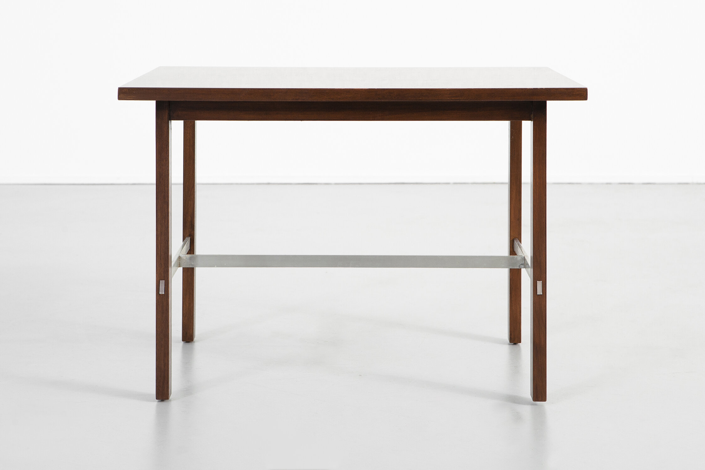
What is striking about McCobb’s work is its simplicity. While this style is so regularly seen today, it was inventive and new for the time he worked. Every furniture piece is boiled down to its necessary parts— legs, seats, shelves, drawers— with no ornamentation. This paired back design requires each element to be carefully considered to achieve elegance rather than boring simplicity, a feat McCobb achieved with beautiful materials, thin and tapering forms, and thoughtful geometry. In his dining chairs seen above, for all intents and purposes they are very simple, straightforward chairs. McCobb’s touch is seen in the careful angle of the back, the tapering of the legs at the base, and the selection of rich wood. Looking at his pieces more than half a century later, they are truly timeless. His modernist vision was done so correctly that his work stands the test of time.

DESIGNERS TO KNOW: ASHE LEANDRO
Buckus-017-Edit.jpg

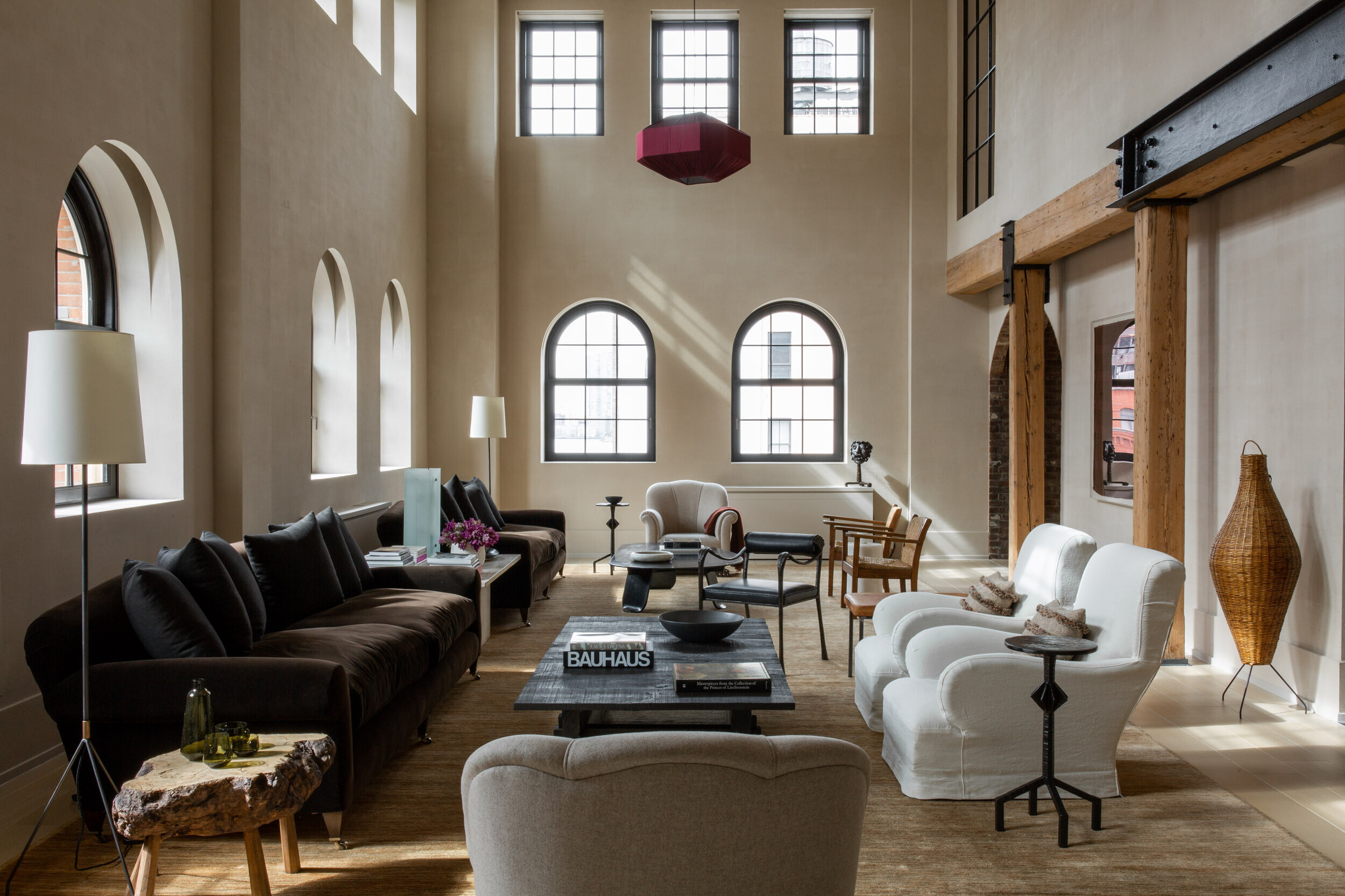
Ashe Leandro is an architecture and interior design practice located in New York City. Founded in 2008, Reinaldo Leandro and Ariel Ashe’s firm works globally on both residential and commercial projects. Ariel Ashe studied design at New York University, going on to design sets for SNL and eventually moving into interiors. Reinaldo Leandro moved from Venezuela to New York to get his masters in architecture at Columbia. They have a line of furniture, rugs, and lighting called Ruemmler. Clients include Jake Gyllenhall, Seth Meyers, Naomi Watts, and more. Their projects have been featured in the biggest shelter publications and they have been named to the most exclusive and prestigious lists of top designers.

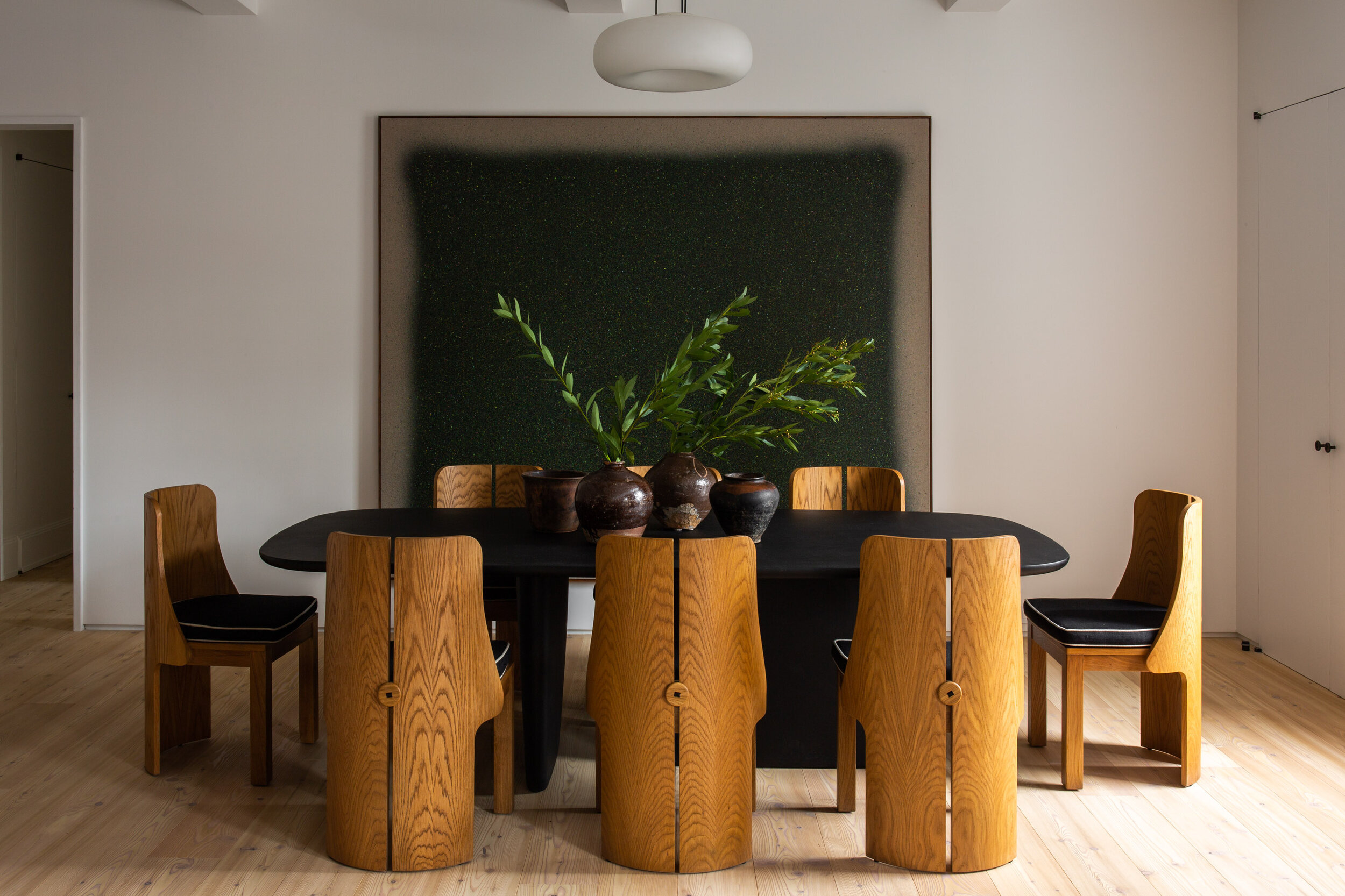
The Ashe Leandro design philosophy is: “we embrace instinct, ingenuity and humor over traditional design convention.” It is seen clearly through the inventiveness of their work. There is a singularity, an excitement, and a surprise to each of their projects. In getting to know their aesthetic, it becomes clear when looking in shelter magazines what they have worked on; the designs are uniquely theirs. Ashe Leandro has a clear aesthetic through their entire body of work. It is absolutely contemporary and paired down, yet littered with inventive detail; it is sumptuous but approachable. It is the sort of contemporary design that will remain timeless and free from fading like trends. Incredible forms and materials are given the space to shine. By stripping back to the essentials, they allow what is left to truly sing. Their work is dramatic yet comfortable, intriguing yet approachable, and surprising yet homey. Walls are painted in whites, creams, and blacks. Sofas and chairs are covered in browns, camels, cerulean, and cognac. None of their pieces scream out for attention, but when considered for a moment you realize how beautiful they truly are. Pieces like the Ruemmler No 172 chair are made with classic oak, but molded and curved elegantly, sliced down the back center, and cushioned in black linen with contrast welt. But in all this careful, precise elegance, there is an inherent casualness. First and foremost, they are designing for humans— families, artists, couples, filmmakers, children. They are taking their jobs as designers seriously— they do not aim for beauty, that will arrive on its own in the final product. And, design is not art, it is made to house a family, to be a space to work in, a place to watch tv, a place to dine with friends. They are unique in featuring children’s spaces on their websites. The painstakingly crafted designs of many firms are designed for adults and adults only. Ashe Leandro rejects this notion that children should not take part in living in beautifully and highly designed spaces. At their most refined and polished, they maintain a durability and sturdiness suitable for any family or pet; families deserve beautifully designed spaces just as much as the careful, childless adults.

Blake Griffey
FEATURED IN JUNE: STUDIO CAK + THE FARNSWORTH HOUSE

DESIGNERS TO KNOW: STUDIO CAK

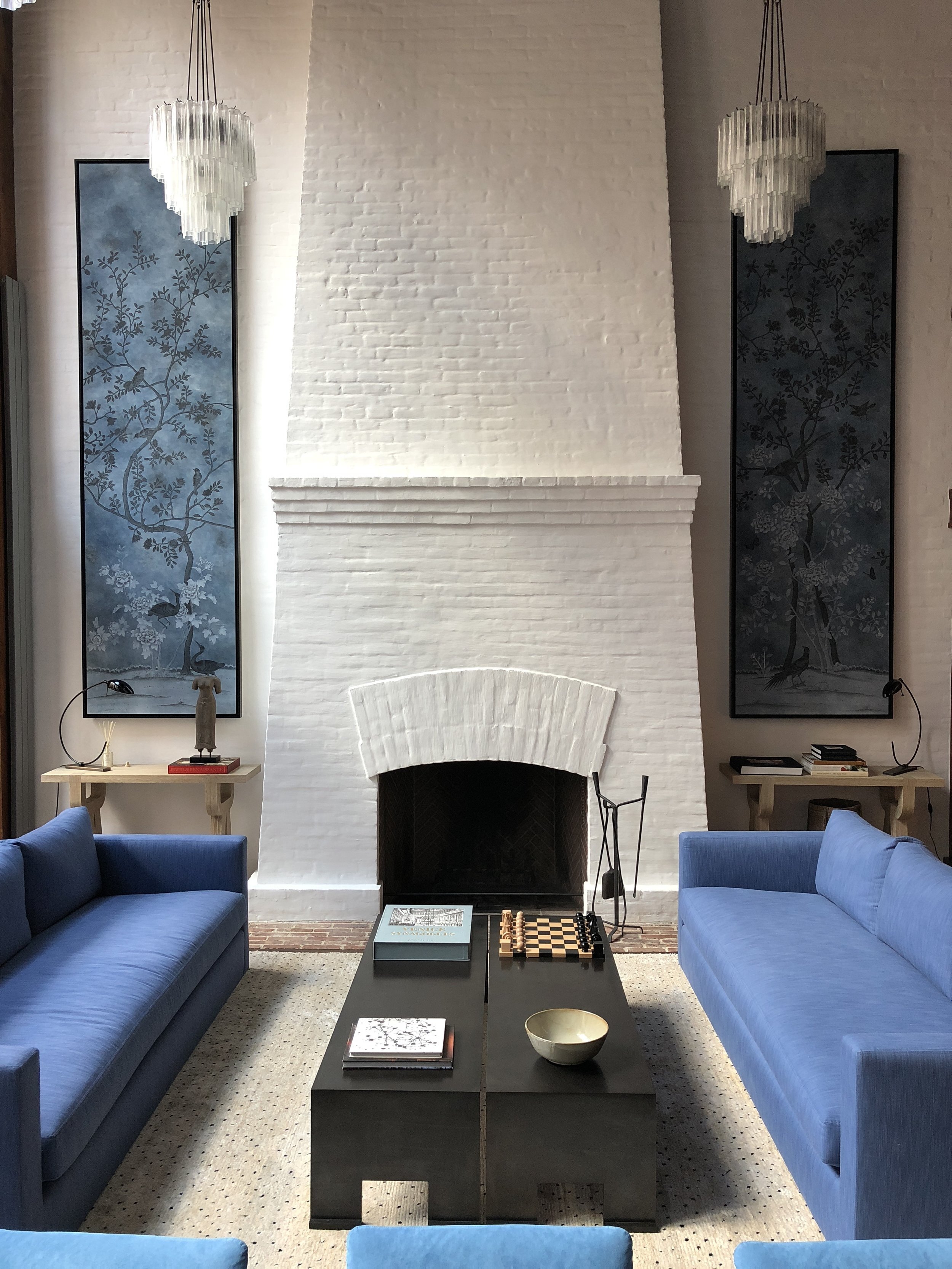
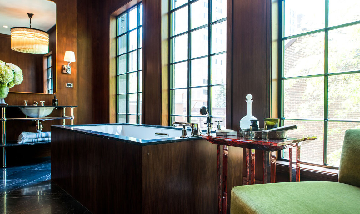
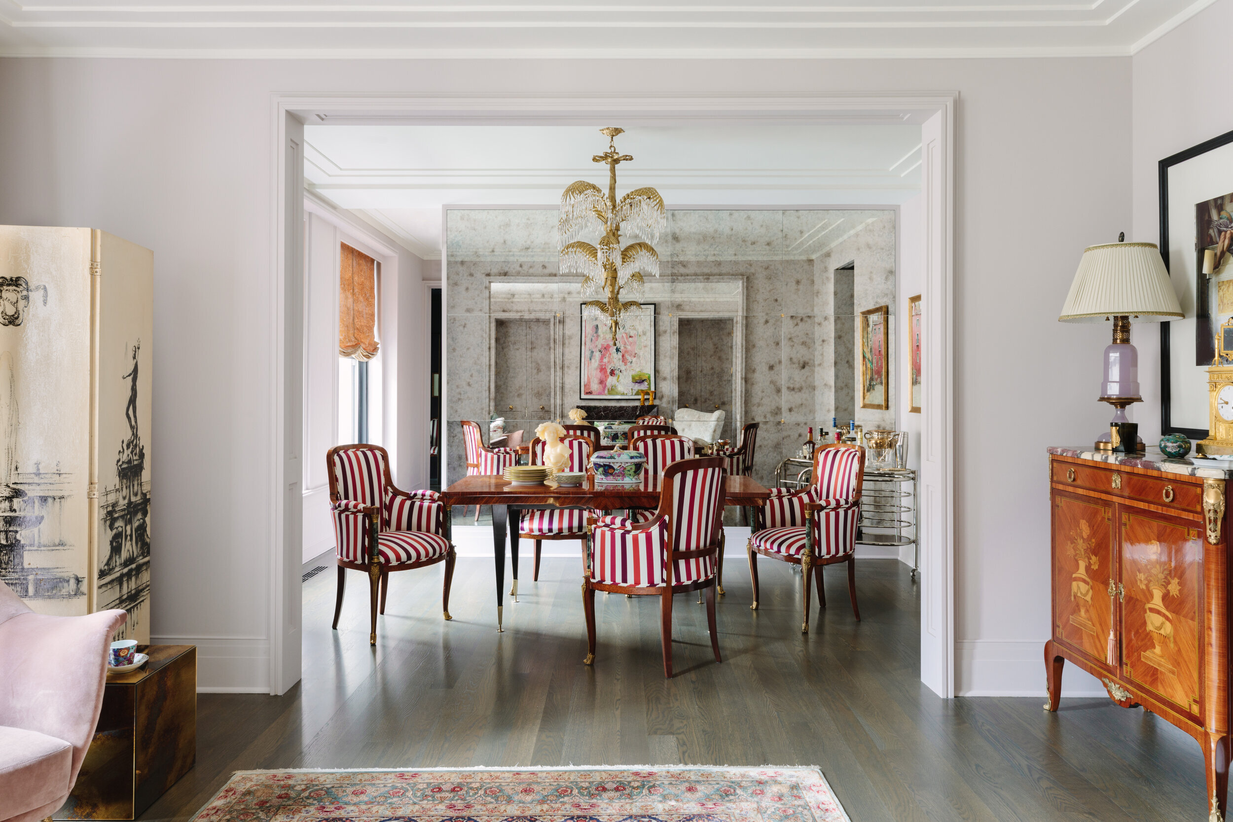
Studio CAK is a Chicago based interior design firm by Christopher Kent. Kent studied design management and housing and urban development at Parsons and Arizona State. He went on to work as a stylist at Abercrombie and store designer at Restoration Hardware, starting his own firm in 2014. Studio CAK “brings a fresh take on European elegance finding accord in balance and striving for function over frivolity with a link between tradition and the future.” The work is rooted in classical forms and styles but brought to the present with inventive colors and composition. Kent’s work is singular, making tradition sing in an inventive way. Studio CAK’s work can be seen in major shelter publications and in projects nationally.

Photos from the Palmolive and Schiller projects

MODERN LANDMARK: THE FARNSWORTH HOUSE

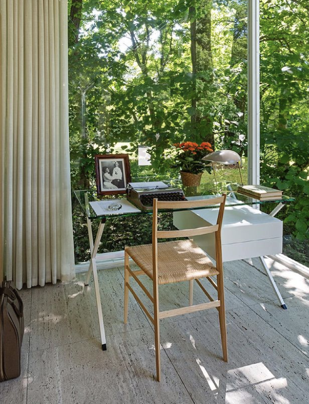
The Farnsworth House is one of the most iconic modern buildings in the world. Located in Plano, IL, the house was designed by Mies Van Der Rohe and commissioned by Edith Farnsworth. It has been culturally significant and newsworthy from the time of its inception. The house stands today as a historically important site for viewing mid century modern design.

Dr. Edith Farnsworth is often erased from the history of the building despite being the commissioner and her close collaboration in its design. Farnsworth was educated, multifaceted, and existed outside of American 1940’s conventions. She was born to a wealthy family in Chicago’s Gold Coast then moved to the north shore, spending her summers in Maine. She studied zoology, literature, and the arts at the University of Chicago and in Italy, going on to medical school at Northwestern. In 1945 she commissioned Mies van der Rohe to design a weekend home on a riverside plot of land outside Chicago. The house was completed in 1951; Farnsworth said “my house is a monument to Mies van der Rohe, and I’m paying for it.” Arguments about the practicality and livability led to lawsuits and major disagreement. In 1967, local government took a quarter of the land to construct a highway. Farnsworth then sold the house and moved to Italy to get back to literature and poetry.

The home is now open to the public and is a National Historic Landmark, and is currently held as a Historic Site by the National Trust for Historic Preservation. Since its construction, water issues have been a problem. The site slopes down to the river and flooding has threatened and caused damage to the home. Currently, the lower terrace is being restored. You can support for the maintenance of this iconic and important building here.

Blake Griffey
FEATURED IN MAY: SETH KELLER, JOHN SALADINO, WALTER FYDRYCK

We are happy to feature new pieces to the gallery this May. The gallery remains open by appointment only — please contact the gallery to set up a time to view any of the pieces you see online. We are best able to help if you provide the pieces you would like to see prior to your appointment. For any requests beyond what you see online, please contact us and we can help source new pieces or refurbish from our stock.

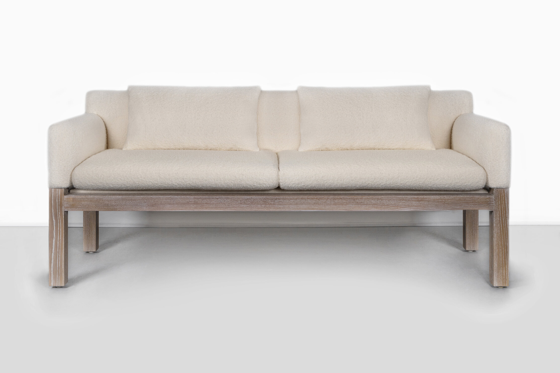
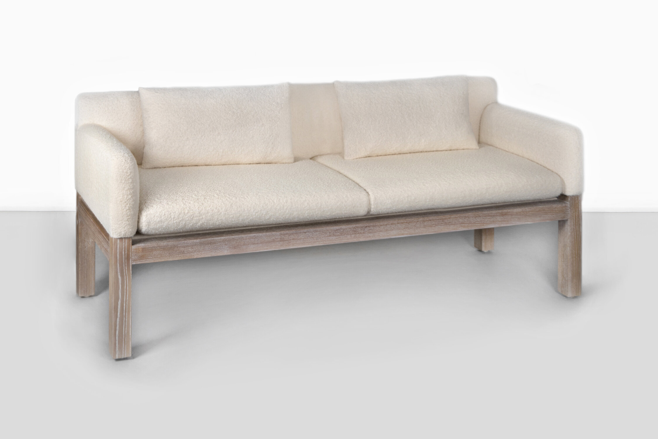
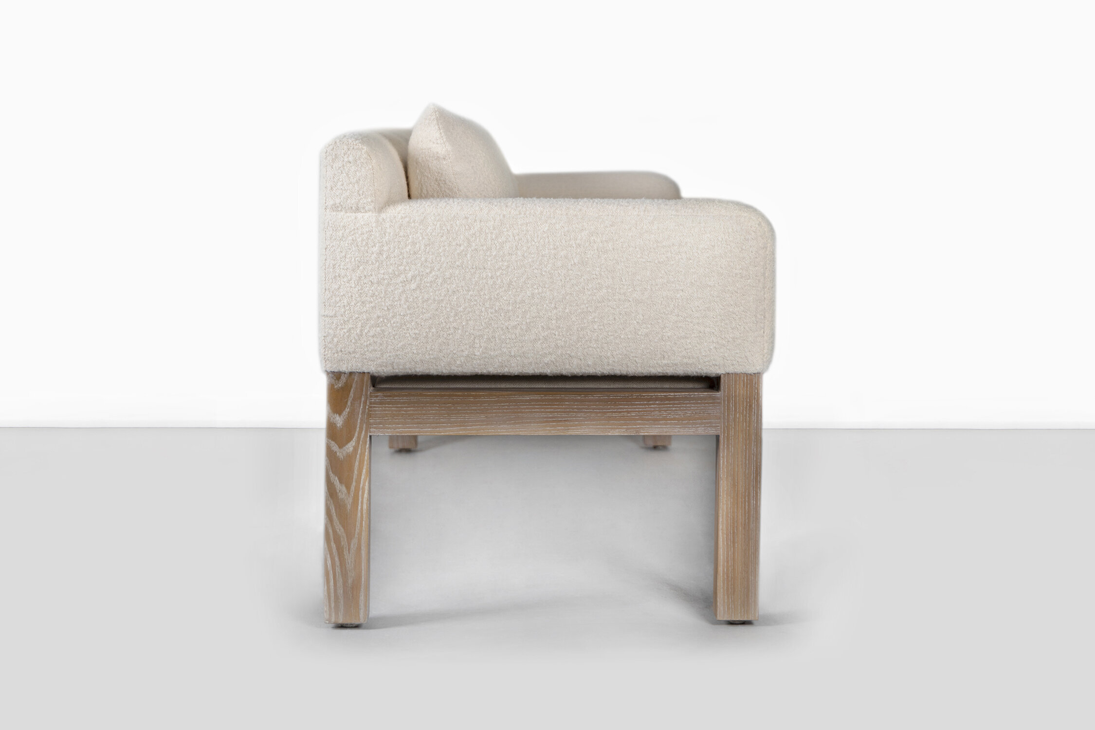
JOHN SALADINO FOR DUNBAR POST + BEAM SOFA

This sofa, designed in the 1960’s, has been freshly reupholstered in boucle fabric and has a newly restored ash base. This design is a rare and sought after. It peels back the bulk of a sofa, with tall wooden legs and streamlined cushions. This sofa is perfect for occasional spaces— an office, entrance hall, sunroom.

IT WALNUT BENCH

Seth Keller has been a working artist for almost twenty years as well as working for the Art Institute of Chicago. Seth’s work is intimately related to exploring manufacturing processes, primarily working with wood. This piece allows the materiality to be showcased. By using simple forms, the color and movement of the wood comes to the forefront.

"ELATED VIBRATIONS"

Walter Fydryck has been working since the 1960’s and was trained at the Art Institute of Chicago. His paintings undulate and bend with colors morphing into others; abstract shapes hover over hazy backdrops. In this piece, Fydryck creates a crisp, futuristic abstract work. The monochromatic scheme and sharp, angular forms makes it seem almost metallic, the shape like a bent piece of chrome reflecting light.