FEATURED IN MARCH: PLATNER, LOTENERO, JUHL

This month we are happy to showcase new and treasured pieces at the gallery. New pieces by Finn Juhl and Warren Platner and works by Michael Lotenero and Mies van der Rohe are highlighted this month. We are available, as always, by appointment. Please reach out and we would be happy to set up a time to show these pieces.

FINN JUHL FOR BAKER FURNITURE CABINET

This cabinet was designed by Finn Juhl for Baker Furniture as part of the Baker Modern line. It is made of freshly restored teak and maple. Finn Juhl was an iconic Danish designer known primarily for his furniture and is credited with introducing this style to America. He studied architecture and began his career as a student working on interiors. He was brought to the American design market by being spotted by a MoMA curator and then being picked up to design a line for Baker. This piece’s design celebrates the materiality of the wood; the grain and texture becomes the star. The contrasting wood species highlight each other and the streamlined design is simple yet beautiful.

WARREN PLATNER FOR KNOLL SIDE TABLES

These side tables are emblematic of Platner’s designs, featuring the curving metal legs he is known so well for. The marble tops come in their original boxes from the 1980s; original glass tops are also available. The combination of materials in conjunction with the lines evokes the modern elegance of mid century design, utilizing classic materials with experimental forms. The marble tops almost hover, support by many spindly legs rather than any substantial forms. This adds to the modern flair: a heavy piece of marble almost floating.


"DREAMSCAPE II"

Michael Lotenero creates evocative and dramatic abstract works. This large scale piece is oil on canvas, with bold and gestural marks against a black field. The majority of the forms rest within the middle linear portion of the piece, carefully evading the upper and lower portions. These contrasting marks seem to float in the black field, this dark container clearly behind the forms but also sheerly shrouding some. The artist clearly uses a variety of methods to create, with clear brush strokes slashing across the canvas, smaller messier fields, and long, almost scratch like lines that move across.

CROWN HALL: A-10

Crown Hall is one of the jewels of Illinois Institute of Technology’s campus. With long planes of glass held by black, steel beams, the space almost floats, with light pouring in from all sides. The building was designed in 1954 and is part of a collection of iconic early modern architecture on the school’s campus. It is the home of the College of Architecture and was finished in 1956. The space is almost entirely open, free from beams or structural walls, allowing it be changed and adapted to whatever is needed of it. This drawing comes from Mies’s office and comes from a set of technical working drawings.
FEATURED IN FEBRUARY: WESLEY WILLIS
Photograph © Anthony Iacuzzi

Photograph © Anthony Iacuzzi

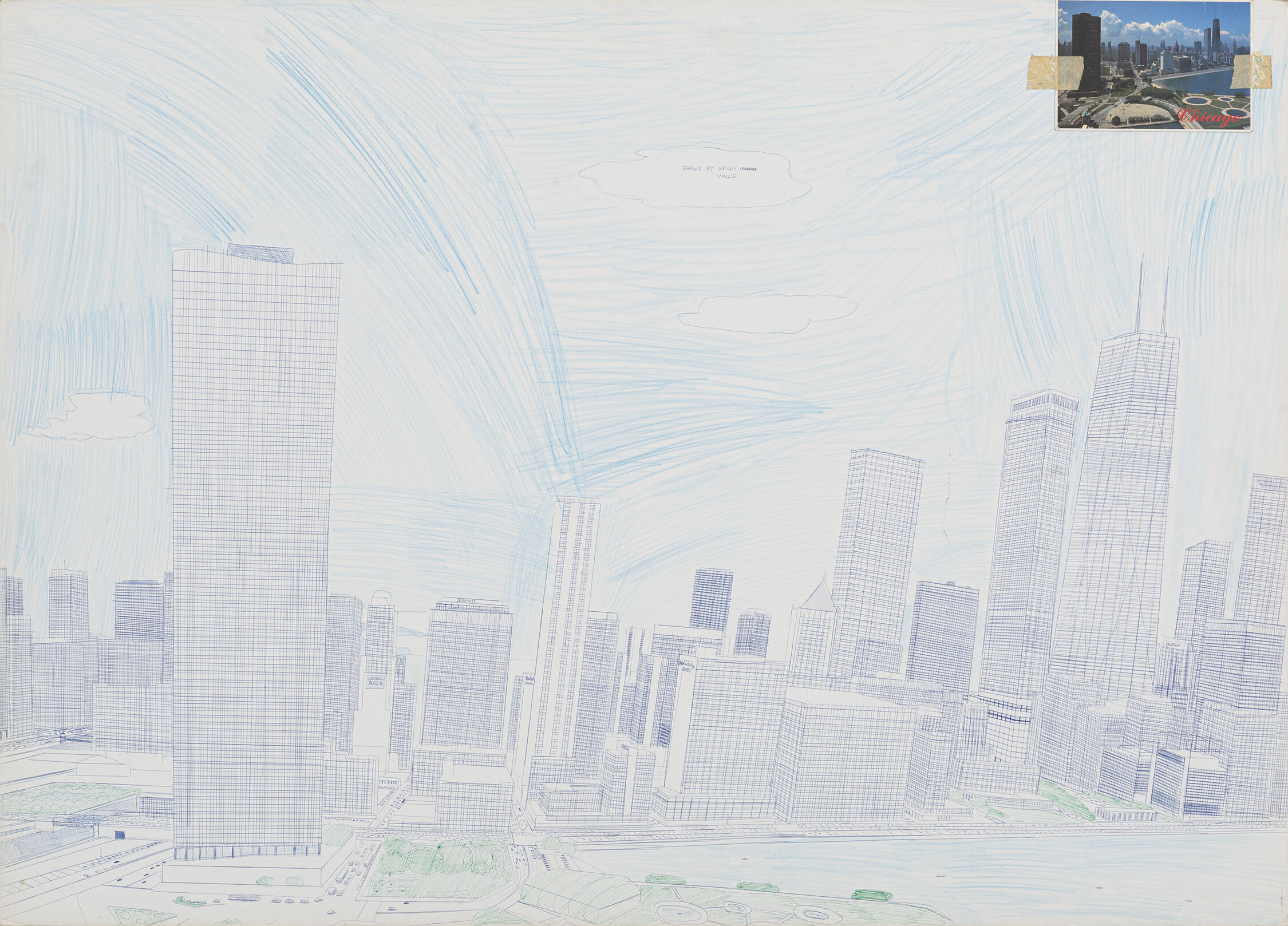
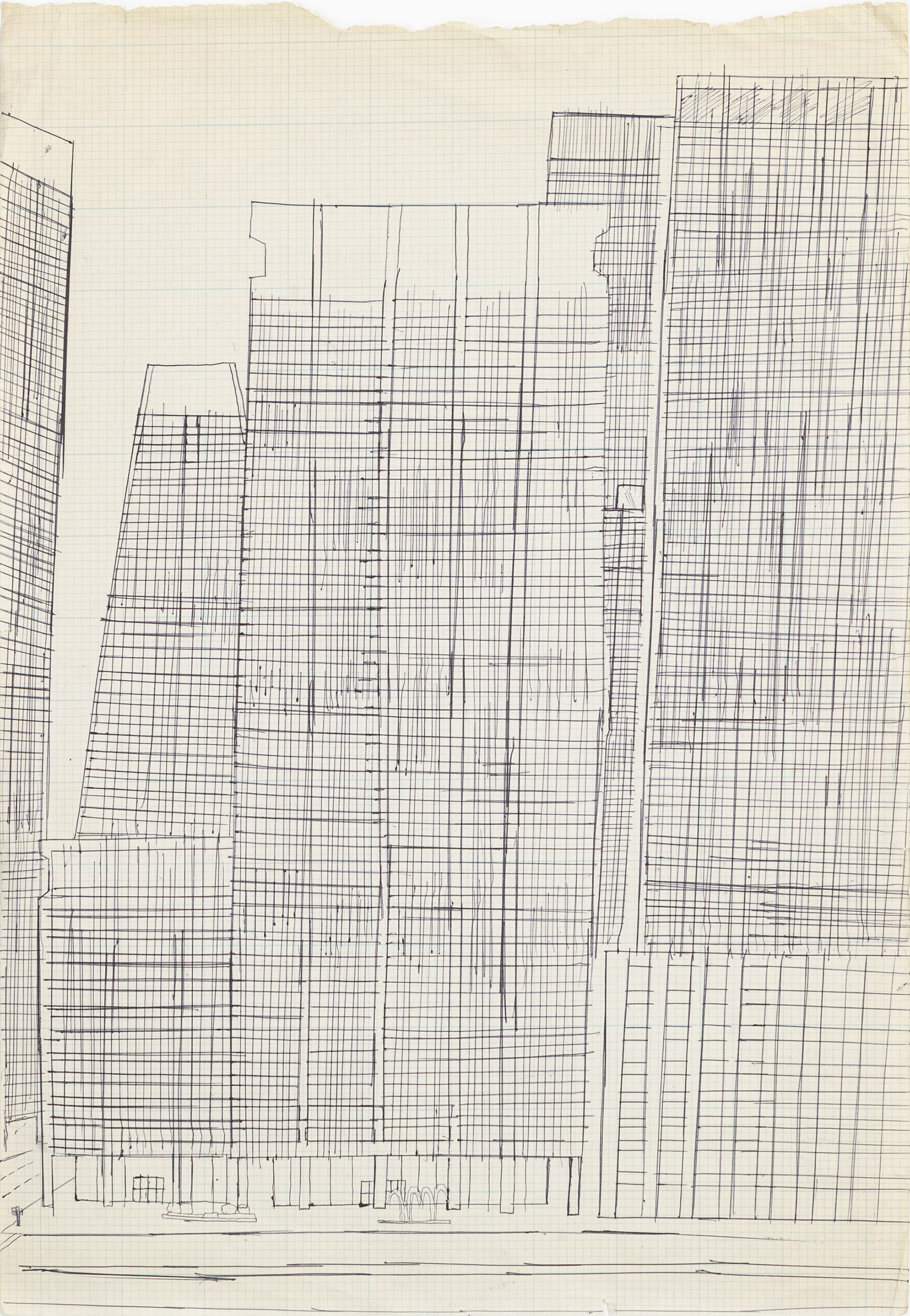
Wesley Willis (1963-2003) was a self-trained artist and native Chicagoan, growing up on Chicago’s Southside. Willis honed his technical abilities in the Chicago Public Schools, where he took drafting class and aspired to become an architect. 

Willis could often be found sharing his drawings on the streets of Chicago and engaging those passing by, his personality and sensitive heart earning him a dedicated following. Willis’s graphic vision captures the urban life spirit of the late 20th century. As an intuitive artist he has made a bold, genuine, and unique contribution to the visual arts. His work is represented in significant museum collections both in Europe and America. His work was seen most recently in the show “Just Connect” at the Museum of Contemporary Art Chicago.

In addition to his art career, Willis was a part of the outsider music scene. He performed with The Wesley Willis Fiasco, Monster Voodoo Machine, and solo. A character named Milan in the ongoing Wonder Woman comic is based on him.

Willis’ interest in architecture and drafting training is seen in his work: exact, intentional lines, images of skyscrapers and trucks. He utilizes traditional drawing techniques with a heavy emphasis on perspective and vanishing points. He employs drafting methods to create surprising representations and intentional observations. There is a sort of meditative quality to his work: skylines comprised of hundreds of carefully drawn lines in ink, quiet studies of trucks. He brings a softness to the hard landscapes of the skyline with his handcrafted works.

DESIGNERS TO KNOW: LEYDEN LEWIS

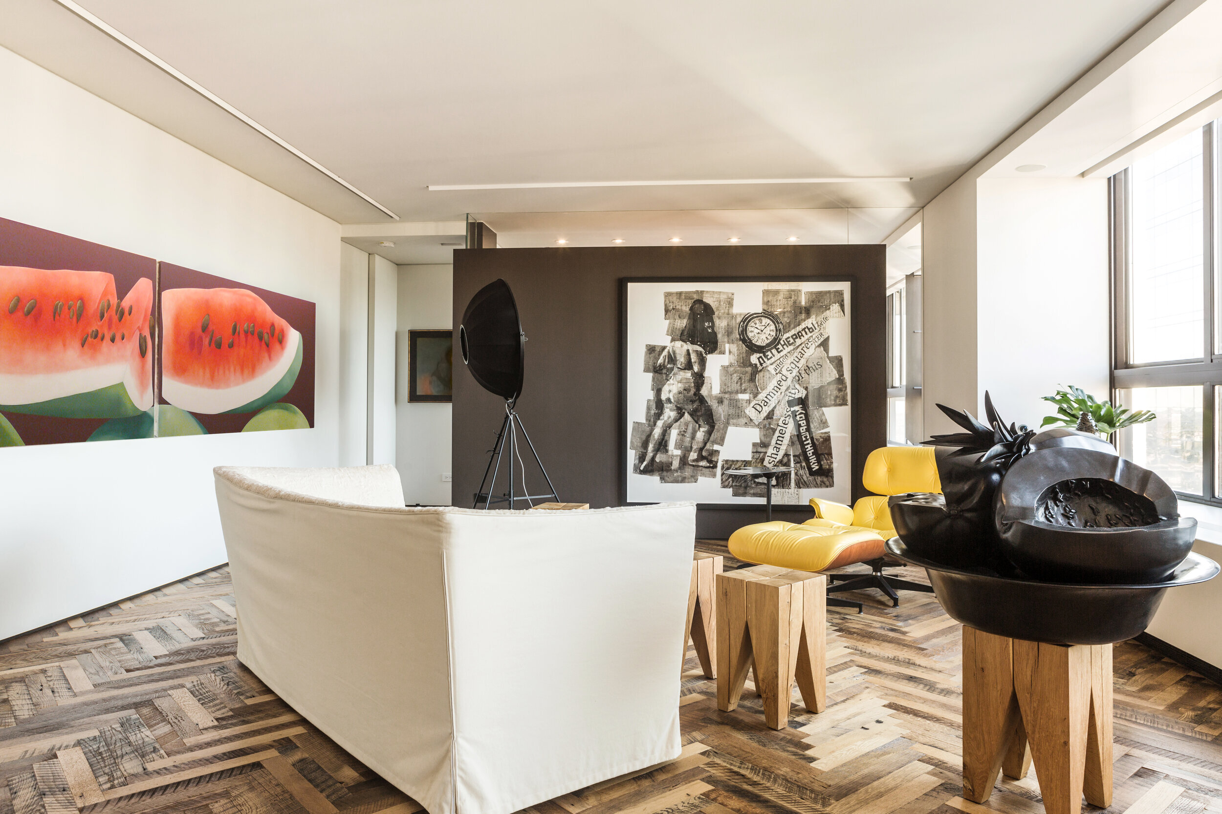
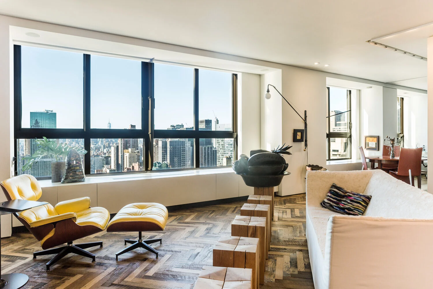
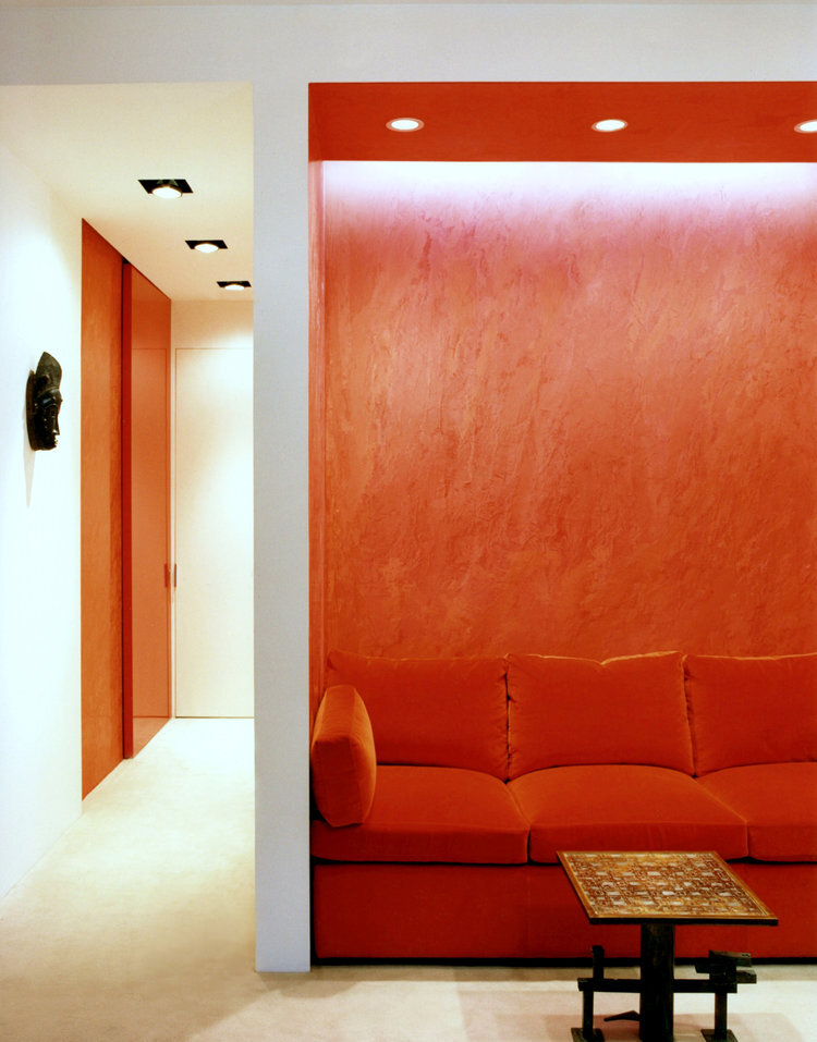
Leyden Lewis is known for work that “encompasses the culturally rich Caribbean heritage of Trinidad and Tobago, urban sophistication, and classical European Modernism.” His work shows his eccelctic interests and inspirations. Beginning his design career as an interior decorator’s assistant, he went on to earn his Masters in architecture from Parsons in New York City. His work is not limitted to just interior design and architecture, Lewis also working as a fine artist with art curated by Thelma Golden at the Studio Museum and aiding clients in building their own art collections.

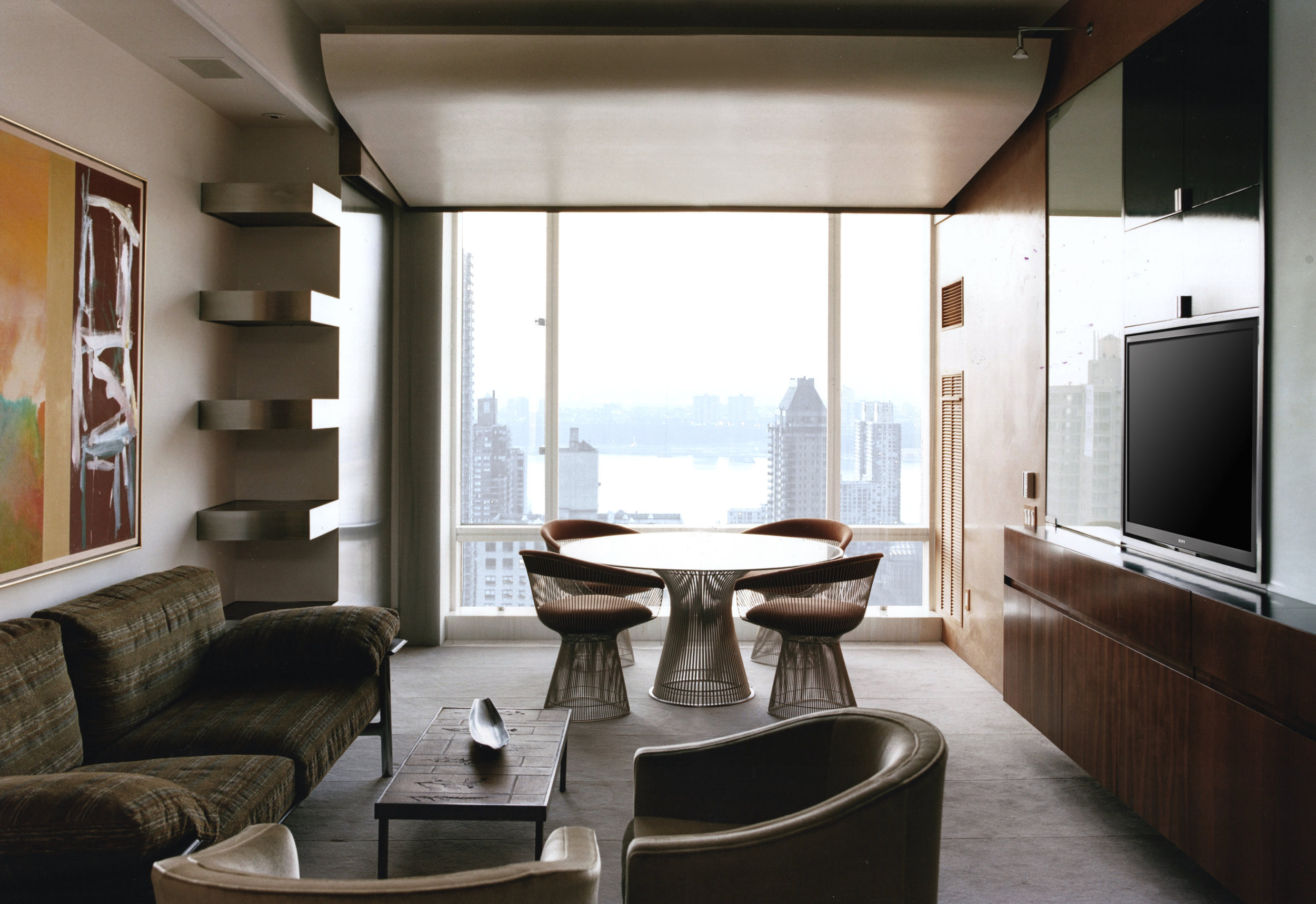
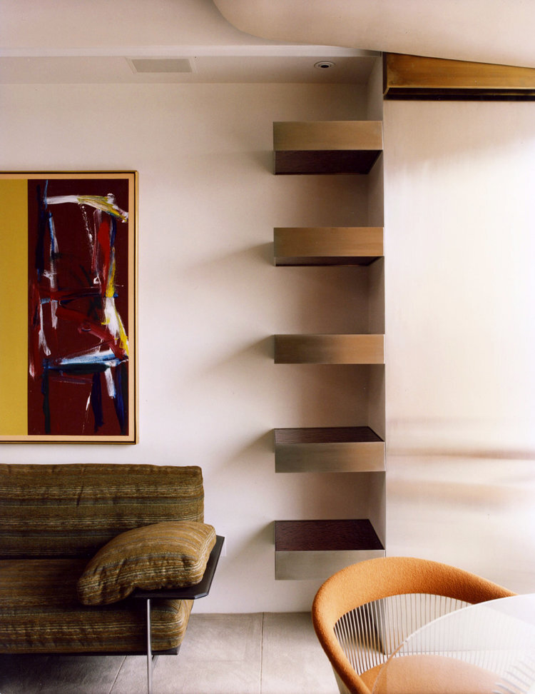
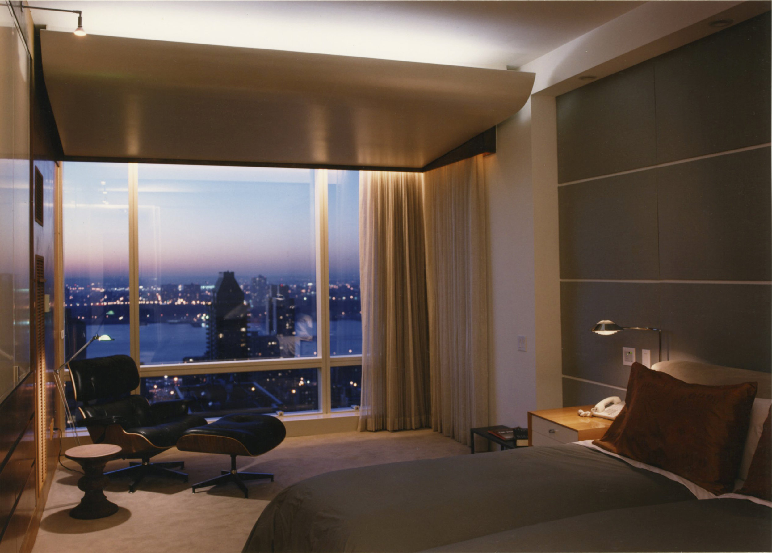
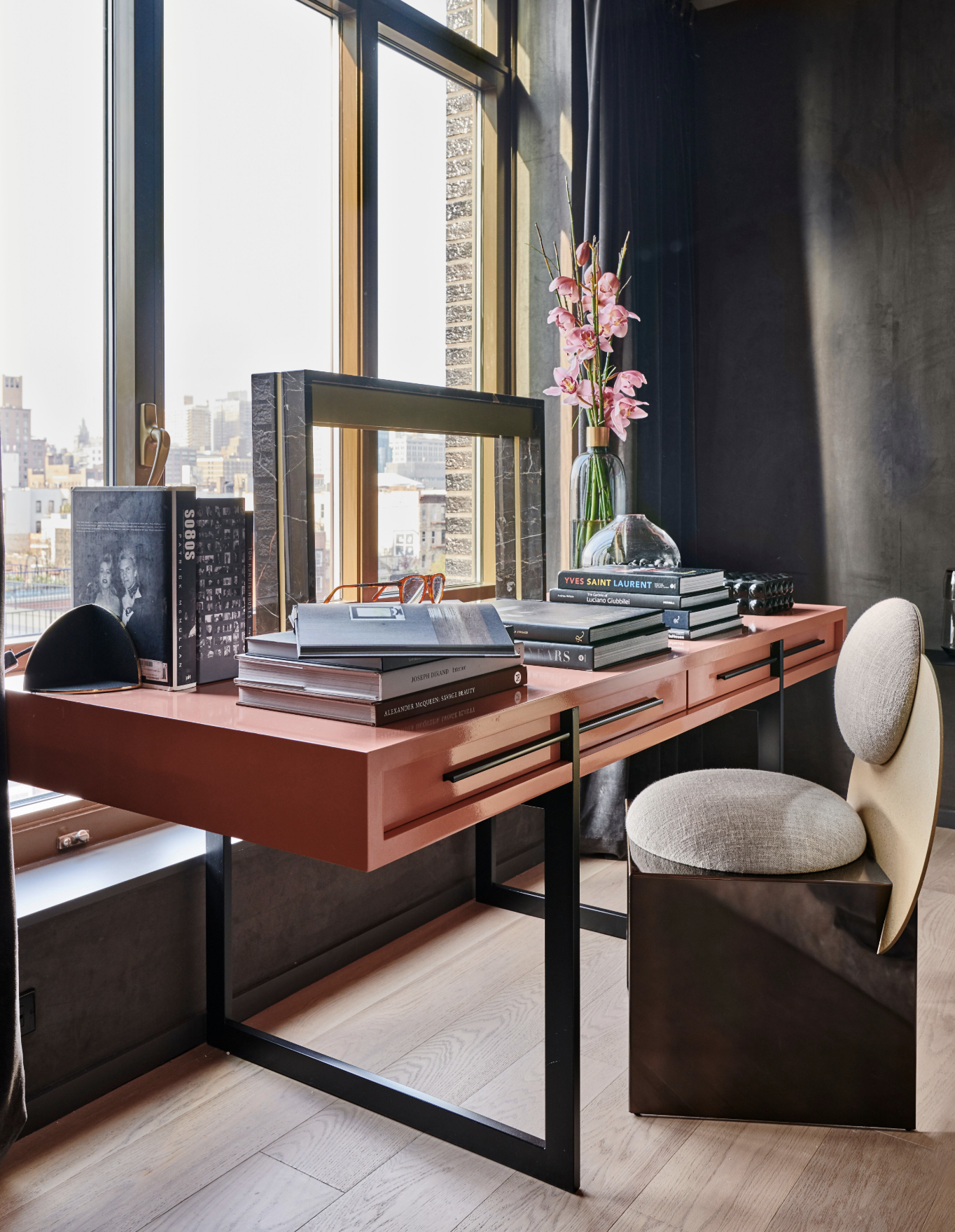
Given Lewis’ training and expertise, the forms of the spaces are very clearly integrated into his interior designs: walls that don’t quite meet, a ceiling that appears to unfold to reveal a skyline view. It is clear that he does not just consider the space inside the drywall as his territory, but considering why that exact drywall is there and why can’t it be another material. The containers themselves are so well considered and it shows the benefit of architectural knowledge in interior decorating. This integration of form and contents sets Lewis aside from other designers. Any interior designer, no matter how hands on or off they may be in dictating the architecture of a home, will have a say in what the structure itself looks like. But with Lewis, it is one and the same. The decoration exists in complete harmony with the building.

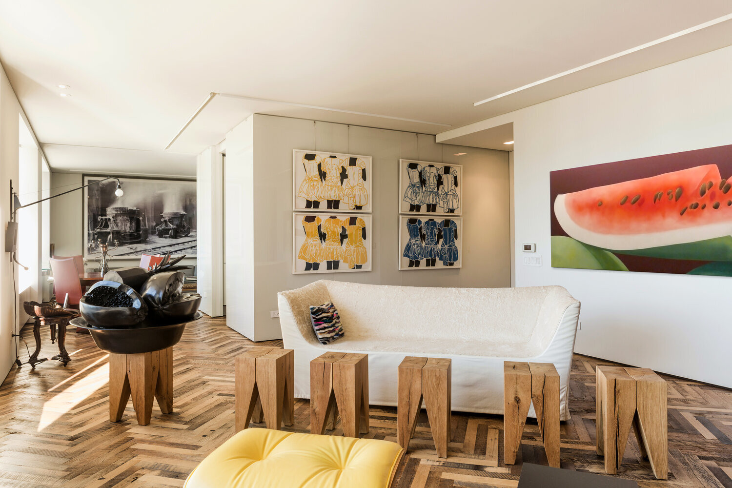
As a working artist with knowledge of the art world, art too plays a large role in his designs. Each space he works on is greatly abetted by his art selections. Art is not just used as decor, but as important elements in creating a cohesive space, just as a sofa or flooring selection. It breathes life into rooms, and provides a foil to Lewis’ sleek, modern architecture. It is clear when viewing Lewis’ work, he is unafraid of bold art. He chooses not just simple paintings, but confrontational and dazzling works. These are not pieces to pull together a color scheme or add visual interest to blank walls, but art to be looked at in its own right. Lewis’ spaces are both living places as well as galleries.

Lewis’s Studio works in both residential and commercial design globally. He is located in Brooklyn, where he has been based for the last thirty years. For more information, visit his website or Instagram for photos and updates on his current projects.

OUR YEAR IN REVIEW

Happy New Year from Matthew Rachman Gallery!

This year we continued to bring in newly restored modern furniture and breathtaking works by our artists. Although we were unable to present any curated shows, we are grateful to continue to bring forward new and exciting work. In the early few months of the year, we featured work that had not been seen before, such as Ted Stanuga’s “Humbold” which drew sidewalk onlookers with its grand scale, or a triptych of Slater Sousley’s quietly vibrating plein air paintings.
This year we have also begun creating our own bespoke furniture. Our first piece is the MR Sofa, featuring bold, curving lines and beautiful blue mohair.

We continue to be available via appointment to anyone interested in seeing work in person and look forward to all the great work that will come in 2021. Thank you to all for your continued to support.

DESIGNERS TO KNOW: TIMOTHY GODBOLD

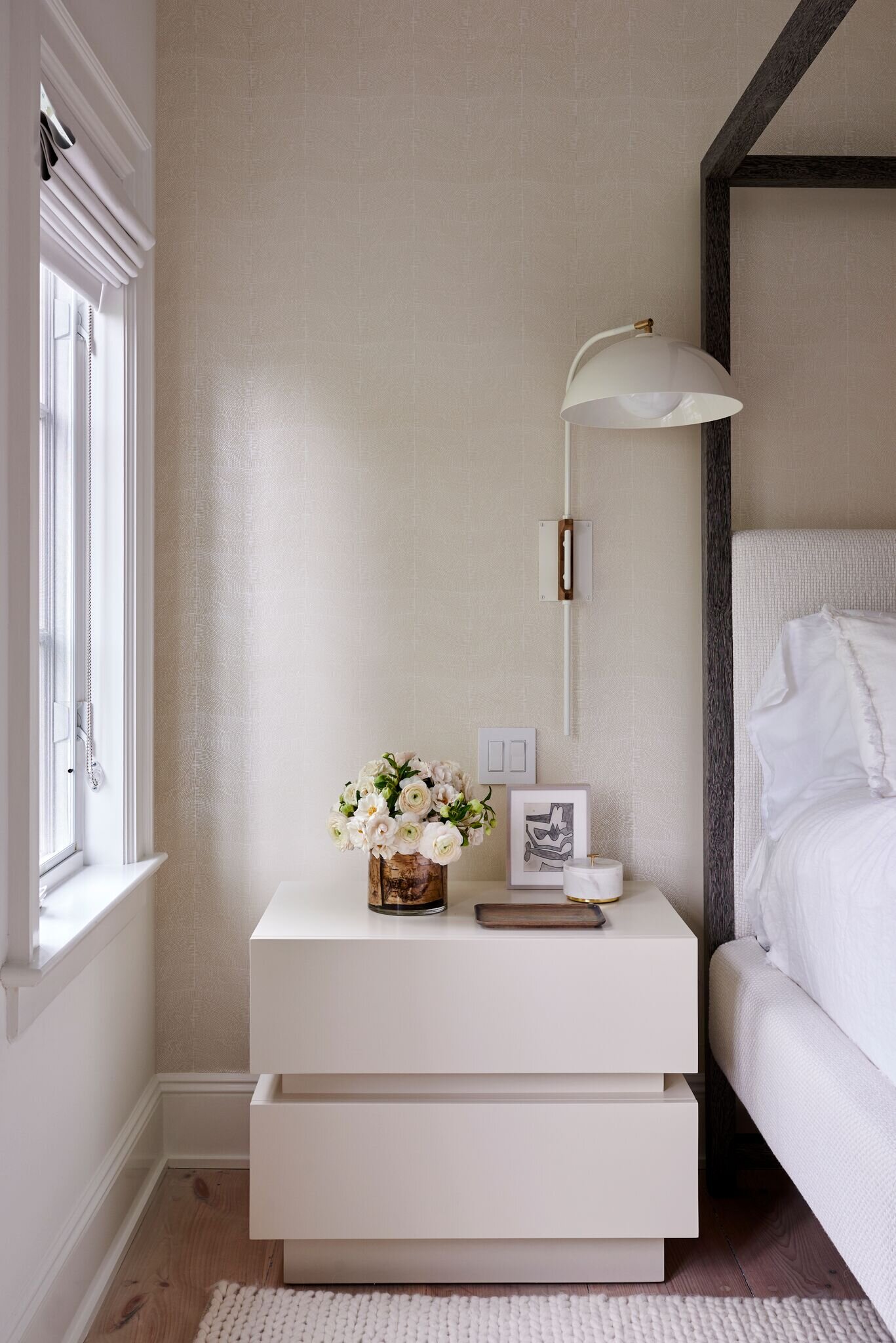
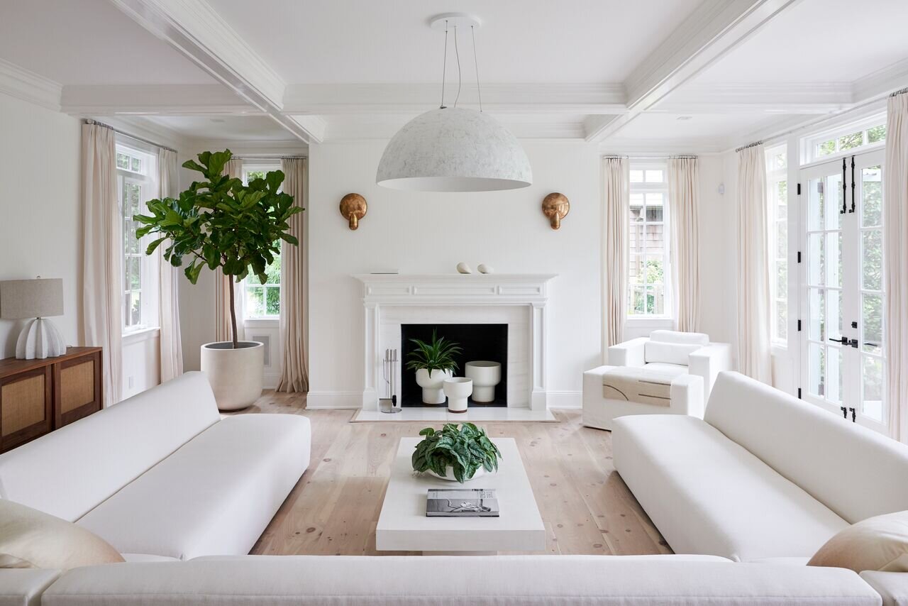
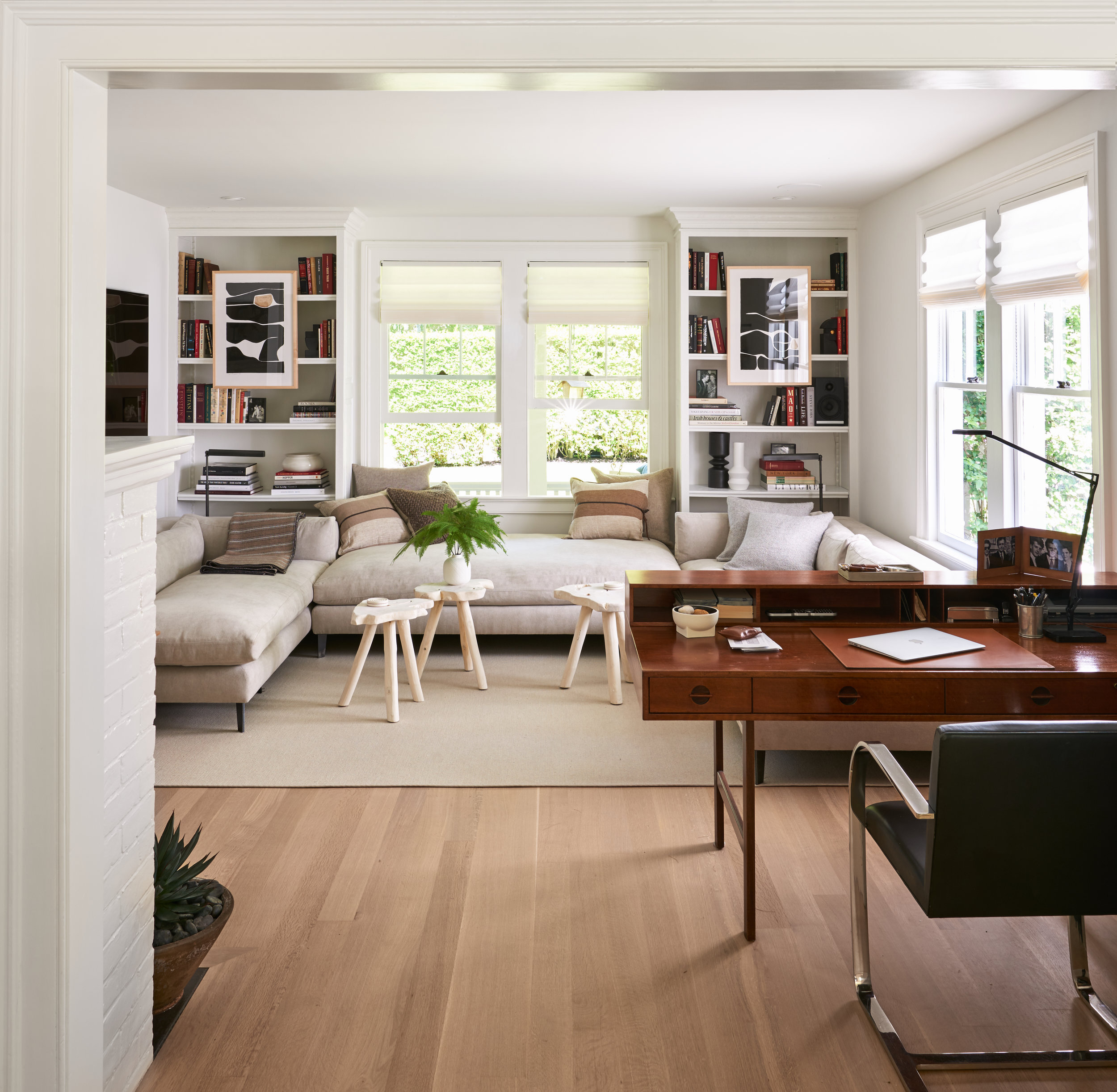
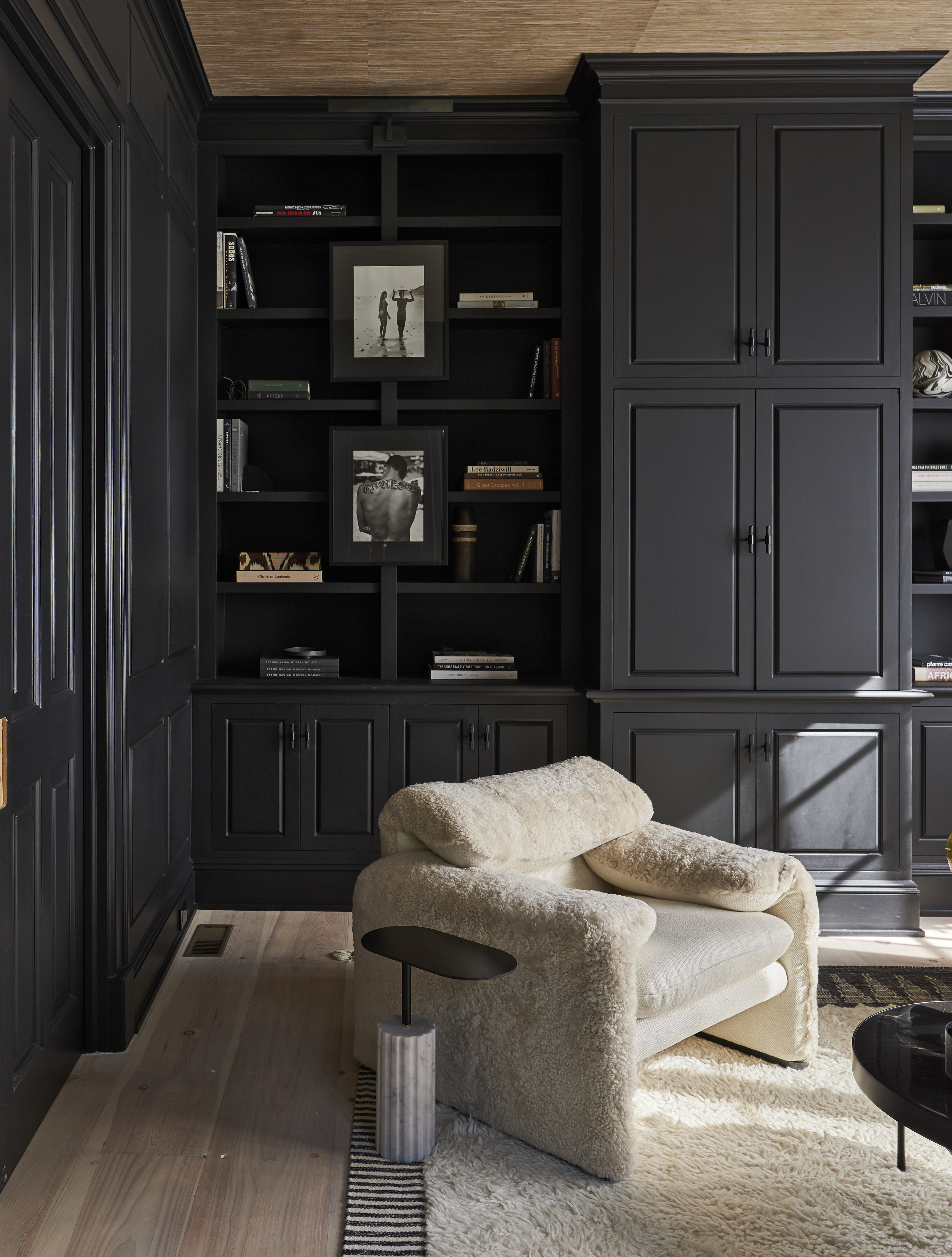
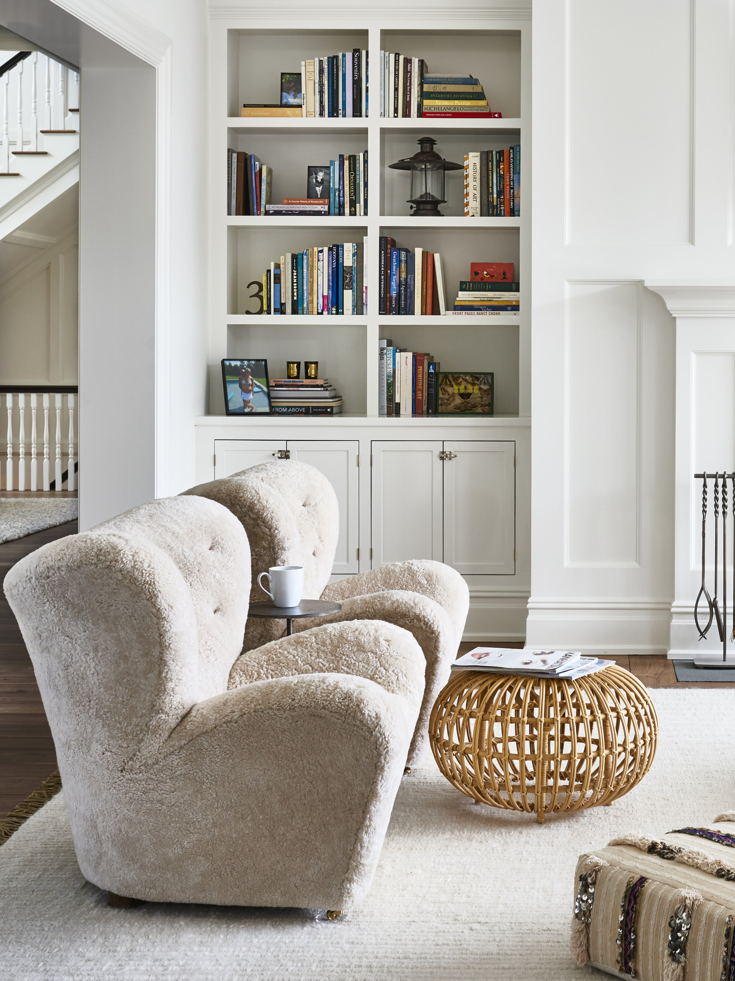
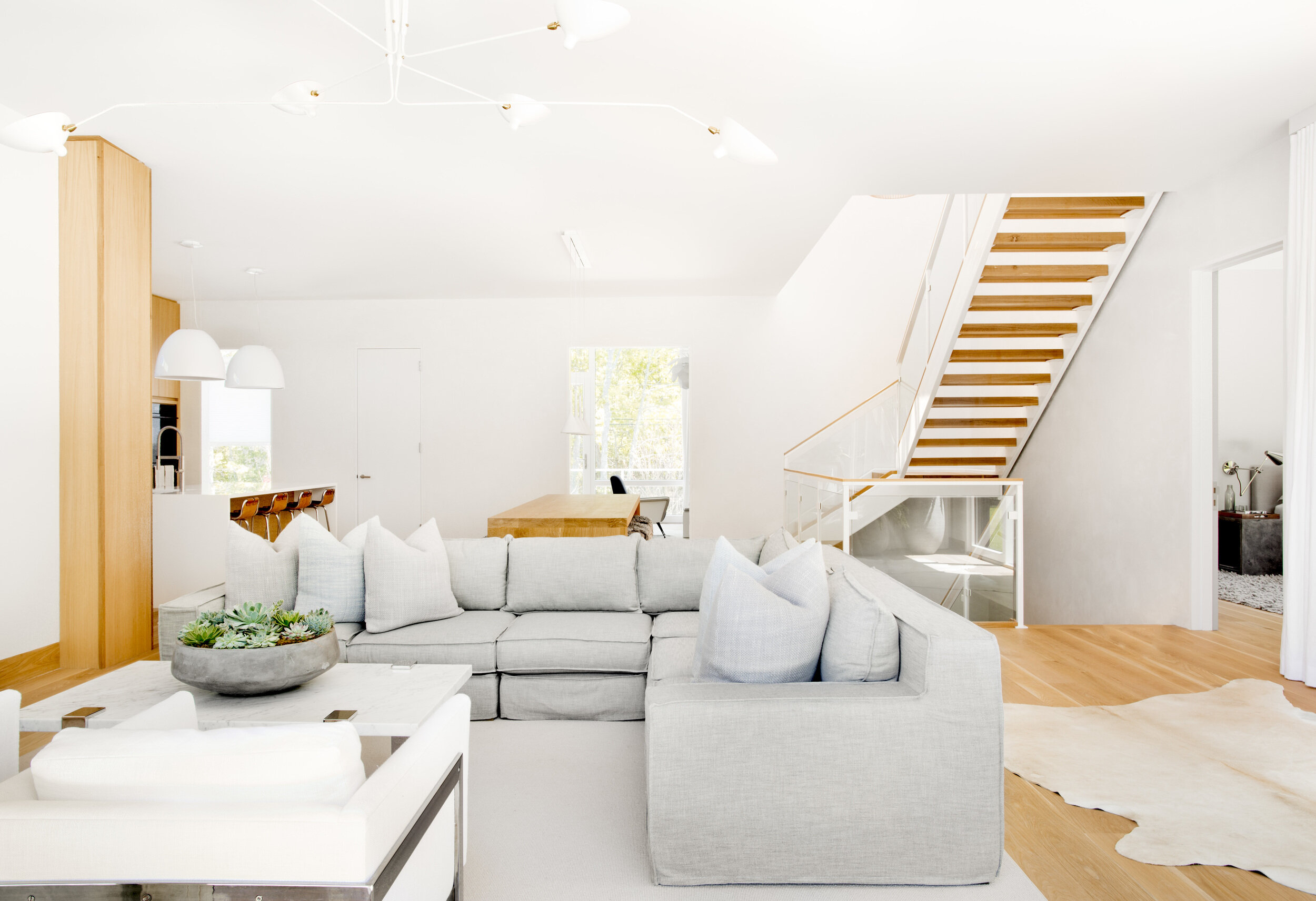
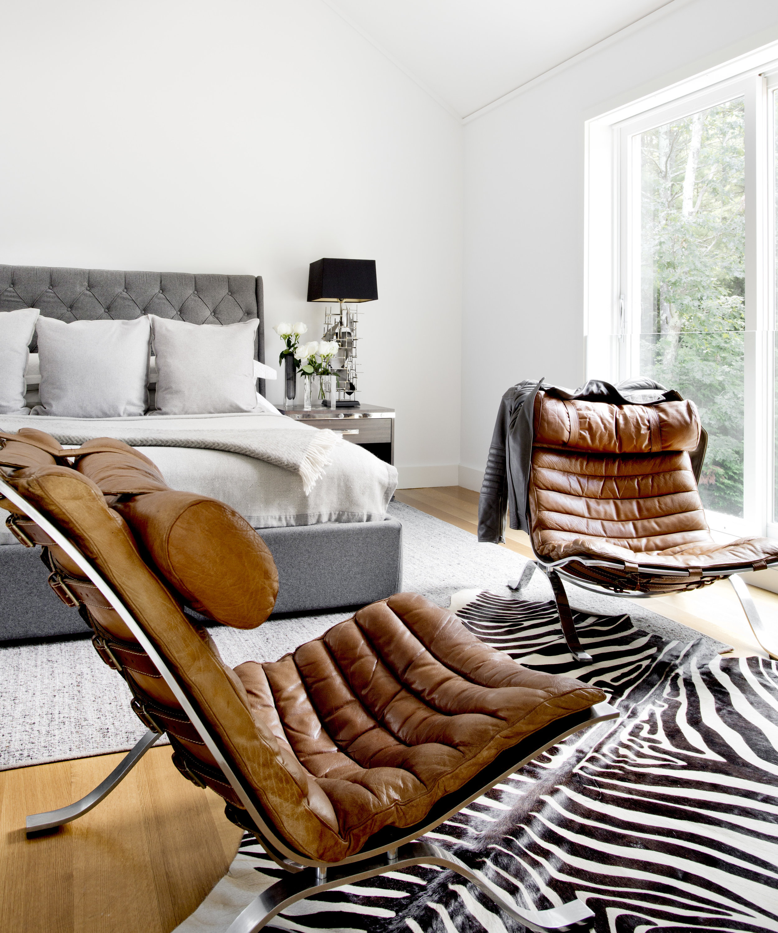
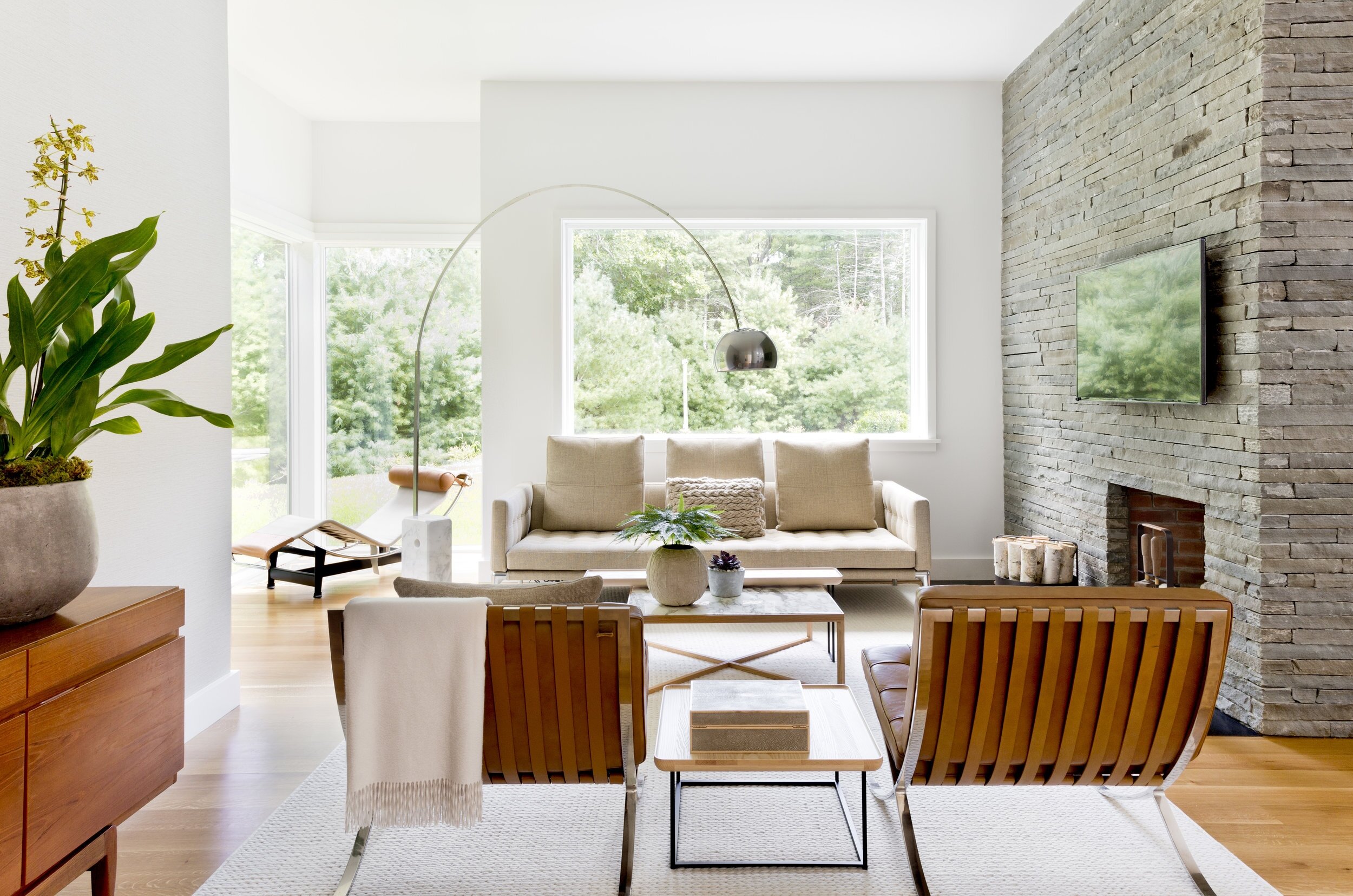
Timothy Godbold, fashion designer turned interior designer, creates refreshing, refined, spaces. Godbold began his career working with Ralph Lauren and had his own label and he has recently published a book on military style. His cream colored, masculine spaces are absolutely inviting and comfortable. Sticking to a strict scheme of mixed neutrals, the visual interest comes through finishes and textures: white walls and rugs, shearling, warm woods, saddle leather, natural linens. This tight scheme keeps the spaces subdued and relaxing but highly sophisticated, and allows him to adventure with sculptural pieces and forms.
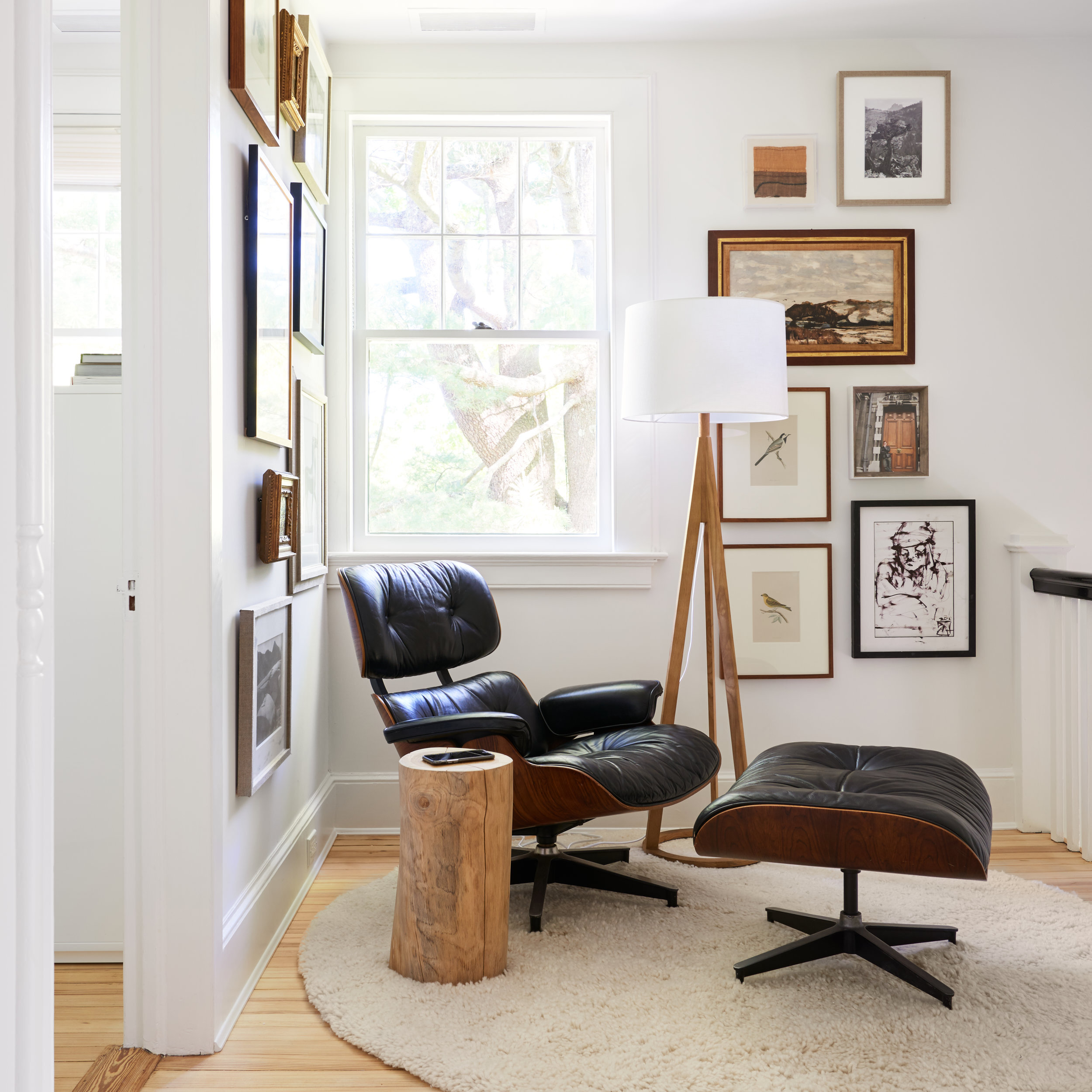
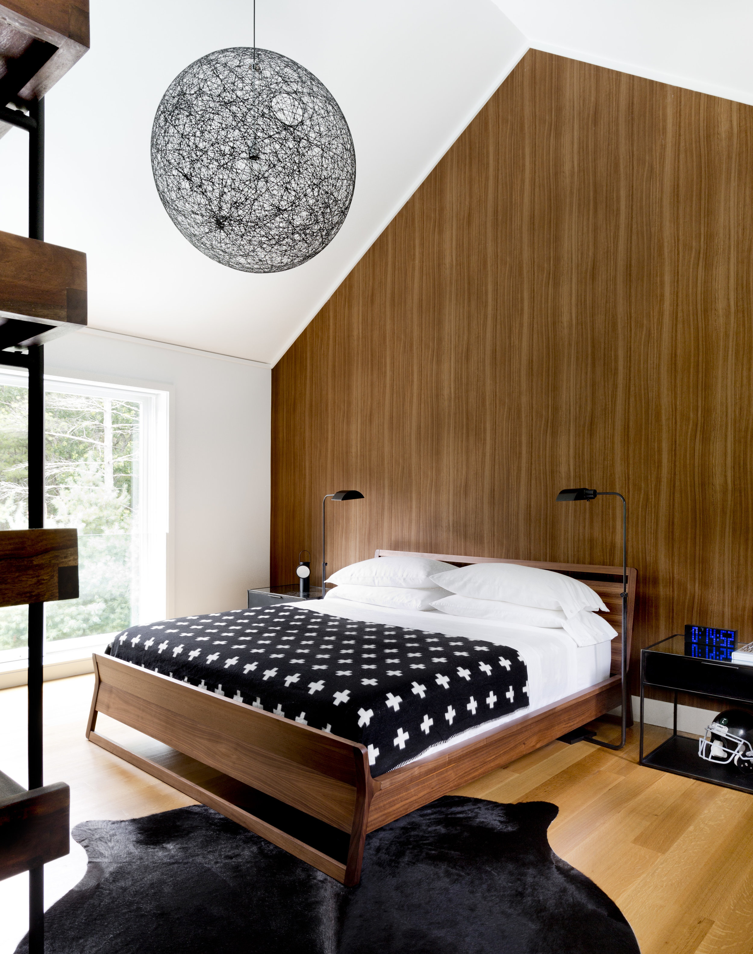
Godbold’s spaces have enough pieces to feel filled and finished, but no more. This restraint in space planning and decoration mirrors the restrained palette, creating rooms that do not overwhelm. The often masculine, modern pieces are juxtaposed against the softness of the upholstery and color scheme for serene balance.

GET THE LOOK