Posts tagged matthew rachman gallery
DESIGNERS TO KNOW: LEYDEN LEWIS

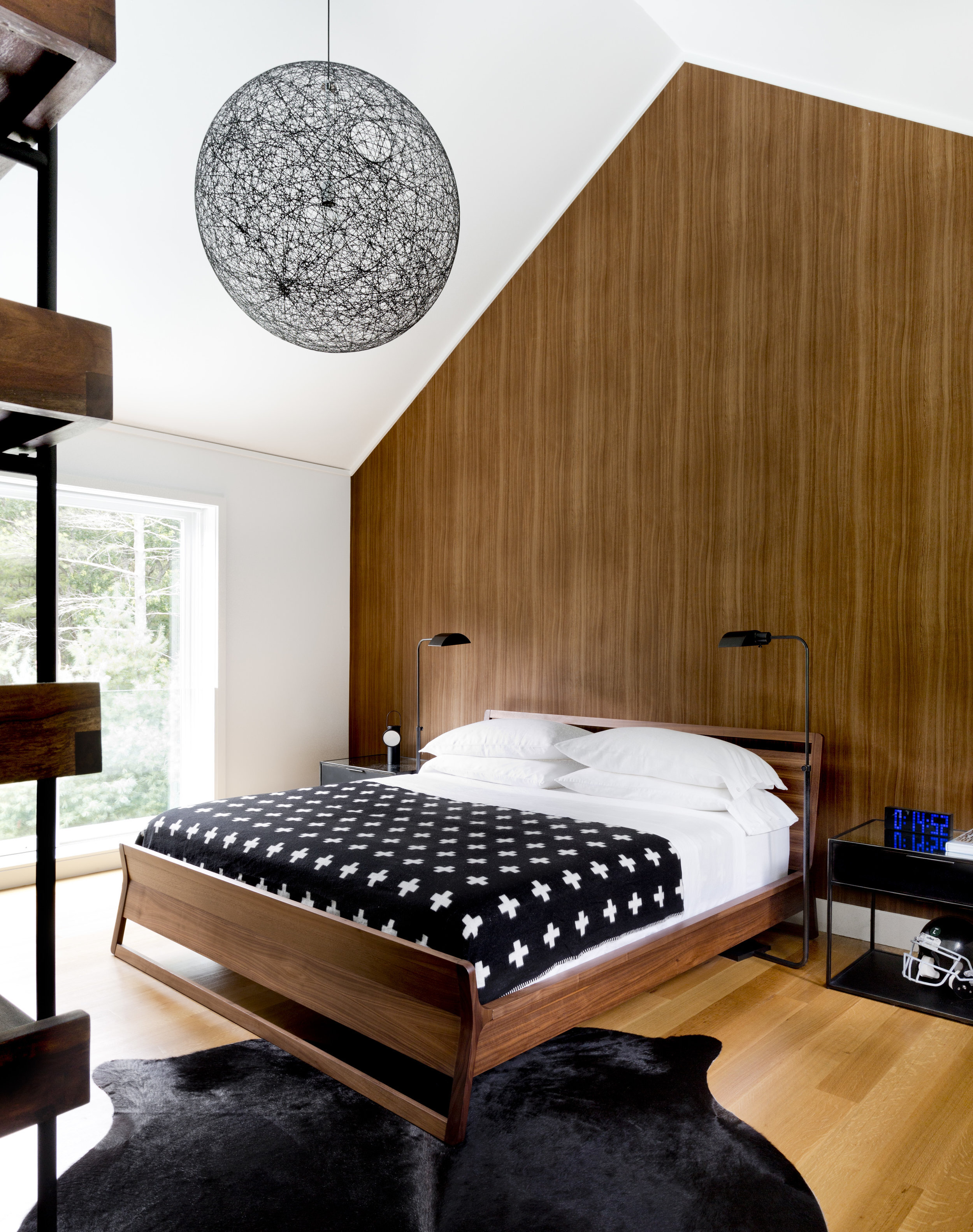
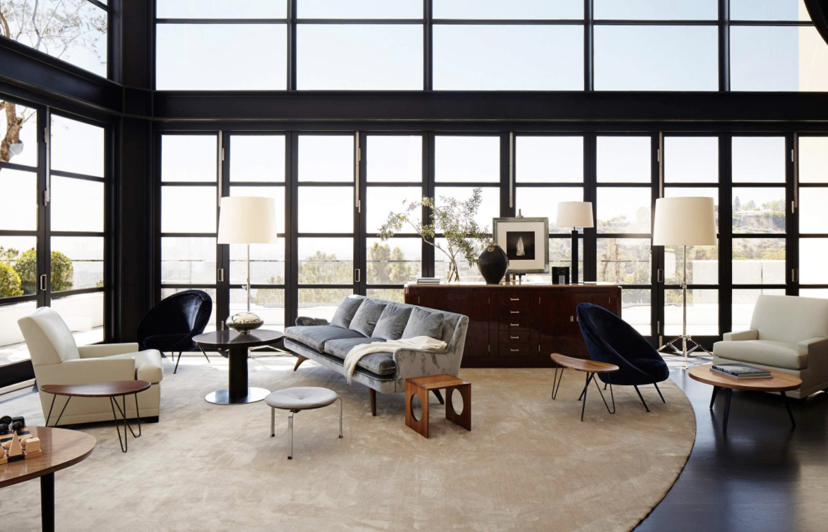
Leyden Lewis is known for work that “encompasses the culturally rich Caribbean heritage of Trinidad and Tobago, urban sophistication, and classical European Modernism.” His work shows his eccelctic interests and inspirations. Beginning his design career as an interior decorator’s assistant, he went on to earn his Masters in architecture from Parsons in New York City. His work is not limitted to just interior design and architecture, Lewis also working as a fine artist with art curated by Thelma Golden at the Studio Museum and aiding clients in building their own art collections.

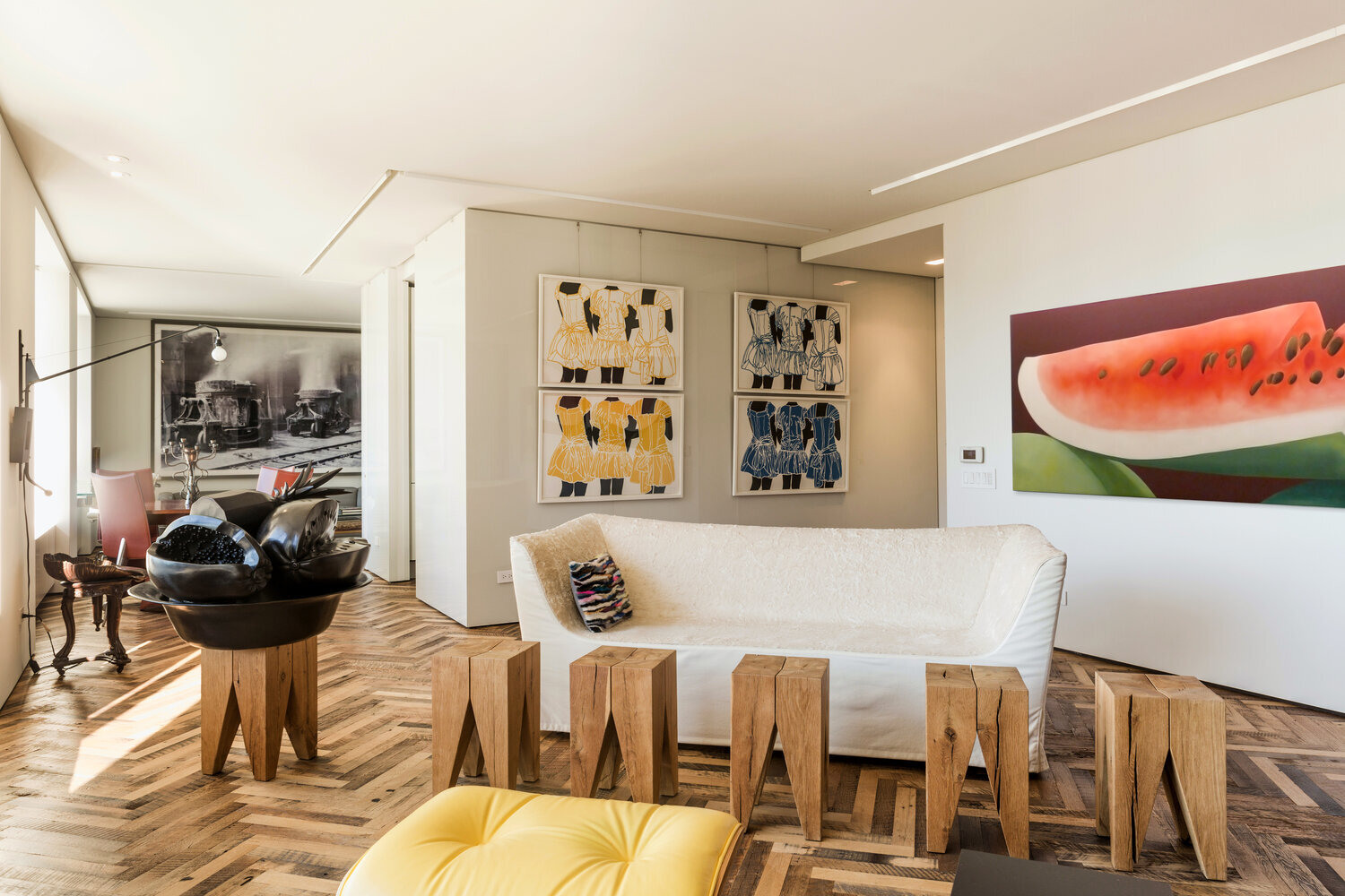
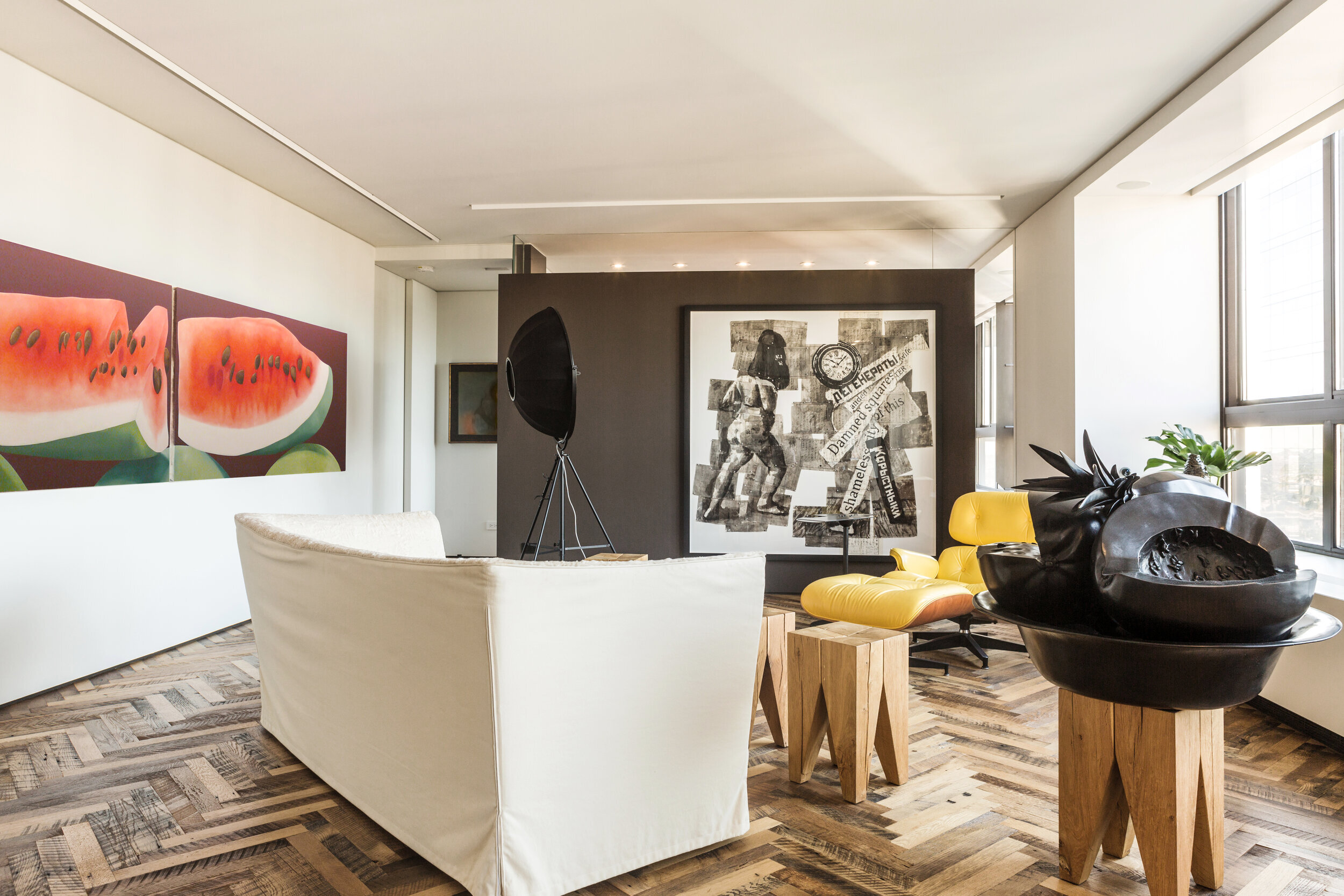
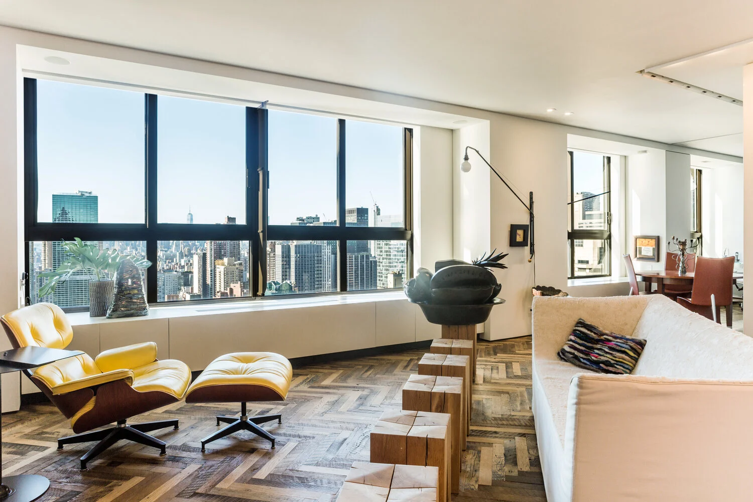
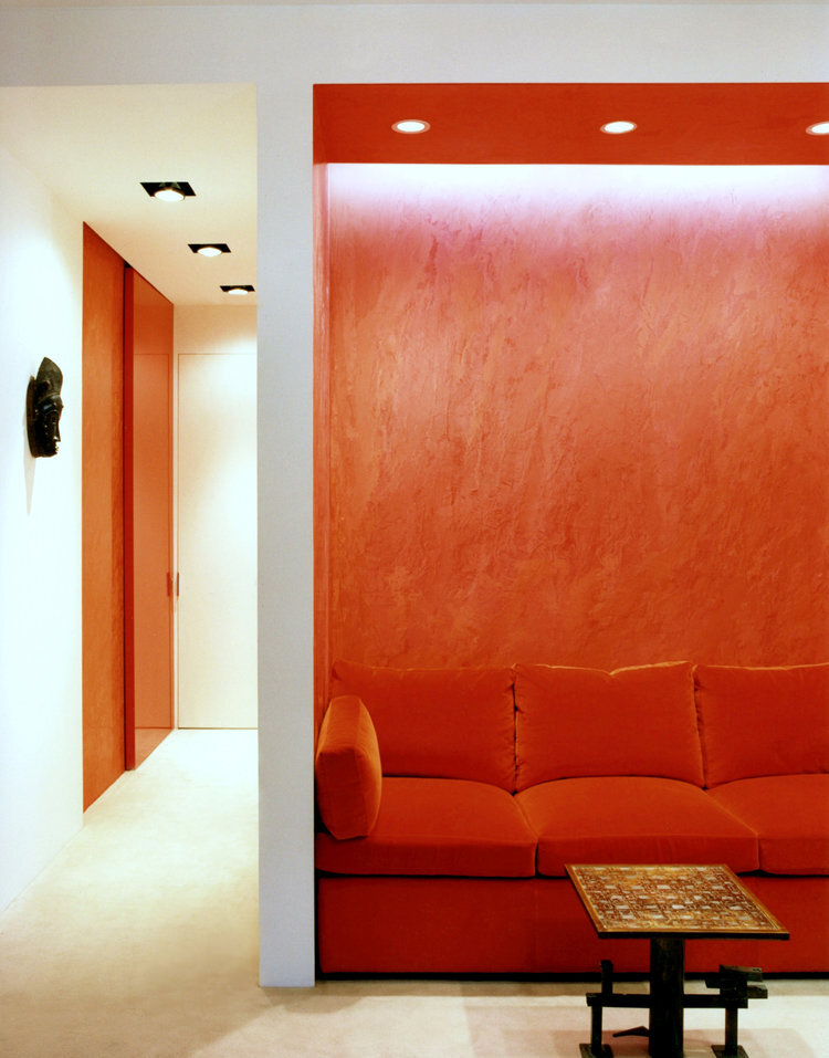
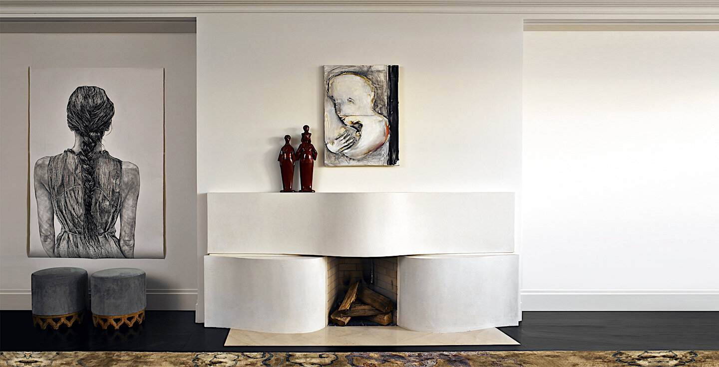
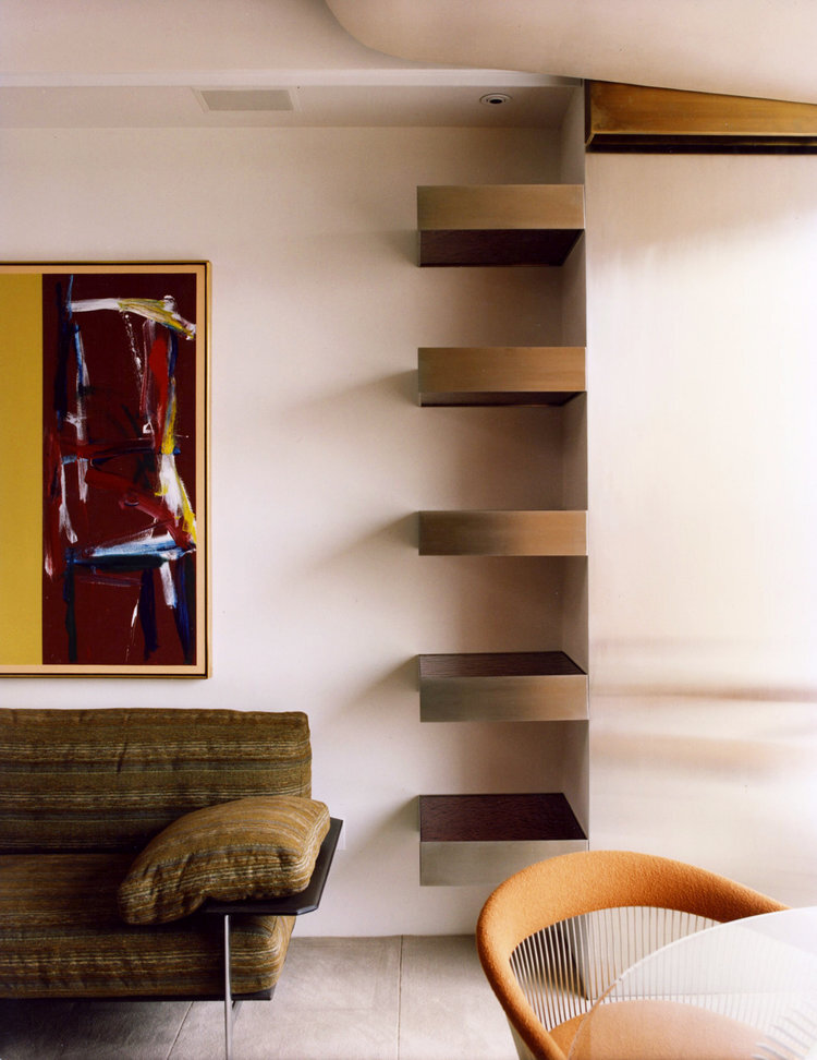
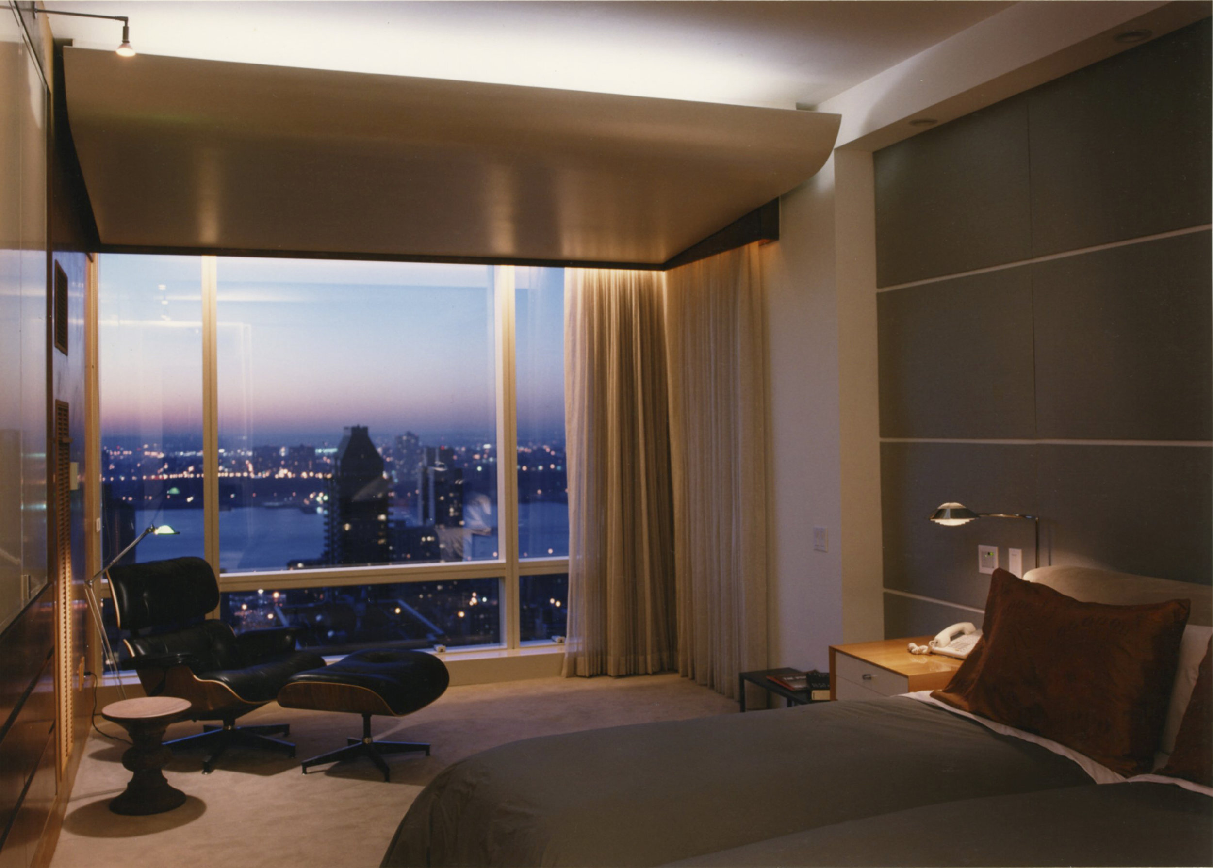
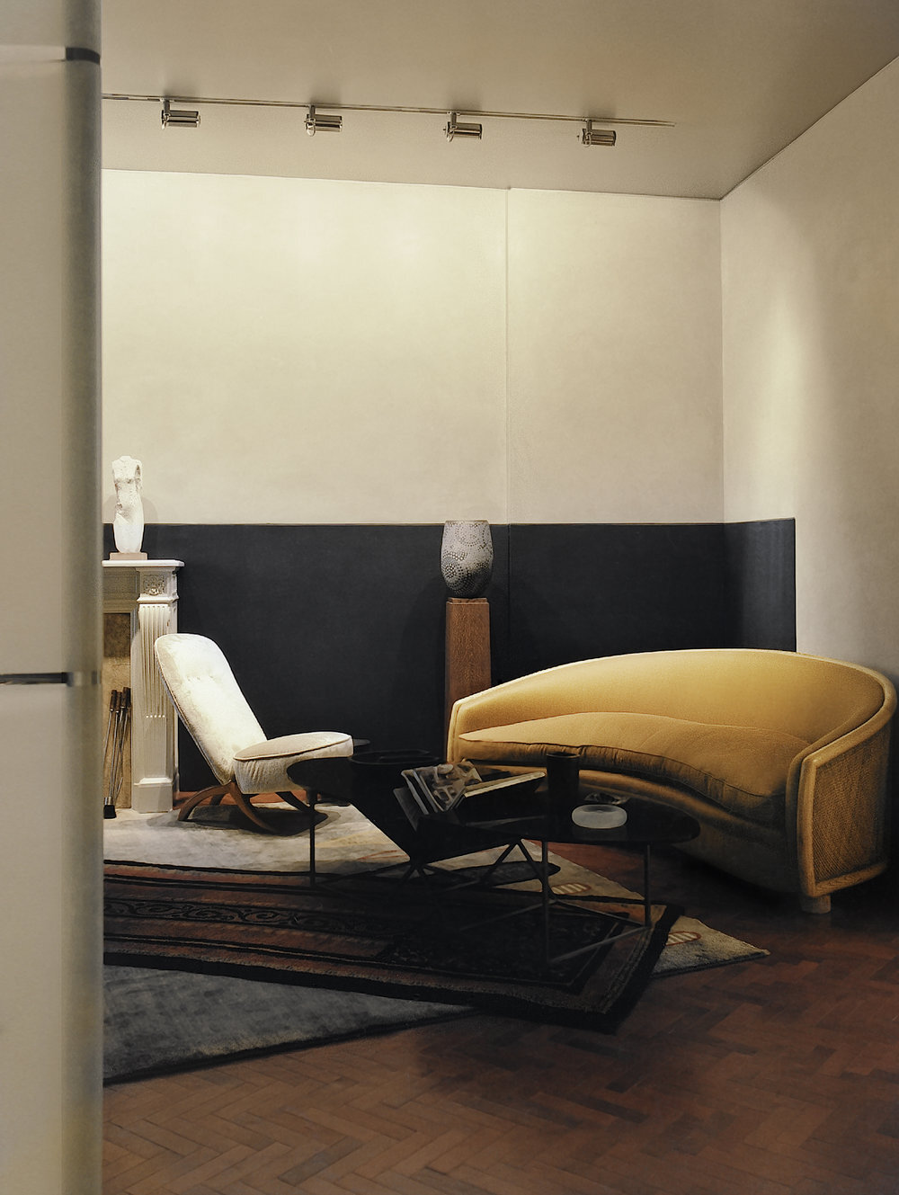
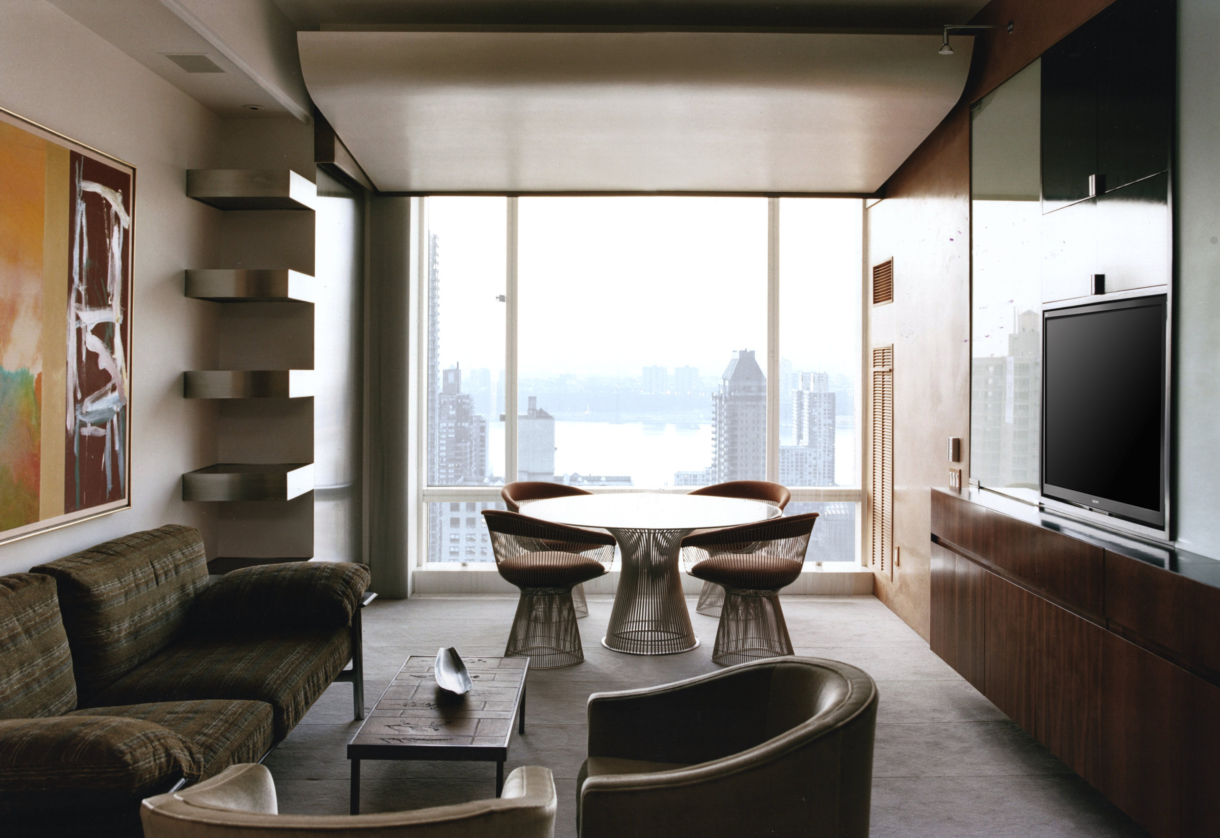
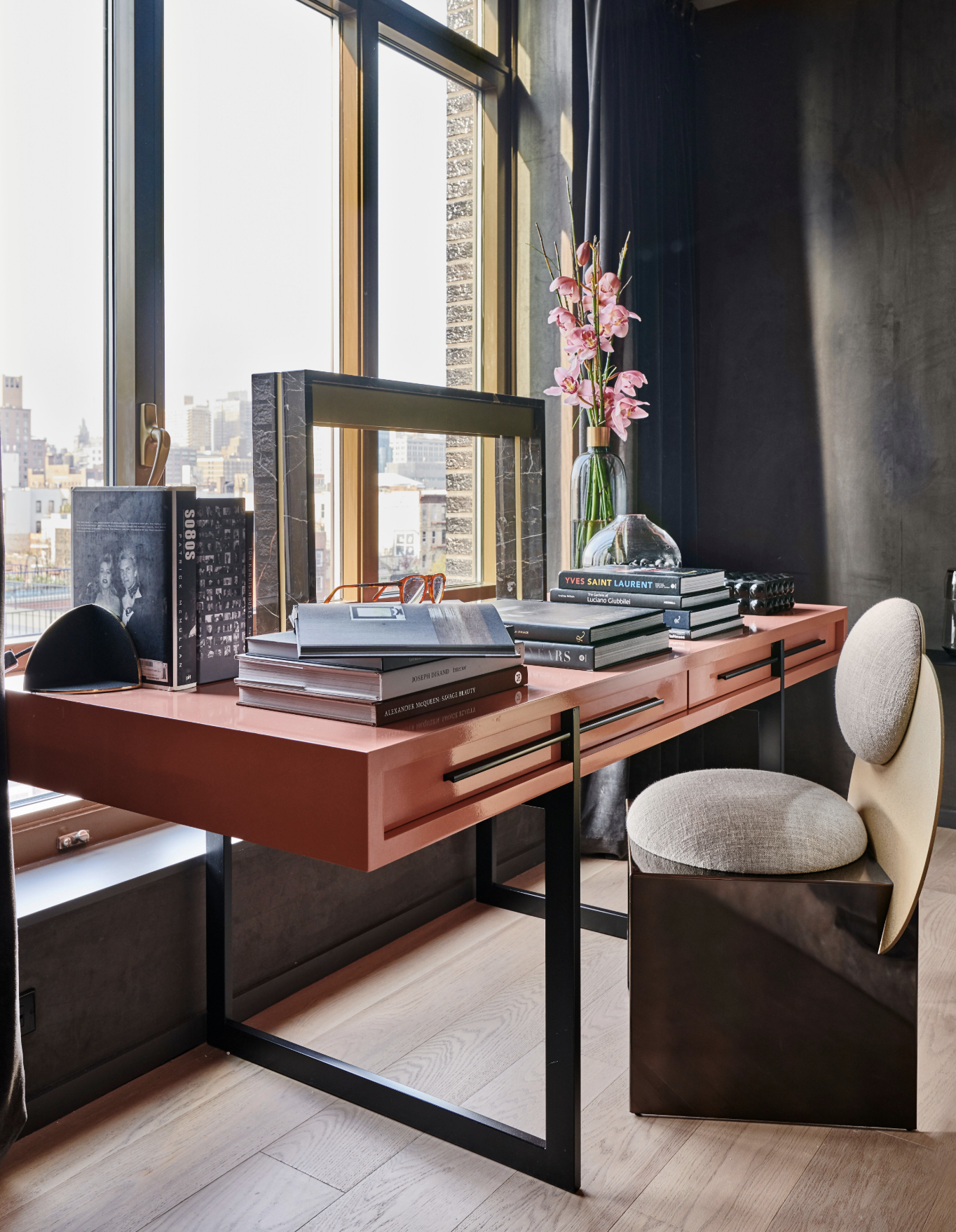
Given Lewis’ training and expertise, the forms of the spaces are very clearly integrated into his interior designs: walls that don’t quite meet, a ceiling that appears to unfold to reveal a skyline view. It is clear that he does not just consider the space inside the drywall as his territory, but considering why that exact drywall is there and why can’t it be another material. The containers themselves are so well considered and it shows the benefit of architectural knowledge in interior decorating. This integration of form and contents sets Lewis aside from other designers. Any interior designer, no matter how hands on or off they may be in dictating the architecture of a home, will have a say in what the structure itself looks like. But with Lewis, it is one and the same. The decoration exists in complete harmony with the building.

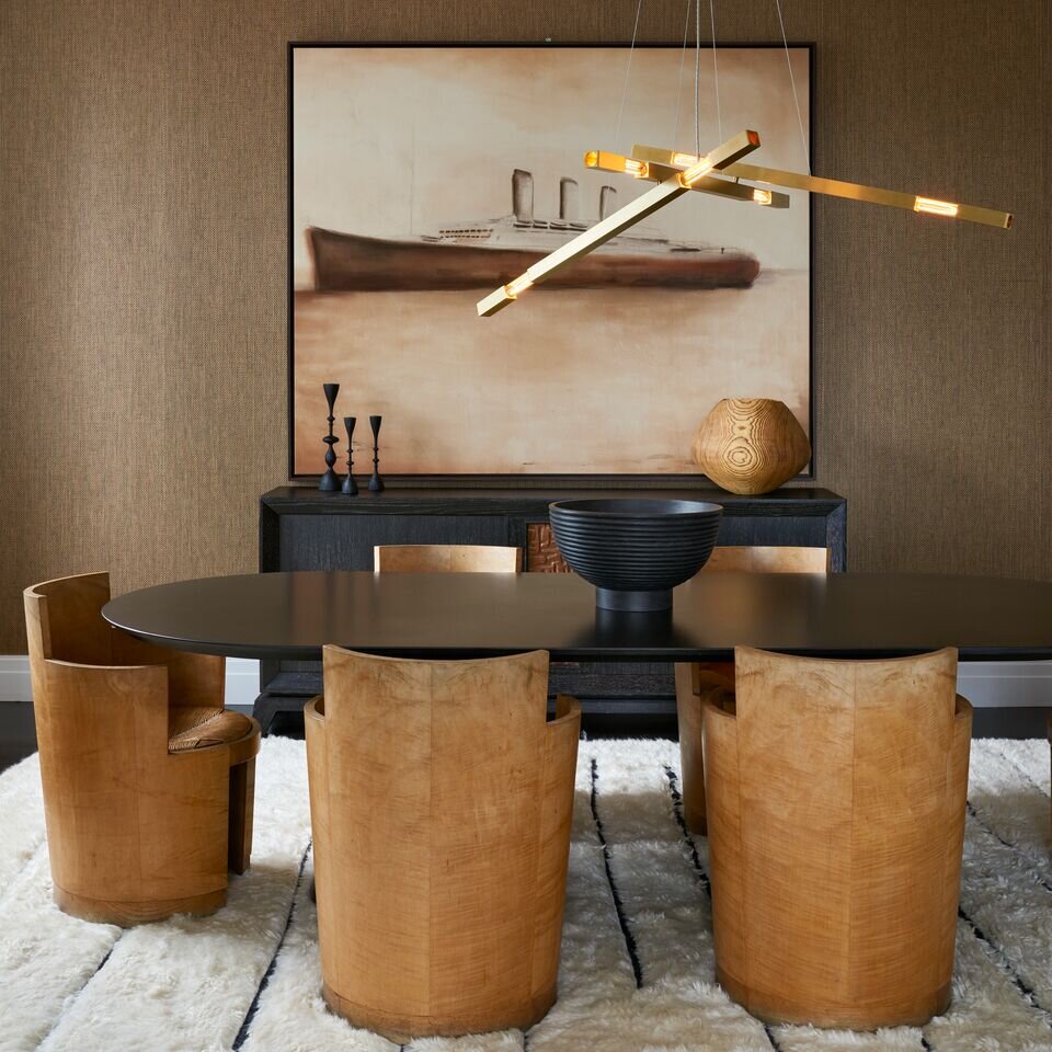
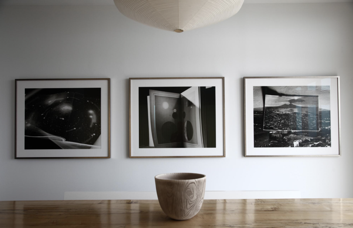
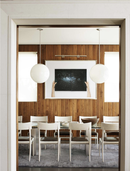
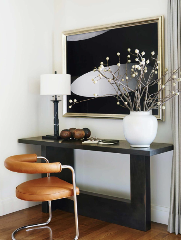
As a working artist with knowledge of the art world, art too plays a large role in his designs. Each space he works on is greatly abetted by his art selections. Art is not just used as decor, but as important elements in creating a cohesive space, just as a sofa or flooring selection. It breathes life into rooms, and provides a foil to Lewis’ sleek, modern architecture. It is clear when viewing Lewis’ work, he is unafraid of bold art. He chooses not just simple paintings, but confrontational and dazzling works. These are not pieces to pull together a color scheme or add visual interest to blank walls, but art to be looked at in its own right. Lewis’ spaces are both living places as well as galleries.

Lewis’s Studio works in both residential and commercial design globally. He is located in Brooklyn, where he has been based for the last thirty years. For more information, visit his website or Instagram for photos and updates on his current projects.

OUR YEAR IN REVIEW

Happy New Year from Matthew Rachman Gallery!

This year we continued to bring in newly restored modern furniture and breathtaking works by our artists. Although we were unable to present any curated shows, we are grateful to continue to bring forward new and exciting work. In the early few months of the year, we featured work that had not been seen before, such as Ted Stanuga’s “Humbold” which drew sidewalk onlookers with its grand scale, or a triptych of Slater Sousley’s quietly vibrating plein air paintings.
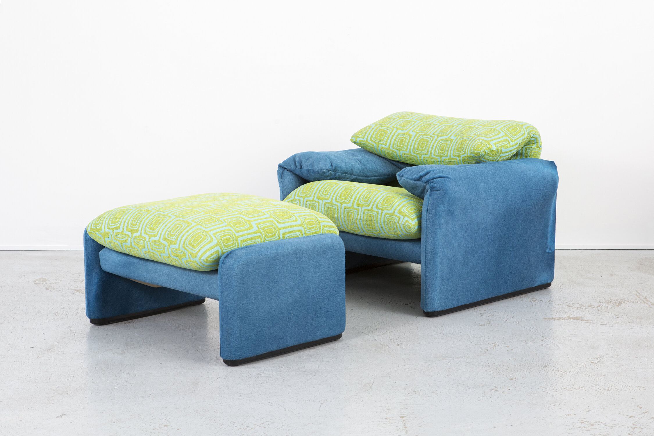
This year we have also begun creating our own bespoke furniture. Our first piece is the MR Sofa, featuring bold, curving lines and beautiful blue mohair.
We continue to be available via appointment to anyone interested in seeing work in person and look forward to all the great work that will come in 2021. Thank you to all for your continued to support.

DESIGNERS TO KNOW: TIMOTHY GODBOLD

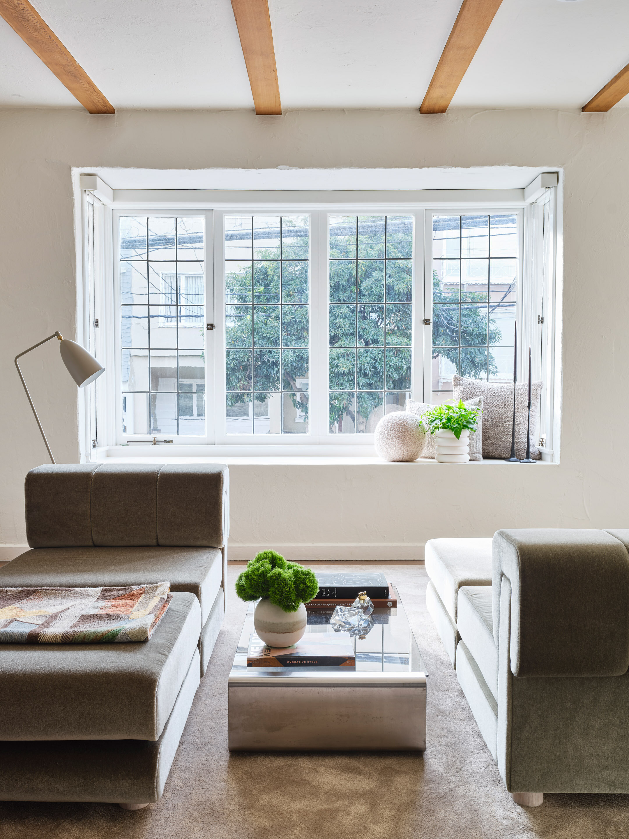
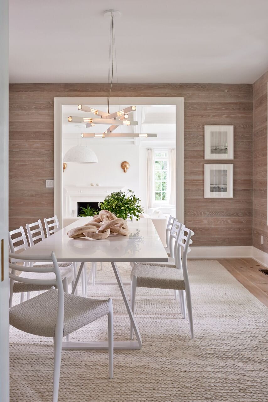
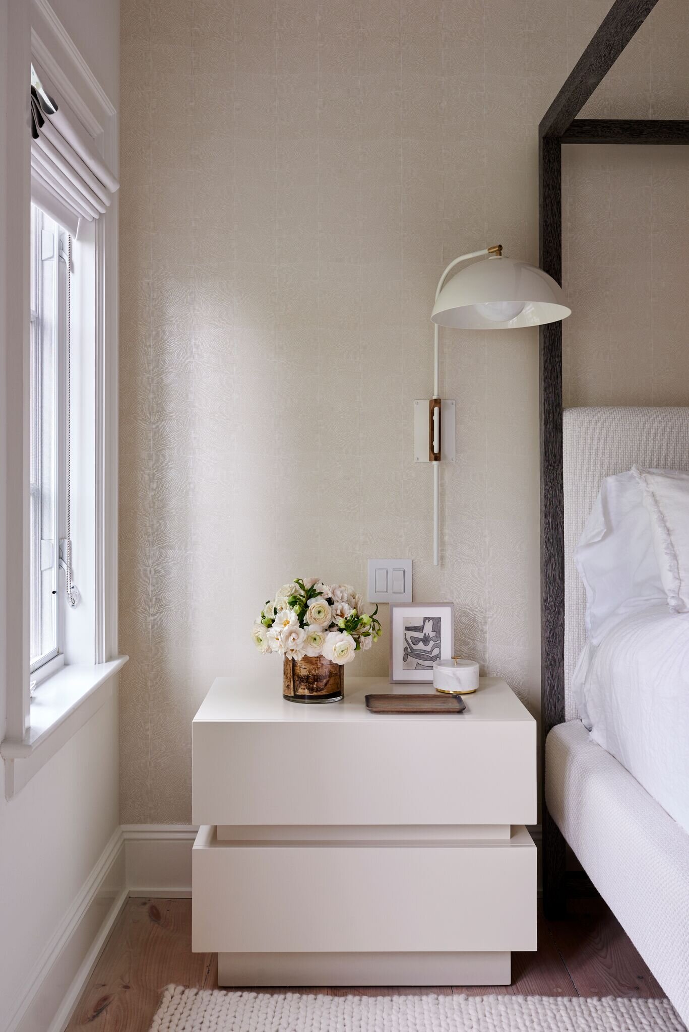
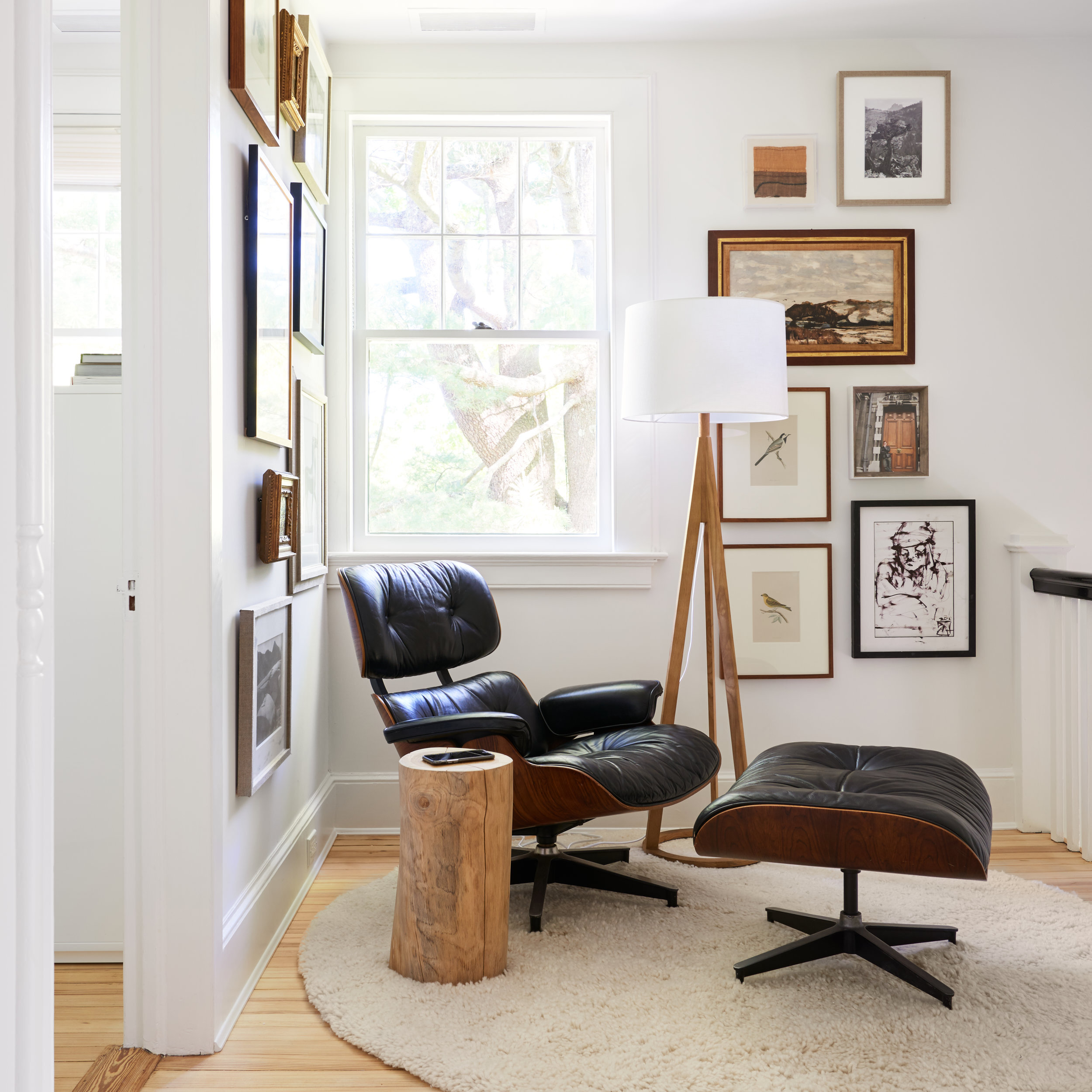
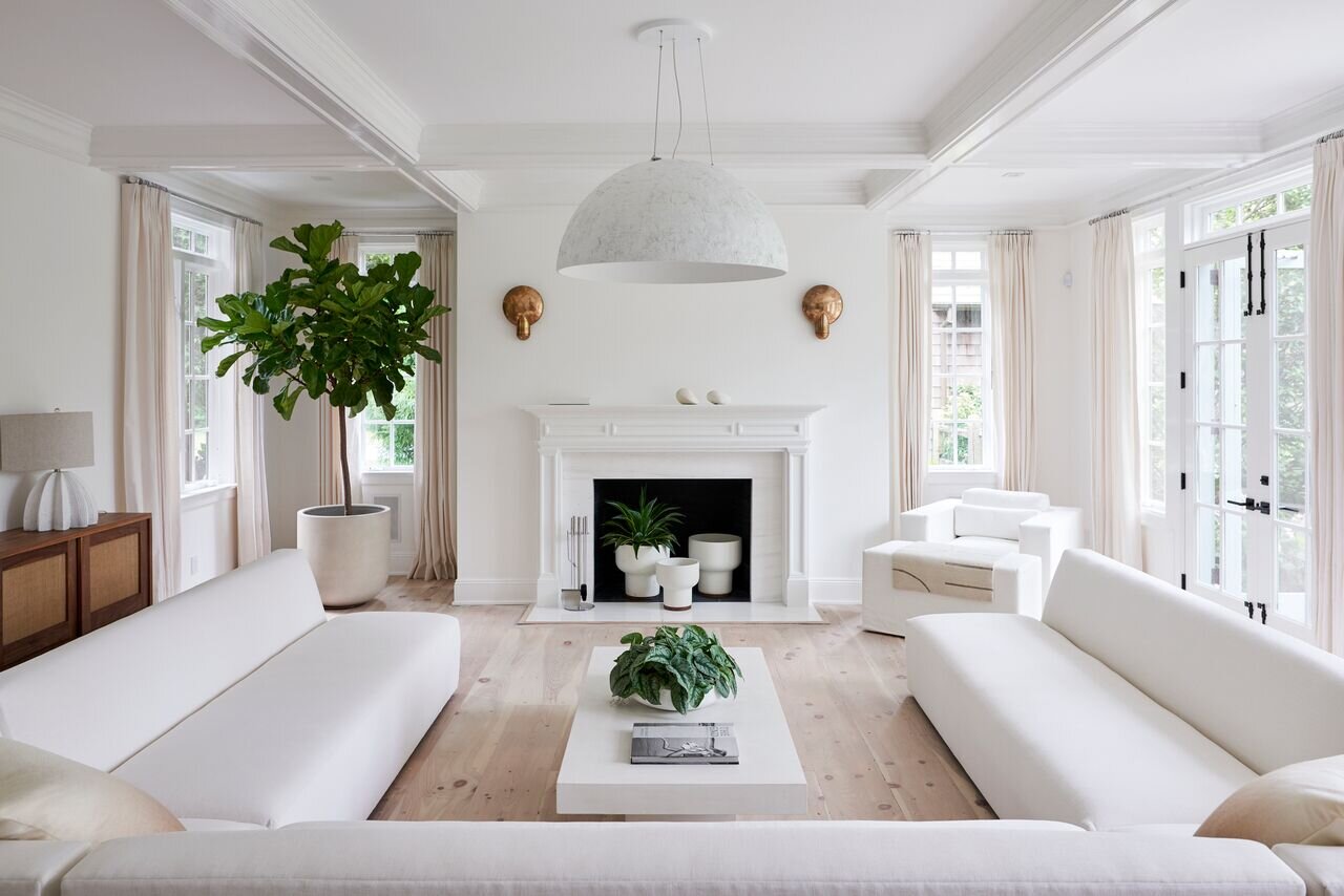
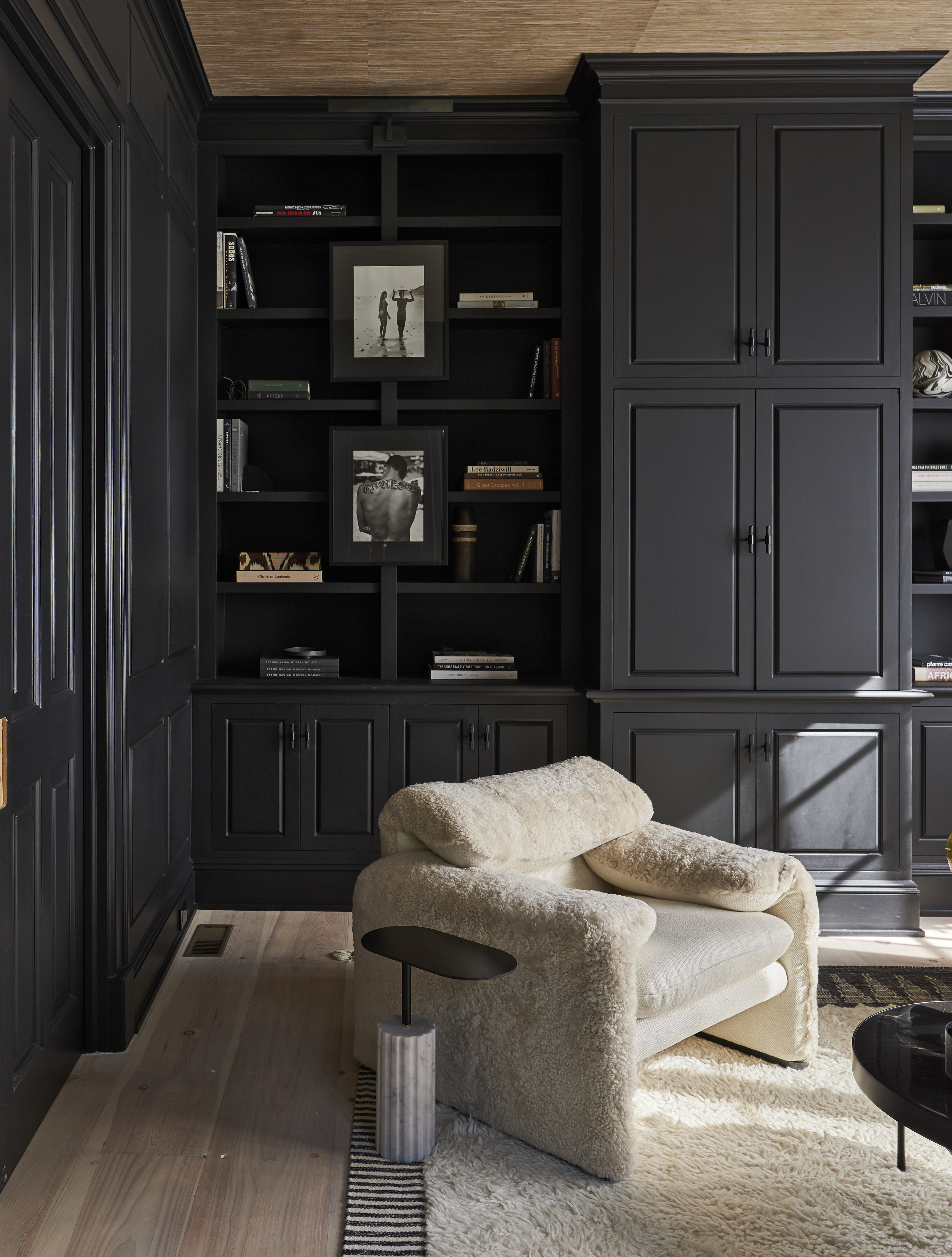
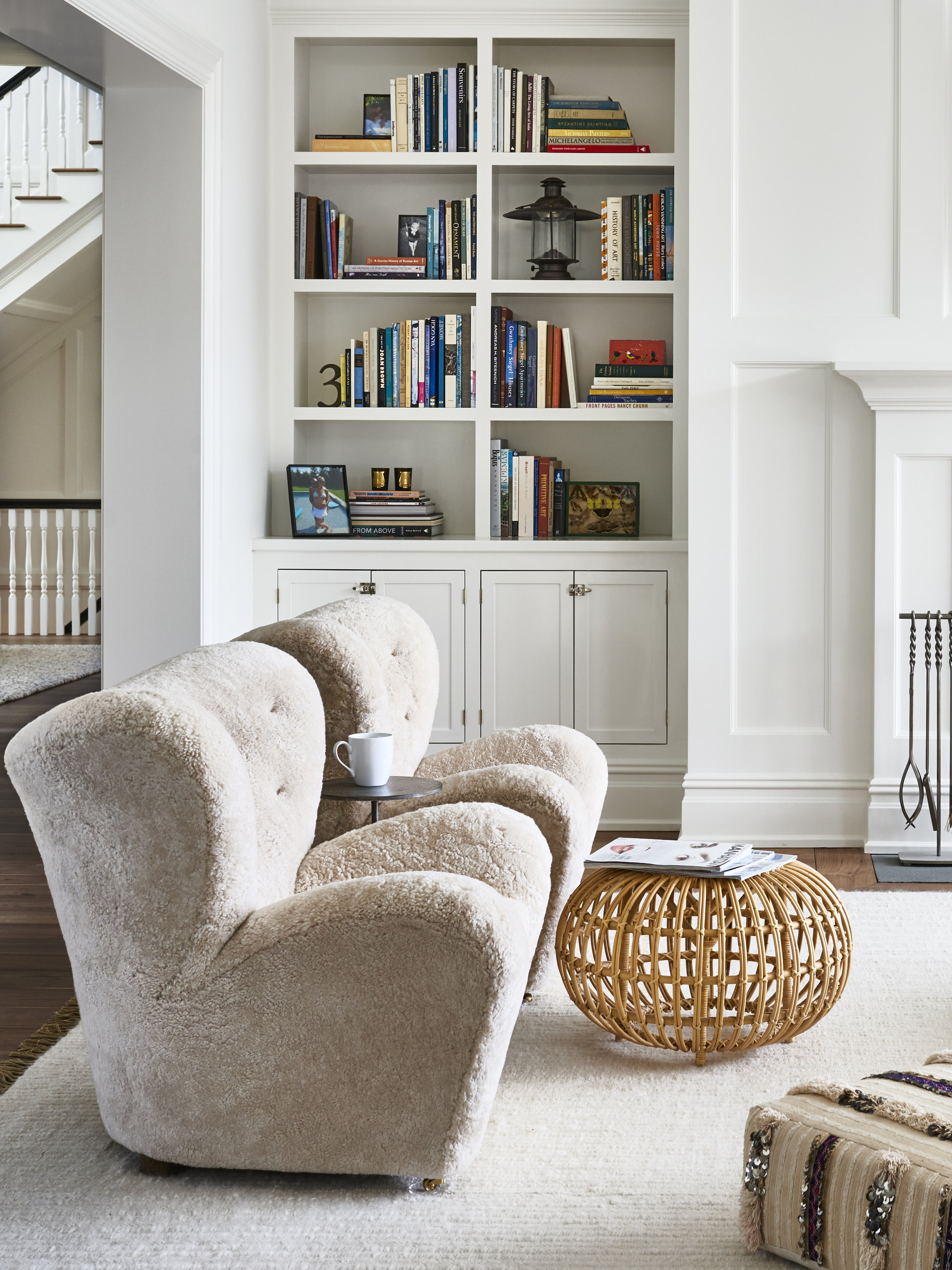
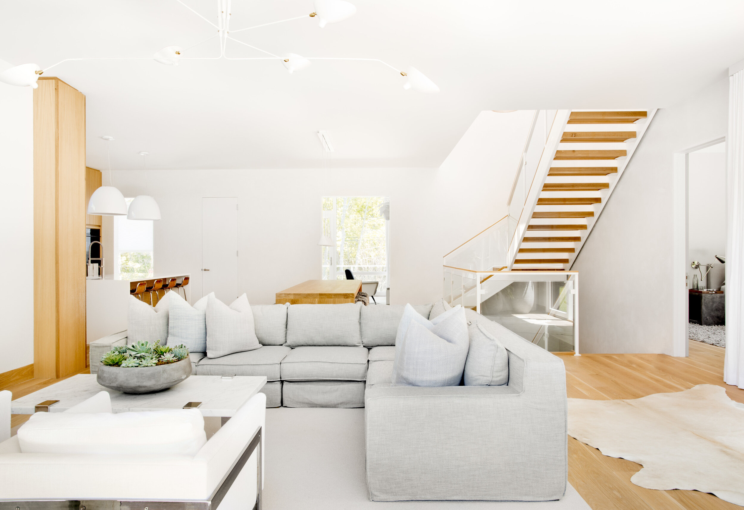
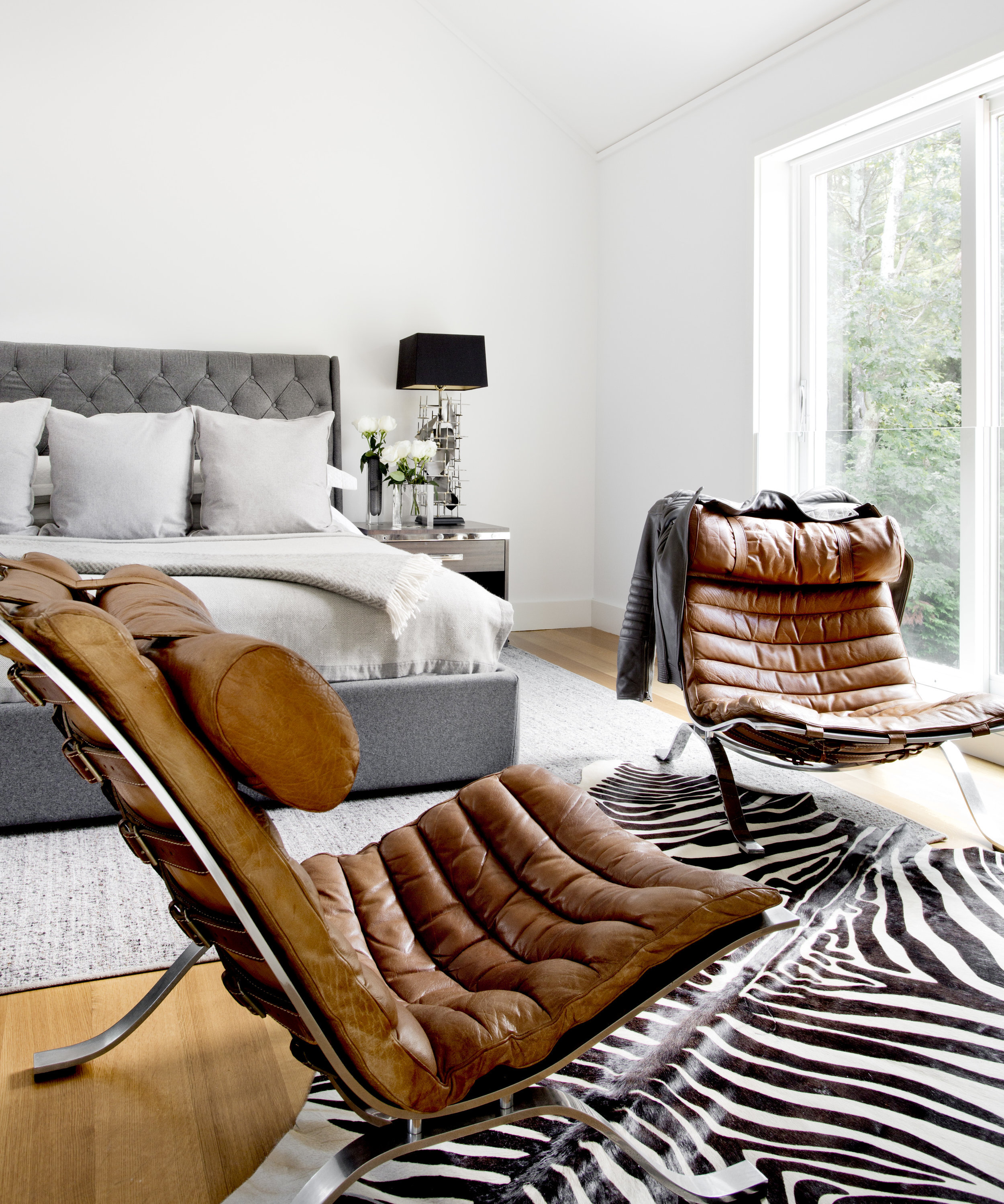
Timothy Godbold, fashion designer turned interior designer, creates refreshing, refined, spaces. Godbold began his career working with Ralph Lauren and had his own label and he has recently published a book on military style. His cream colored, masculine spaces are absolutely inviting and comfortable. Sticking to a strict scheme of mixed neutrals, the visual interest comes through finishes and textures: white walls and rugs, shearling, warm woods, saddle leather, natural linens. This tight scheme keeps the spaces subdued and relaxing but highly sophisticated, and allows him to adventure with sculptural pieces and forms.

Godbold’s spaces have enough pieces to feel filled and finished, but no more. This restraint in space planning and decoration mirrors the restrained palette, creating rooms that do not overwhelm. The often masculine, modern pieces are juxtaposed against the softness of the upholstery and color scheme for serene balance.

GET THE LOOK

FEATURED IN NOVEMBER

This month, we have an exciting collection of contemporary art and mid century modern furniture to feature. The gallery is open by appointment only— if there are any pieces available you would like to see in person, please contact info@matthewrachman.com or call 773.245.3182 and we would be happy to set up a time.

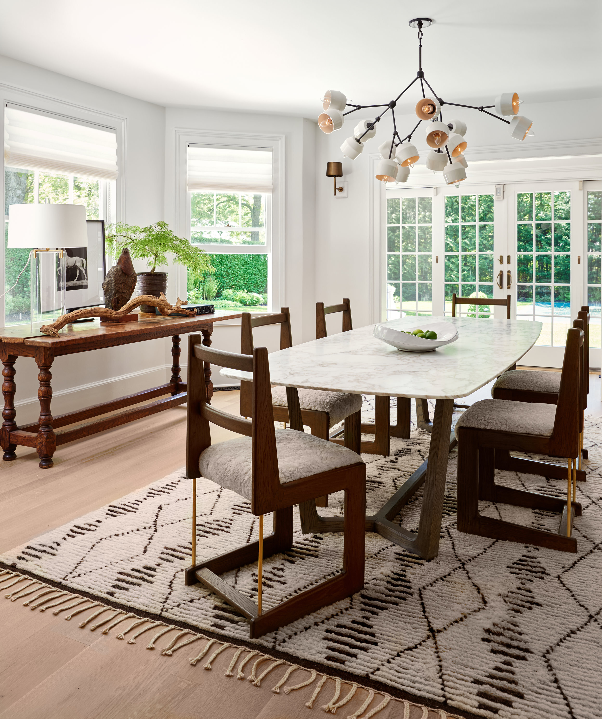
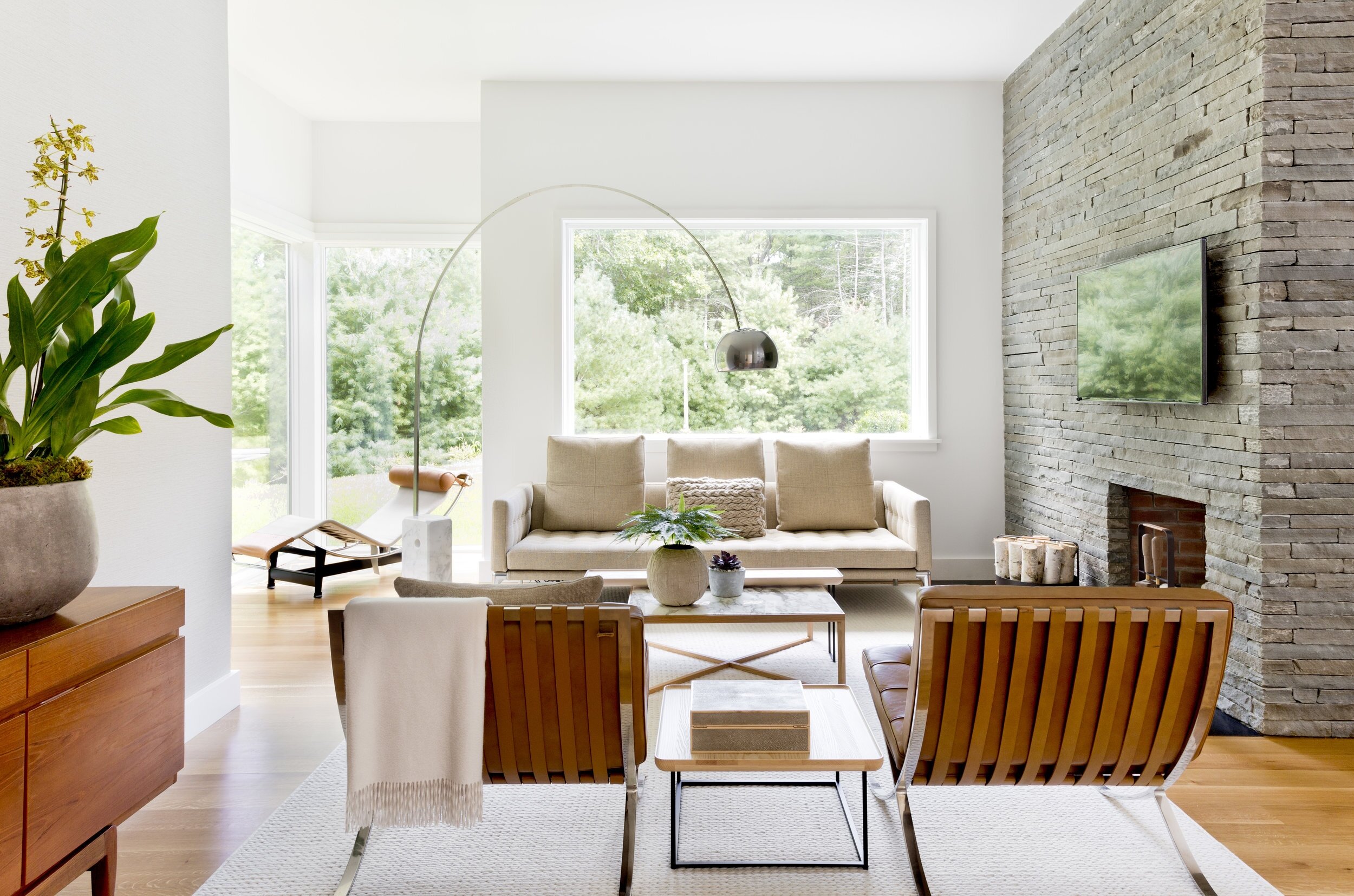
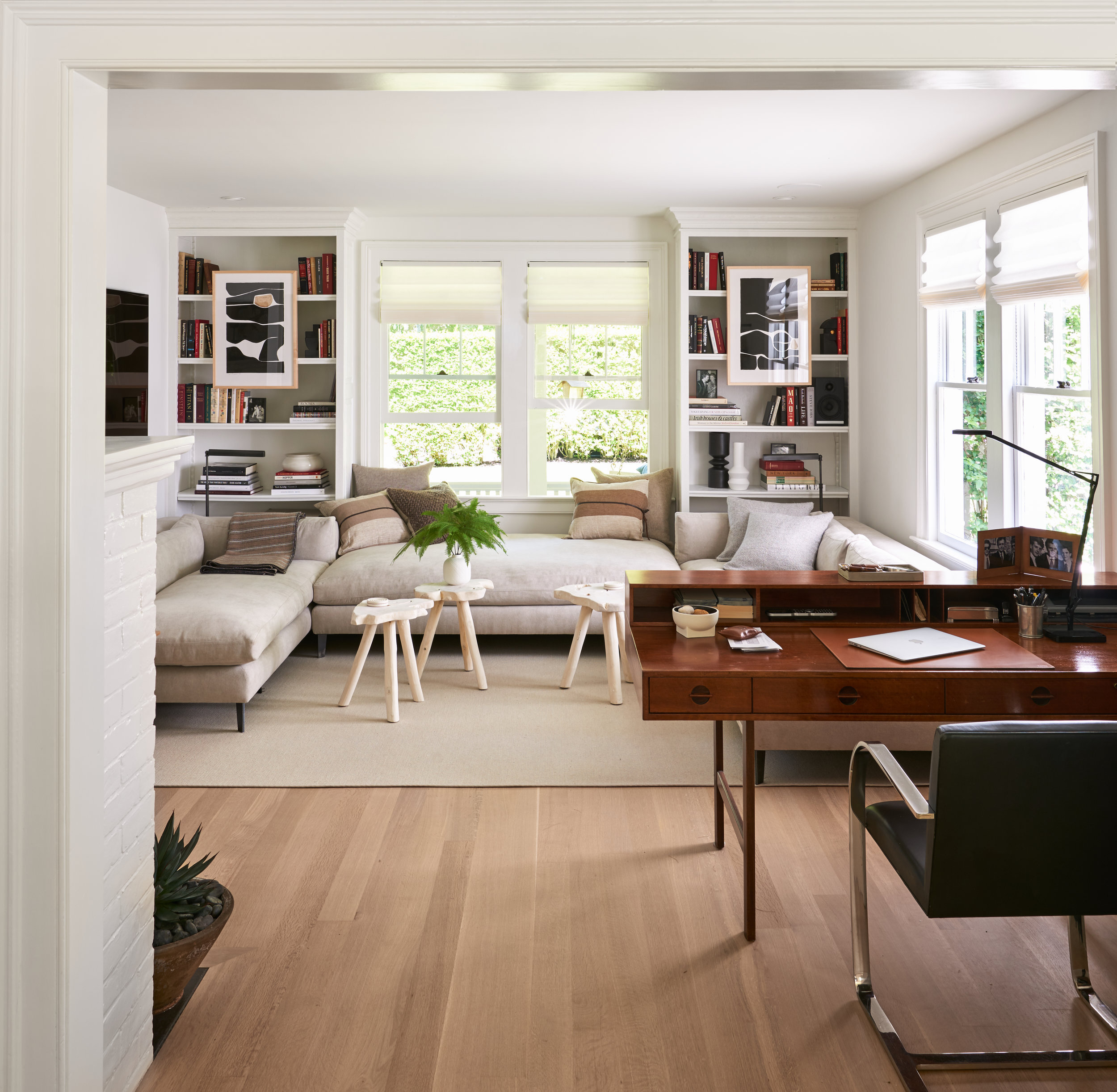
This month we would also like to feature the work of Dan Fink Studio, a New York based interior design firm. Fink’s designs are warm and eclectic, incorporating elements of traditional, contemporary, and mid century design. His pallets are muted to elevate the beautiful textures: mohair, wood, marble, lacquer, mirror. His space planning is inventive, putting furniture in unexpected but beautiful and functional places.

Charlotte Perriand designed the Les Arcs ski resort in Savoie, France in the 1960s. Employing her signature modern style, Perriand designed every piece of the buildings to be built quickly and efficiently given the resorts location and limited seasonal building time. This sconce is a prototype for the metal wall sconces created for the bedrooms. Sleek and simple, Perriand creates a visually interesting and functional wall fixture with simple materials. The bulb sits directly behind the metal sheet, providing a defused wash of light on the walls.

This set of chairs was designed by Frank Gehry, an American architect born in Canada who has designed some of the world’s most famous buildings. These chairs are made of long strips of maple, bent and formed into tall, sleek chairs. The design is unique by bending a strong sturdy material, using wood to form a basket weave on the seat of the chair.

Slater Sousley’s plein air paintings capture the serenity of nature. In “The Woods Beckon” we see his expert shine through— painterly strokes that blur lines, soften contours, and emphasize the subtle movement of the woods. He works quickly to capture the exact light, seen in his deft use of highlight.

Gustav Axel Berg was a Swedish furniture designer working in the middle of the 20th century. He operates in standard mid-century materials: simple, textural upholstery and bent light woods. Berg’s furniture is especially curved, utilizing exact contours and innovative silhouettes. These chairs, made of patent leather and birch, are the epitome of Berg’s work. The woven patent leather is unexpected but beautiful, and the detailed curves add interest to these simple chairs.