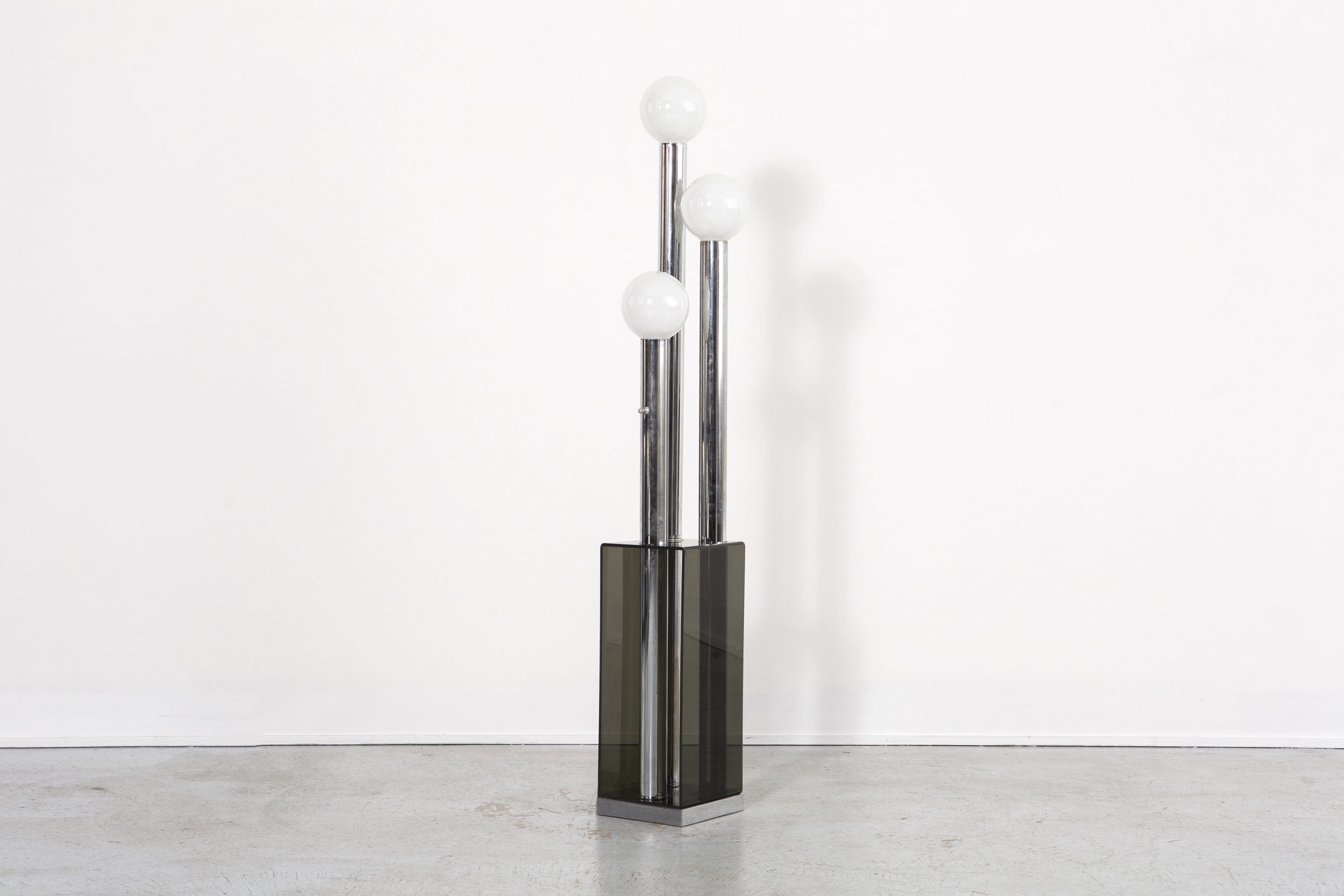
FEATURED IN NOVEMBER

This month, we have an exciting collection of contemporary art and mid century modern furniture to feature. The gallery is open by appointment only— if there are any pieces available you would like to see in person, please contact info@matthewrachman.com or call 773.245.3182 and we would be happy to set up a time.

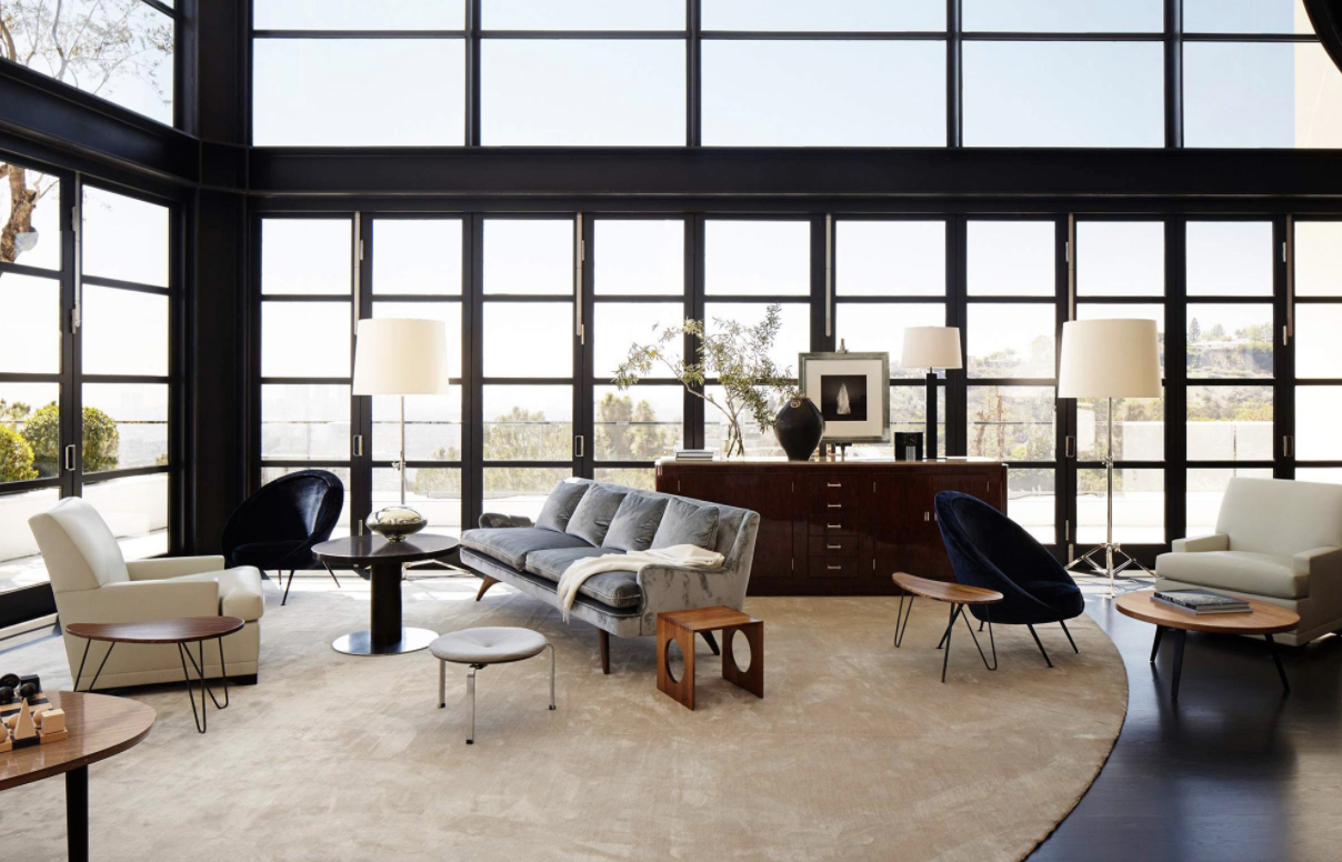
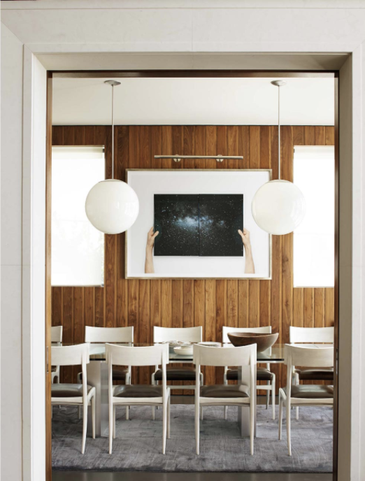
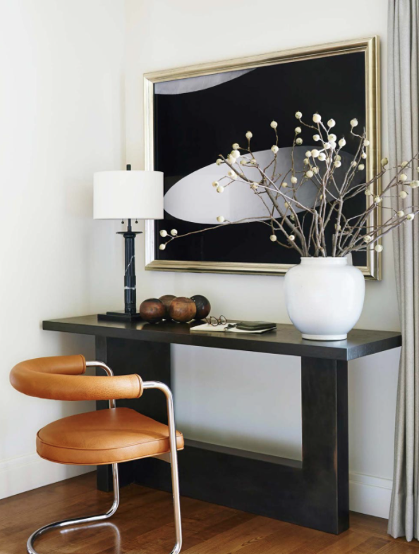
This month we would also like to feature the work of Dan Fink Studio, a New York based interior design firm. Fink’s designs are warm and eclectic, incorporating elements of traditional, contemporary, and mid century design. His pallets are muted to elevate the beautiful textures: mohair, wood, marble, lacquer, mirror. His space planning is inventive, putting furniture in unexpected but beautiful and functional places.

Charlotte Perriand designed the Les Arcs ski resort in Savoie, France in the 1960s. Employing her signature modern style, Perriand designed every piece of the buildings to be built quickly and efficiently given the resorts location and limited seasonal building time. This sconce is a prototype for the metal wall sconces created for the bedrooms. Sleek and simple, Perriand creates a visually interesting and functional wall fixture with simple materials. The bulb sits directly behind the metal sheet, providing a defused wash of light on the walls.

This set of chairs was designed by Frank Gehry, an American architect born in Canada who has designed some of the world’s most famous buildings. These chairs are made of long strips of maple, bent and formed into tall, sleek chairs. The design is unique by bending a strong sturdy material, using wood to form a basket weave on the seat of the chair.

Slater Sousley’s plein air paintings capture the serenity of nature. In “The Woods Beckon” we see his expert shine through— painterly strokes that blur lines, soften contours, and emphasize the subtle movement of the woods. He works quickly to capture the exact light, seen in his deft use of highlight.

Gustav Axel Berg was a Swedish furniture designer working in the middle of the 20th century. He operates in standard mid-century materials: simple, textural upholstery and bent light woods. Berg’s furniture is especially curved, utilizing exact contours and innovative silhouettes. These chairs, made of patent leather and birch, are the epitome of Berg’s work. The woven patent leather is unexpected but beautiful, and the detailed curves add interest to these simple chairs.

MILO BAUGHMAN

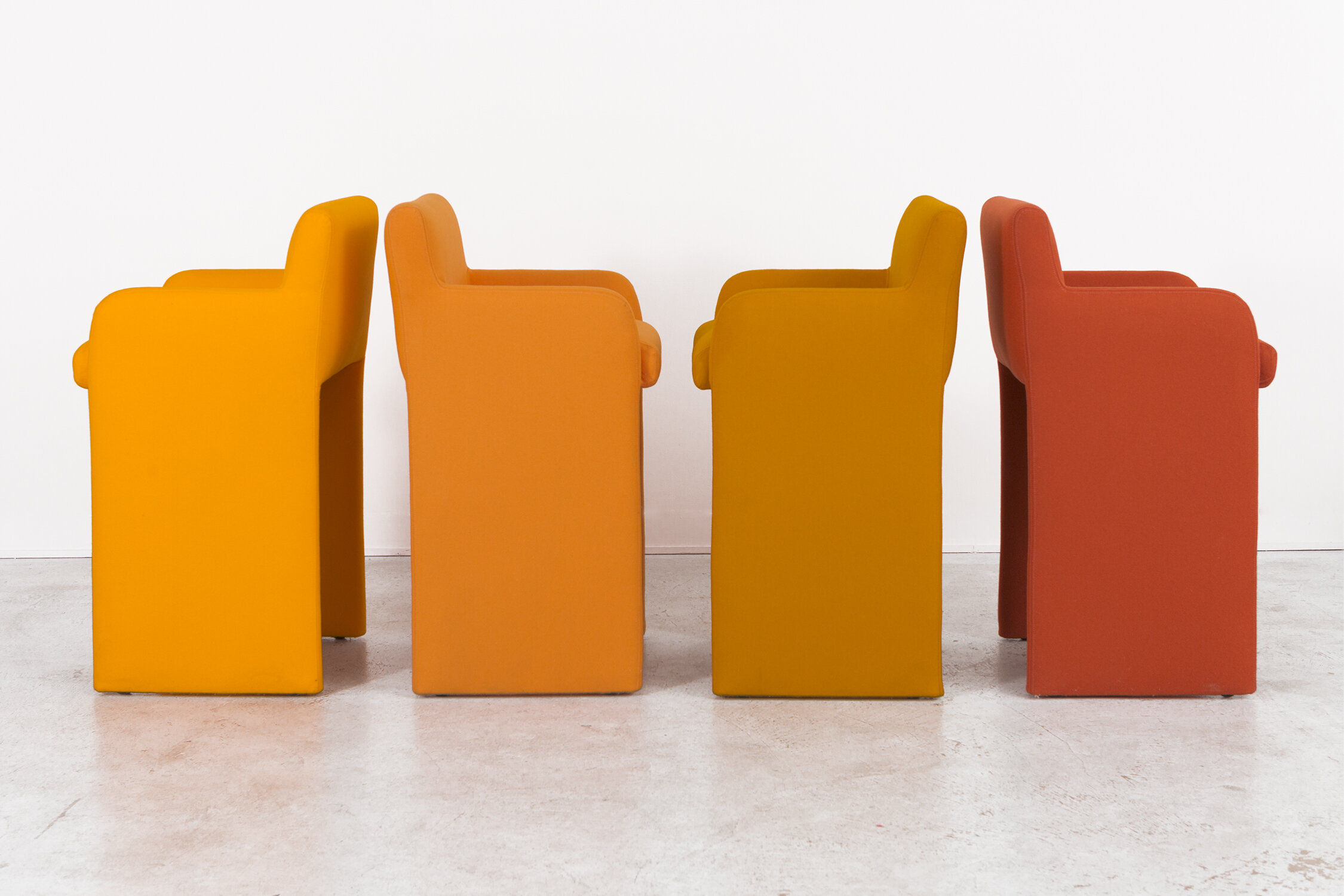
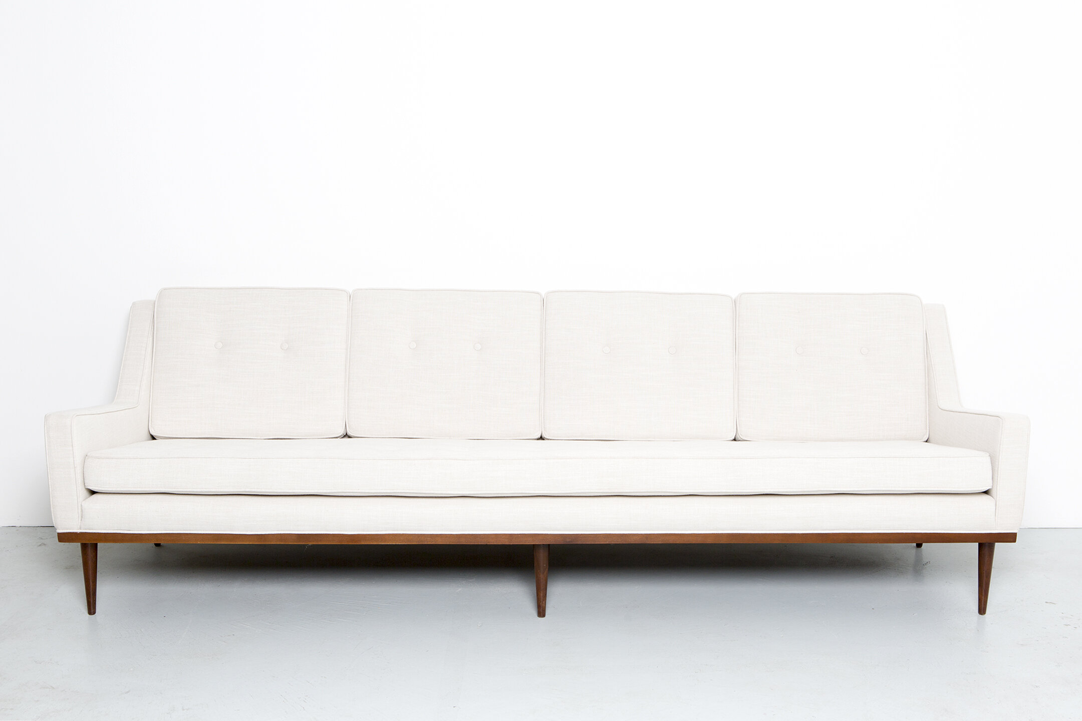
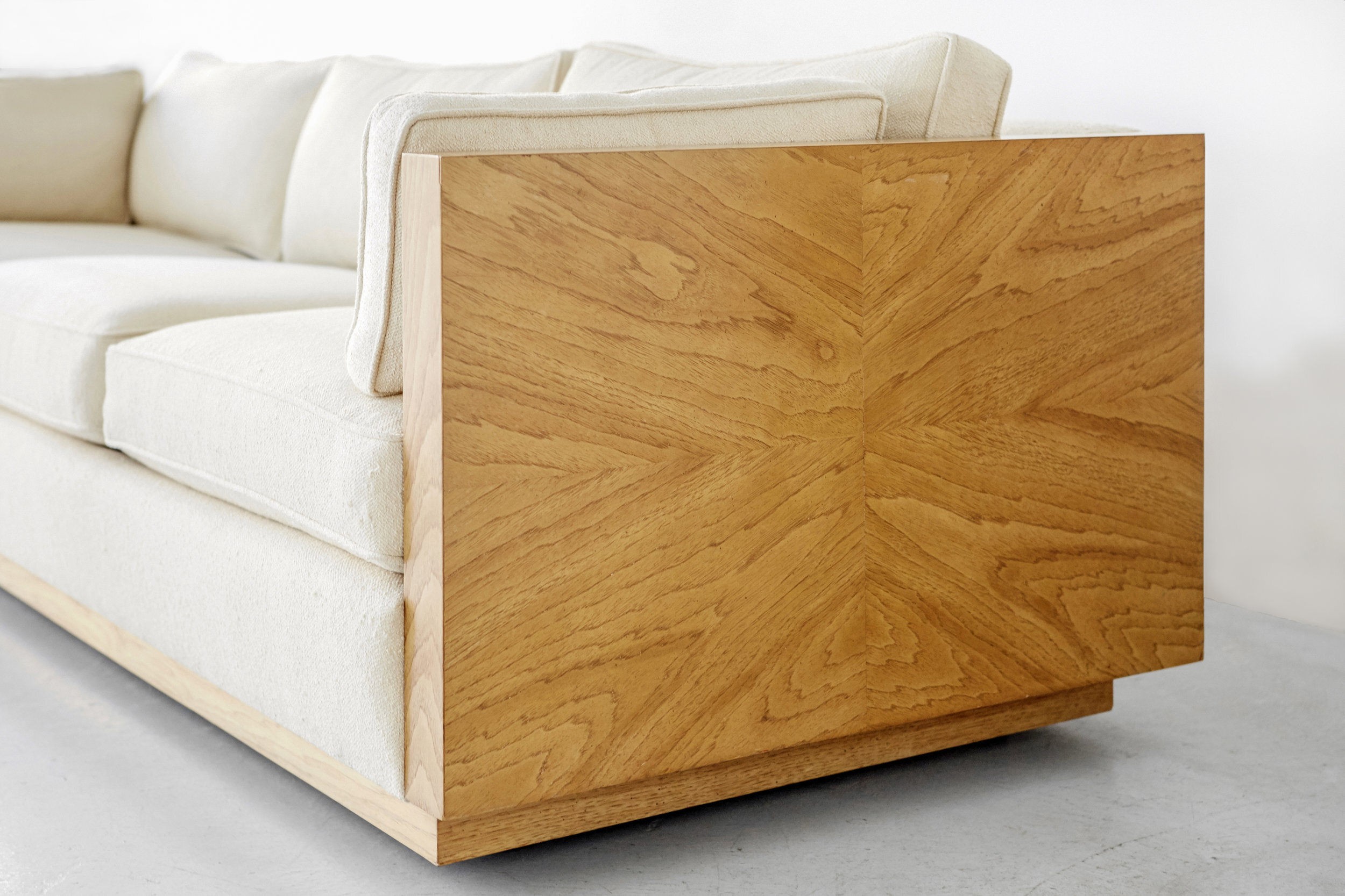
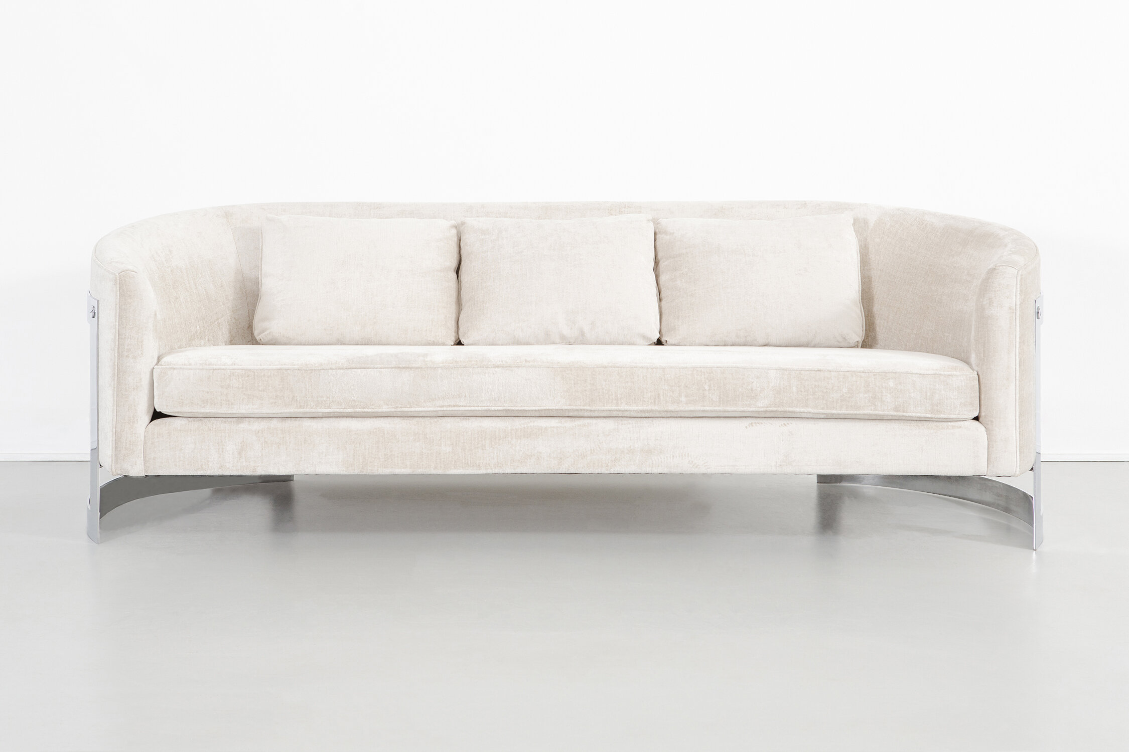
Milo Baughman was an American modern furniture designer. His career began during his service in World War II, designing officer’s clubs. After returning from war, he went on to study at the Art Center School of Los Angeles and Chouinard Art Institute. He then established his own design practice while also designing for other manufacturers, such as Glenn of California, Pacific Iron, Drexel, and most notably with Thayer Coggin. This collaboration lasted for 50 years and include some of Baughman’s most well known designs.

Baughman’s designs are without frills: the interest and excitement is baked into the forms and materials he employs. Using rich wood, upholstery, lucite, and chrome, his pieces are practical enough to fit into any home but almost sculptural enough to be works of art. The lines are intentional and bold with sleek curves or perfect right angles. In avoiding extra details, every element of his designs are carefully chosen and elegantly considered. Even his most adventurous pieces are appropriate in scale and usability. For example, the rosewood coffee table top appears to hover with its lucite legs, or the rosewood credenza looks as if three wooden cubes are suspended in air with the chrome body. Baughman’s furniture pieces have remained timeless due to the use of classic materials and simple design.

FEATURED IN SEPTEMBER

We are happy to feature a combination of new pieces and favorites for the month of September. As always, the gallery is open by apointment. Please reach out and we would be happy to set up a time to show any of our pieces.

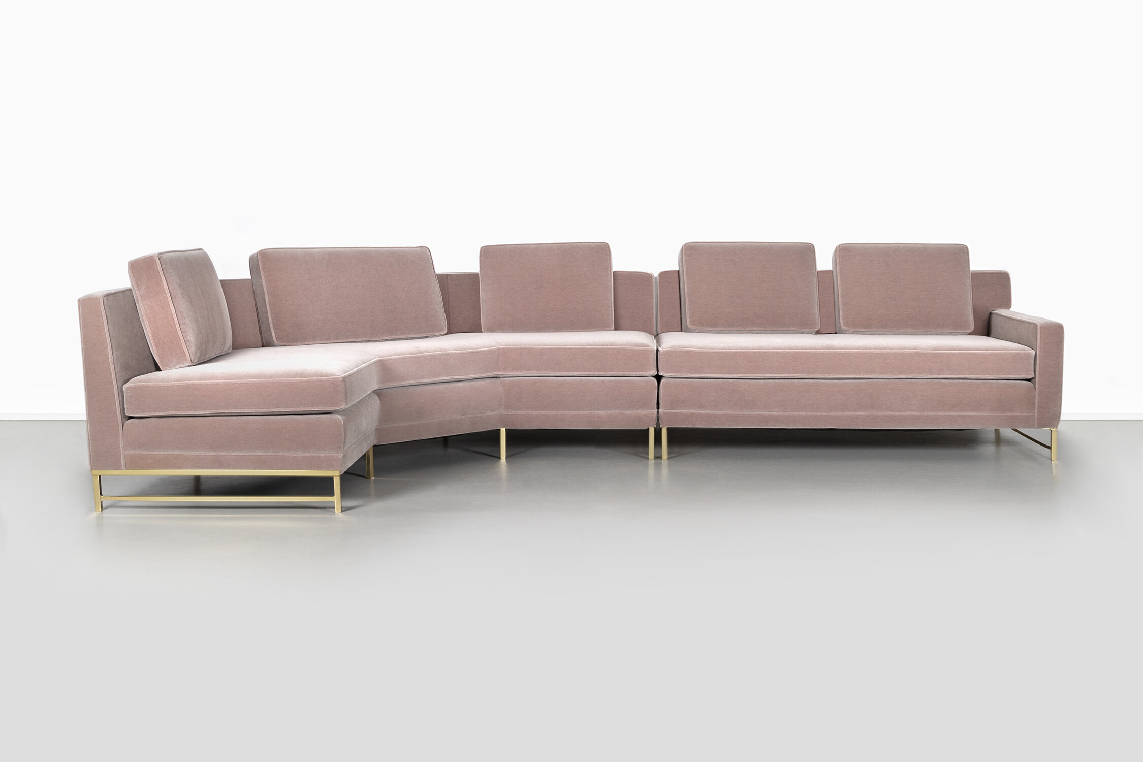
This two-piece sectional was designed by Paul McCobb, prominent mid-century designer whose signature is clean lines and intentional details. Designed in the 1950s, this piece was one of McCobb’s many he designed for manufacturer Directional, a longstanding collaboration. It has been restored with brass bases and mohair upholstery.

Natasha Kohli is a Chicago based artist who creates graphic, bold pieces. Her “Would” series presents pathways with no clear solution, such as this winding golden maze in “4 Would.” With no solution or message, it becomes a mediation. The eye is given many paths to follow along simply for the purpose of following, not for completing the maze.

As reflected in the title of her pieces, Camilla Taylor creates works that reflect something we have seen before but can’t quite remember. “Familiar” in particular combines familiar forms and materials in ways that seem new or different. The form evokes some kind of pinchers but also appears to possibly be melting, all made of fabric and buttons. Taylor seeks to evoke memories and to unearth that which rests just below everyday interactions.

Seth Keller’s walnut bench combines the irregular and organic beauty of wood with clean, streamlined contours. By avoiding any great detail or adornment, the beauty of the wood is given the room to shine. The result is this simple and beautiful piece.

Blake Griffey
DESIGNERS TO KNOW: SUSANNE LOVELL

Susanne Lovell Inc., a Chicago based architecture and interior design firm, was founded by Lovell in 1985. Her designs have been praised by the most esteemed design publications and awards. With an in house art advisory team, each of her designs features museum quality pieces prominently. Her adept ability to select art creates even more dynamic spaces, not just placing decorations but elevating her spaces through beautiful, engaging art at the highest standards. Each element of her designs is considered, her spaces themselves becoming a carefully composed art piece. Even in historical spaces, Lovell fully inhabits and transforms the entire room into her vision.

Ornamentation is found throughout Lovell’s spaces: the fine details are a great part of what makes the interiors so special. Minimal but not minimalist, they are given only exactly what they need to remain clean and light. The ornamentation remains primarily in the pieces themselves, rather than in extra decorative items. There is no need for overwhelming amounts of accessories when each piece is imbued with thoughtful and intricate design. From the welt on a pillow, the fabric of a drapery, the styling of a coffee table, the hardware on a door, there is no element of the designs that feels untouched.

GET THE LOOK

Blake Griffey
DESIGNERS TO KNOW: BRIGETTE ROMANEK

Romanek Design Studio, named for founder Brigette Romanek, is a full service design firm. Originally from Chicago, she moved west to LA to pursue her design career. Her business grew organically, beginning with friends calling on her to help with their homes, drawn to Romanek’s innate taste. As a self trained designer, she draws on instinct and a variety of inspirations and sources of learning. This has led to her to receive accolades such as Architectural Digest’s 2019 “AD 100” and the 2020 Elle Decor "A-List."

Romanek creates beautifully layered spaces. The longer you look, the more you see the elegant and rich details she has chosen: a perfectly streamlined light fixture, a quietly textured area rug, a paint color that is the perfect green. Each room looks absolutely inviting and absolutely comfortable however luxurious they may seem. These are art pieces made for living.

Romanek is a master of high low design, mixing inexpensive finds with rare treasures. The installation like arrangement of blue and white vessels on the image to right is made up of vases that cost between $5 and $20, according to the designer. It is not the price, but the intention that creates the quality. Together, these vases create a dazzling display on her living room coffee table.

romanekdesign_work_laurel_canyon_3.jpg

Romanek’s designs are a true blend of disparites: new and old, hard and soft, witty and serious. She is deliberate about her integration of pieces from the past with newer pieces, avoiding major trends: trendy work sours quickly. While she is not afraid of contrast, almost all her spaces are made up of light surfaces: oak floors and cabinetry, carrara countertops, white ceramic tiles, ivory painted walls. True of all of her work is an emphasis on light and air. The contrast comes in through the finishes of furniture pieces and the interaction between different finishes.

Romanek’s sense of humor is echoed by her constant playing with the design of her own home: the large image above and the image to the left are images of the same room in her house. While she has traded out pieces, exchanging ornate crystal chandeliers for contemporary deconstructed globes, and fur rugs for flat, lightly patterned weaves, she maintains the lightness and intention. Each piece in every room could stand alone as a sculptural work. Most pieces have exaggerated proportions and lines that turn function into art.

Blake Griffey