FEATURED IN AUGUST

ROOT BY CLARA KIM

Weaving between design and art, Clara Kim creates one of a kind pieces out of her studio in Chicago. Created with a tree's root system in mind, Root's steam-bent legs stretch outward, folding up to encircle the viewer. Both an elegant expression technical mastery and wood's hidden abilities, Clara Kim's Root is a unique statement incorporating graceful form to create unique function.

CREDENZA BY MILO BAUGHMAN FOR GLENN OF CALIFORNIA

Baughman's name is synonymous with California's imprint on American midcentury design. Traversing six decades of design, his timeless pieces take many forms but the one constant is a dedication to comfort and beauty. This credenza exemplifies the laidback, simplisitic style of Cali modernism. A refined handle, composed of leather and aluminum, keeps the ornamentation minimal; while a subtle rise in the sidewall allows for a functional, yet stately back ledge. This handsome dresser can round out a warm bedroom or one in need of an anchor.

UNTITLED BY SHINNOSUKE MIYAKE

Through instantaneous and impulsive brushstrokes, Shinnosuke Miyake uses painting as a form of sketching. Looking through the viewfinder of a camera, he carefully selects an inch by inch square of his initial painting. Using the selection as a source for reproduction, Miyake expands on the accidental. To Miyake, this process is a form of irony within abstraction. Though the works may seem fluid at first glance, the paintings are realistically reproduced moments within a larger picture. Works in Closer combines his freeform mark making and rigorous technical painting, by transferring key details onto new canvases. Using this self-imposed process, Miyake produces new works of expanded windows of opportunities.

FEATURED IN JULY

ORANGE TO GREEN PAINTED BANDS BY JEAN ALEXANDER FRATER

In Jean Alexander Frater's work, a lush use of color and fabric is smartly balanced with sharp formal logic. Her cogent formal organizations allow colors harmonize and glow. Her work focuses more on the pleasures and individual reactions of viewing. 


BRASS PEDESTAL TABLE BY MASTERCRAFT

This table, made by Mastercraft in the 1970s, features their classic combination of brass bases topped with glass. These minimal pedestals feature a near mirror polish that accentuates their delicate curvatures. Styled enough to coordinate with more ornate interiors, yet reduced enough to play with Midcentury Modern classics, the Mastercraft Brass Pedestal Table is a solid middle ground that can bring together interiors of many types.


 DREAMSCAPE II BY MICHAEL LOTENERO

Dreamscape II is summery, like warm twilight. Comprised of brushed, scraped, and poured paint, its surface has an entrancing transparency that is offset by seductively opaque moments. The picture's thick atmosphere parts right of center to reveal a creamy luminescence; meanwhile thick streaks of white disrupt its illusionist qualities. Pulsing with vibrant energy in every mark, Lotenero's Dreamscape II turns the compelling space of a dream into dynamic abstraction.

FEATURED IN JUNE

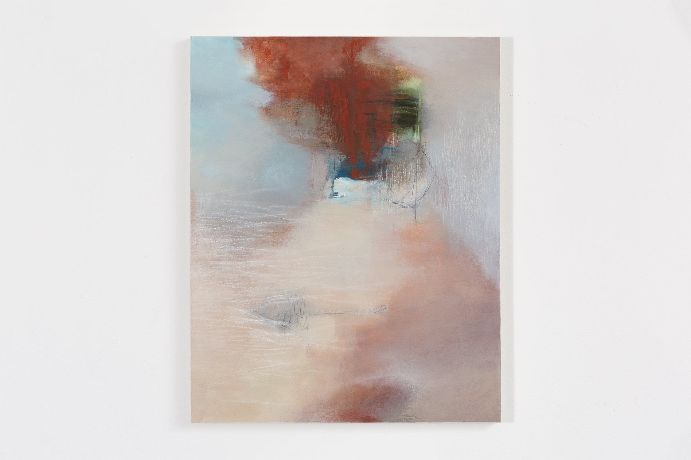
WITHOUT WORDS BY SARA PITTMAN

Sara Pittman’s abstractions present dreamy perspectives of fogged colors. Like a comfortable descent into sleep; Pittman’s work shows controlled use of warm and cool tones to create a balanced, yet striking artwork. Her diverse applications of paint allow textures to create and disrupt the visual depth in a painting. Without Words is an enticing display of thin, effervescent layers of paint contrasted against delicate scrapes and fine textures. 

CIPOLLA PENDANT LAMP BY MASSIMO VIGNELLI FOR VENINI

Possibly the most influential designer of the 20th century, Massimo Vignelli collaborated with Venini to create the Cipolla Pendant Lamp. Vignelli's unique mindset as a designer allowed him to refresh how glass was used in lamps. By focusing on the material strengths of glass, while giving attention to its natural beauty, Vignelli produced a series of lamps that are graceful, stunning, and functional. Made with hand blown Murano glass, this fixture utilizes the Sommerso technique. This allowed Vignelli to layer light diffusing opal glass with patterned glass to give the fixture its curved stripes. By giving attention to these details, Vignelli created a lamp that is more luminous than a traditional lampshade while being just as beautiful when not in use.

CIEL BY STEPHEN ELIOTT WEBB

Stephen Elliot Webb’s liquified contours guide your eyes through his compositions. A marbled white and baby blue are used to lay out a serene background, while stretched marks of navy blue tie together the canvas with added depth and contrast. On top of all this are splatters of light greens, dispersed freely among the painting. At a distance, the artwork's background billows and undulates, while up close your eyes get lost in the density of pours, drips, and strokes Webb uses to create his paintings. Ciel is finished in an elegant aluminum frame that accentuates its sharp lines and crisp hues. 

FEATURED IN MAY

MIGRANTS 33 BY KRISTA SVALBONAS

Krista Svalbonas' investigations into regional architecture are perfect pairings for our current exhibition Perriand in the Mountains. Focusing on Svalbonas' personal history of her immigration and transitioning between major U.S. cities, Svalbonas collages photographs together to create an accumulation of experiences both visual and felt.

DAPHNE AND CHLOE BY MARC CHAGALL

Marc Chagall's lithograph Daphne and Chloe reminds us of some of the more natural and leisurely elements that we have been thinking about while putting together our exhibition of Perriand's furniture. A leisurely afternoon under a tree, a secret getaway with intimate moments. All of these things enlighten the aura of Perriand's Les Arcs pieces. 


LES ARCS SCREEN BY CHARLOTTE PERRIAND

One of the masterpieces we are honored to have in this exhibition is a dividing screen designed by Perriand. Originally used in Les Arcs, this screen was so loved by Perriand that she incorporated it into her own atelier to separate her office and creative spaces. Remarkably elegant, Perriand considered even the most minute details in its creation. One example of this is the arrangement of nails fastening the wood together. Aligned diagonally, spaced 5 rows apart, the nails become a line that draws your eye through the grid, rather than being an unsightly aspect of this screen's construction. This historic, graceful, and exquisitely handmade piece defines the Les Arcs collection. Perriand's influence in design can be seen everywhere, yet there is nothing quite like these works. Our exhibition, Perriand in the Mountains, is on display until Sunday, May 27th.


Guest User
FEATURED IN APRIL

URBAN HAIKU (WINTER) BY PAMELA STAKER

Pamela Staker's Urban Haiku switches up her normal uses of colors. In this work, there are predominant tones, but no predominant colors. Each stroke peeks out of other brushed moments. Her favorite violet is front and center, but it serves as a guideline rather than a form to be seen. In the background flat panes serve two purposes, wall and expanse. Differing from her larger pieces, the marks are more compact and thin, building a delicate composition. Pamela's painted meditation on urban forms masterfully captures the colors and chaos of city life.  

OBELIA MEDUSA BY NICHOLAS KRIEFALL

Nicholas Kriefall's poetic abstractions create worlds of cloudy colors. Balancing between an endless fall into darkness and euphoric brightness, Kriefall manages to create mildly textured deep abstractions that twist and wind like a Lewis Carol novel. His title's subject, the Obelia Medusa, is a very small predatory animal related to jellyfish. Medusa is a categorization of Obelia likely given because this form has many offshoots that look like the snaked head of the Greek monster Medusa. Whether one looks into this work as a reflecting pool, or an underwater world teeming with tiny animals, Kriefall's Obelia Medusa transports you to the worlds between myth and reality. 

SET OF CLAM CHAIRS BY PHILIP ARCTANDER

These Clam Chairs have exploded in notoriety over the past few years. The frenzy started when a pair was misattributed to the phantom designer Martin Olsen. Previously unknown for his designs, Philip Arctander (1916-1994) was an independent architect in Copenhagen, Denmark. Though he is most well known for his role as the director of the Danish Building Research Institute, a few of his furniture designs persist through today, with the Clam Chair being most prevalent. Arctander's design combines a surreal playfulness with extreme comfort, and was decades ahead of its time when he first designed it.