FEATURED IN DECEMBER

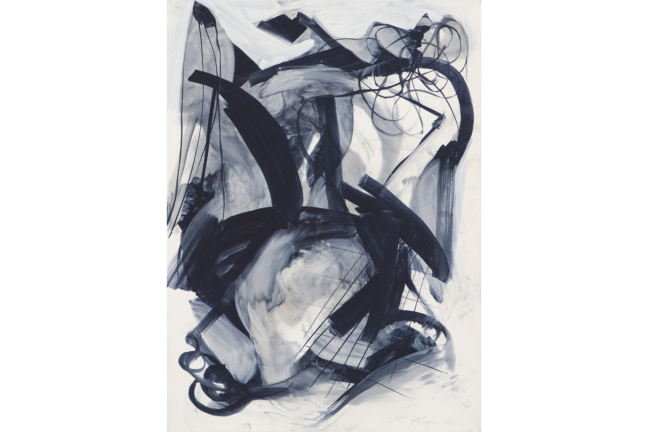
SLEEP BY TED STANUGA

Wrapping his composition with frothy, energetic brushstrokes; Stanuga’s Sleep supports itself through the tension in its lines. Wide, rigid brush strokes of varying transparency connect across the picture to form spaces where washes of light grey and deep blue flow. Spindly, bent lines contrast a net of ribbonlike forms. Below them, converging planes overlay a foggy atmosphere. Stanuga’s refined sensibility from decades of painting is made clear in this work on paper. 

SET OF ADRIAN PEARSALL LOUNGE CHAIRS

Often overshadowed by Kagan and Noguchi, Pearsall doesn’t get quite the same recognition for his groundbreaking designs of the 1960s. After selling Craft Associates to Lane Furniture Company in 1968, Pearsall went on to form Comfort Designs with John Graham. Drifting away from the Atomic Age design’s preference for free flowing wood and glass, Pearsall moved into solid, angular geometry consistent with futuristic styles of the 1980s. Reupholstered in vintage linen velvet, these two lounge chairs have a rich, saturated color whose linear forms respond elegantly to light.

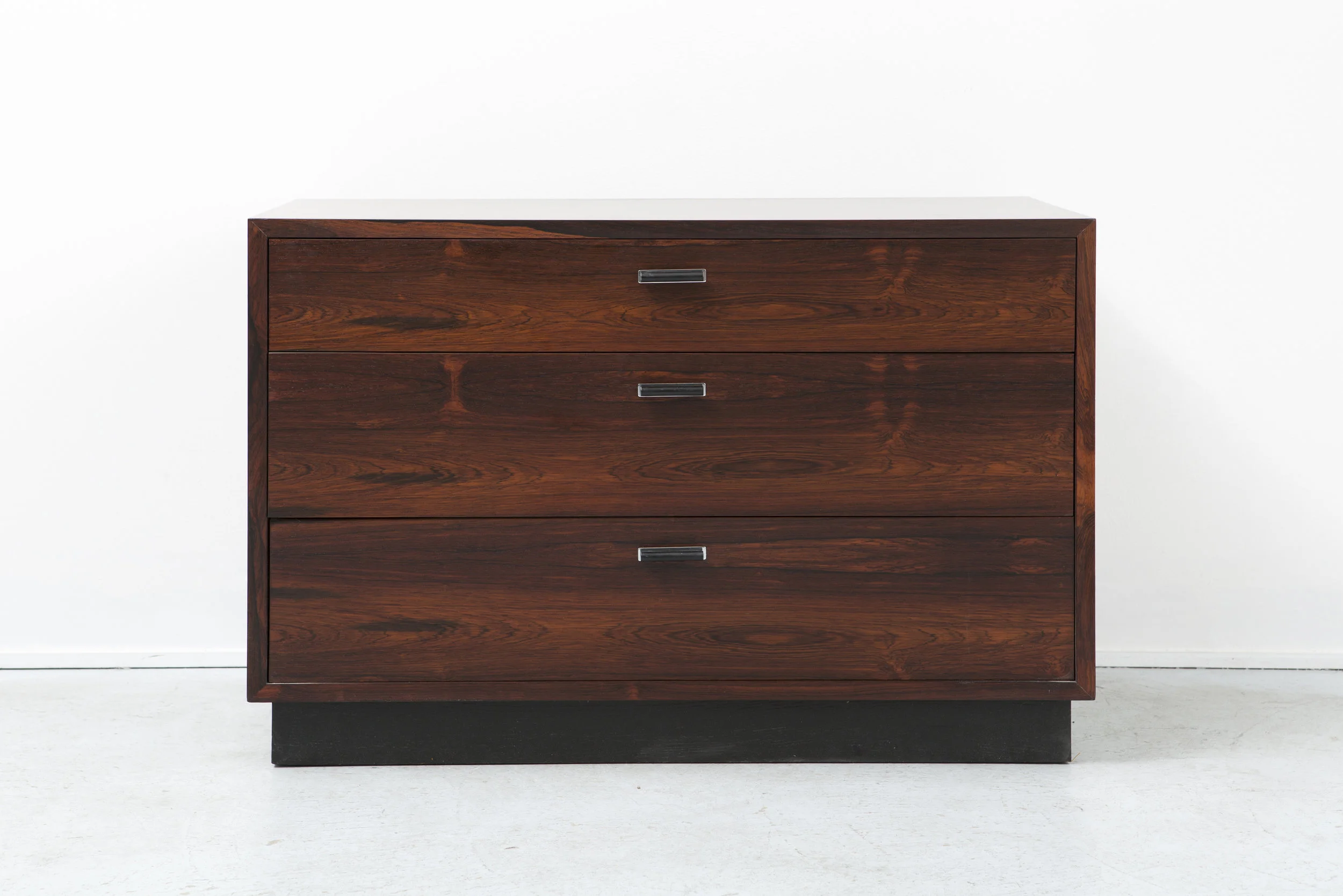
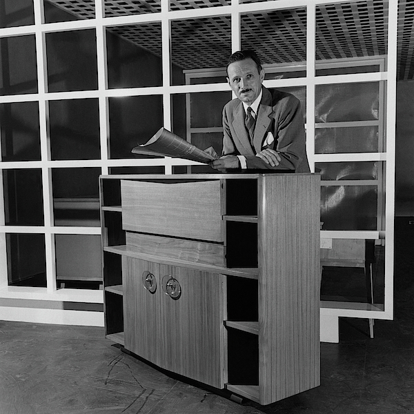
HARVEY PROBBER ROSEWOOD DRESSER

Harvey Probber took on the second half of the 20th Century quite differently from Pearsall, focusing instead on simple geometric shapes made with elegant materials. While never stylistically approaching the forms that other avant-garde designers were interested in, Probber pioneered the concept of modular furniture. His furniture is carefully designed to interact dynamically with other geometries in both the room and furnishings. Some of his more iconic pieces, like the Cubo sofa, show how simple rectangles, stacked on top of each other, form an elegantly rectilinear sofa. This rosewood dresser from the 1960s operates on the same design principles. Masterful craftsmanship, alongside beautiful proportions create a simple, understated, but wholly beautiful piece of furniture. 

Guest User
FEATURED IN NOVEMBER

CHICAGO VINTAGE 1980 BOXING PHOTOS

Phil Mascione’s dynamic composition draws your eye through the picture with the angled lines of the building’s walls. He has skillfully positioned the camera to include figures on each edge of this photograph. A musician warms up in the background, a distracted boxing coach has a conversation to the right, and a discerning spectator eyes the boxer for the far left. Each figure in this photograph draws you back to the subject, the boxer preparing for his match. In a striking way, Phil Mascione manages to convey the drama of the moment in one frame.

LAWRENCE PEABODY FOR RICHARDSON NEMSCHOFF SETTEE

The smooth forms of Lawrence Peabody are instantly recognizable. His rhythmic, elegant lines often give the feeling of a bend, rather than a curve. During his design career, Lawrence Peabody spent much of his time designing for the notable companies Kohler, Sears, Roebuck & Company, Richardson Brothers, and Boyd Lighting while also designing hotels in the US and Caribbean. However, his most refined, enduring work was made for the Richardson Nemschoff furniture company. This settee exemplifies Peabody’s ability to incorporate swooping, graceful curves into bold, well rounded design.

CENDESE PULCINO SCULPTURE

For this piece, Antonio da Ros worked with the Murano glass factory Ars Cendese. The factory itself is part of the rich glassmaking history of Murano. Glass production on Murano started over a millennium ago in 982. During the Renaissance, the production of new types of glass, most notably crystal clear glass, increased demand greatly. Subsequently, the skillfully crafted Murano glass was highly sought after by the upper class of Europe. The Murano glass factories survived the end of the Venetian Republic, starting a new push to develop the art of glasswork even further. Murano’s history of technical mastery in ornate, elegant colored glass shines in this Antonio da Ros sculpture.

Guest User
A Closer Look at As We Enter New Planes
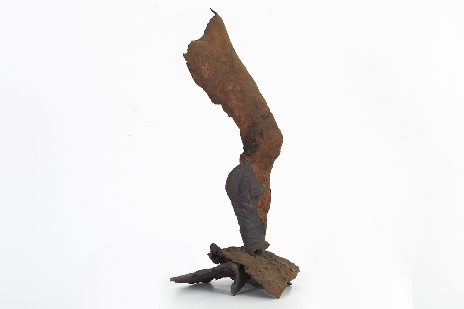
Standing Tall by Ruth Aizuss Migdal, 2009. Stoneware. Photograph courtesy of gallery.

Standing Tall by Ruth Aizuss Migdal, 2009. Stoneware. Photograph courtesy of gallery.

   In Ruth Aizuss Migdal’s Standing Tall, a leg bends suggestively towards the viewer. In her early career Migdal was an abstract expressionist painter, and her sensitivity to the particulars — very much like a painter who very carefully places paint on the canvas — shows itself in the care and attention Migdal gives to exalting organic curvature. Her decisive hand is very apparent and steady. Very much like in abstract expressionism, Migdal has captured a moment and frozen it in time. Standing Tall is still and in motion at the same time. One could imagine the leg’s bending curvature to change any moment.

   Migdal’s work goes beyond simple physical representation of an object. Standing Tall stands as an image of unabashed power, unshaken by its environment. The gesture has been forever immortalized in stoneware.

    At the heart of Migdal’s sculpture is the twofold act of deconstruction and reconstruction. Separating the body from its usual unified context provides the basis of the language Migdal explores and scrutinizes. She undertakes the fragmentation of her subject to underline the gaps in the presence of sculpture. Separate pieces of cast bronze components are treated as puzzle pieces, which Migdal assembles to create new arrangements. She asks us to consider equally what is there physically and what isn’t there. Her work is as additive as it is subtractive.

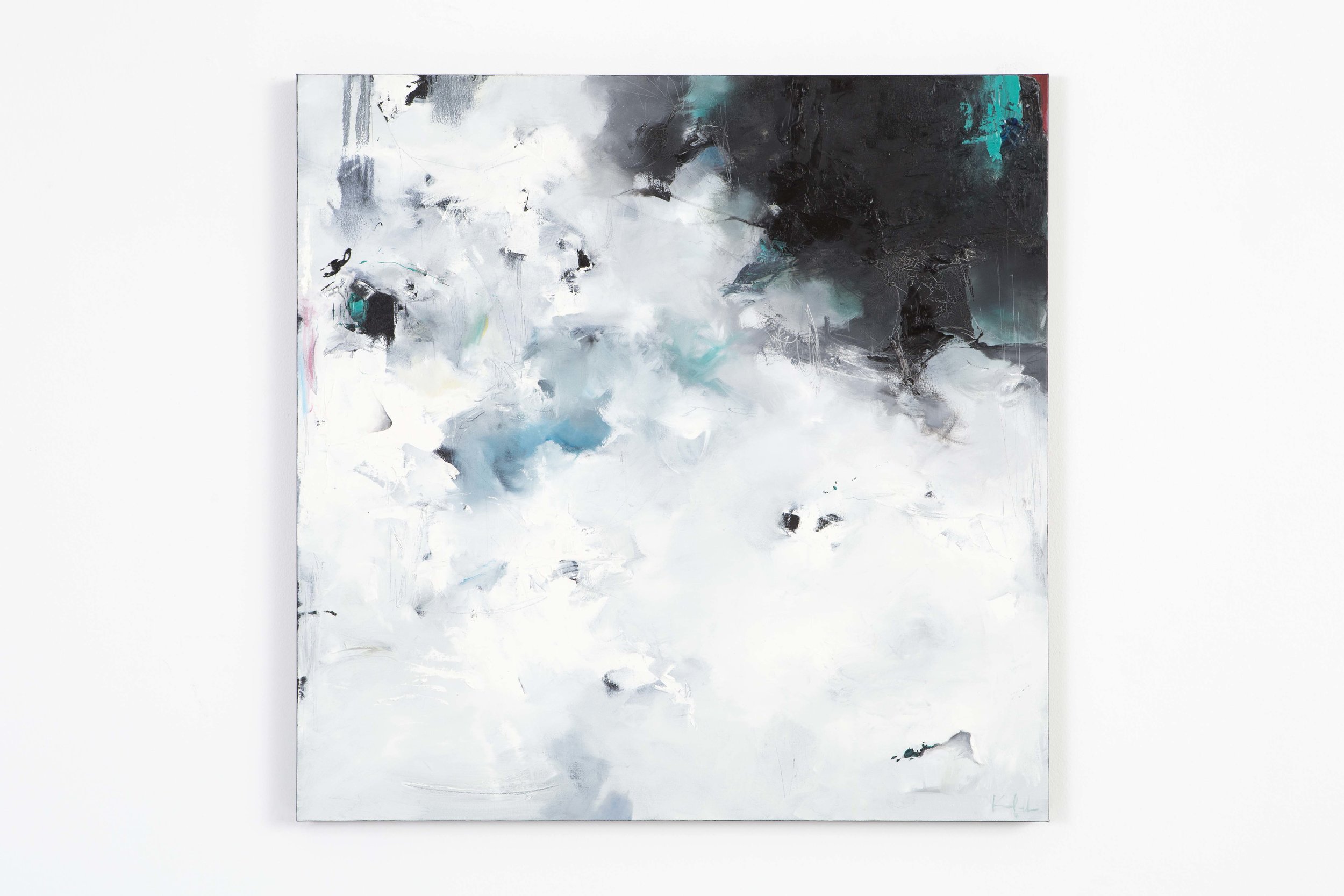
Scattered Floes by Nicholas Kriefall, 2016. Oil on canvas. Photograph courtesy of the gallery.

Scattered Floes by Nicholas Kriefall, 2016. Oil on canvas. Photograph courtesy of the gallery.

     This sense of duality is closely examined in our autumnal show, As We Enter New Planes, featuring sculptures by Migdal and paintings by Nicholas Kriefall.

      Kriefall’s work approaches the mystery of this duality in a different way. He is reliant on the flatness canvas provides. He counters the limitations of flatness by applying multiple layers of thick paint, creating multifarious texture and depth as he investigates the mysteries of the natural world. His landscapes are not readily discernible. Extremely painterly, they are a departure from a traditional understanding of landscape. Kriefall hints at the suggestion of a horizon line in his paintings, but ultimately the eye has no real place to land. This creates a displacement for the viewer.  Instead of being reliant on recognizable representational elements, Kriefall anchors himself in the manifestation of feeling. He deconstructs in order to reconstruct. The viewer arrives at an external representation of an internalized feeling. Kriefall is constantly translating his feelings into something seemingly more tangible, concrete.

      In Scattered Floes we see mystery’s veil shrouding our vision. Kriefall evokes the experience of floating sheets of ice through a blend of white, blue and black. These are the colors of this scene happening in the natural world. The purity of the ice and the water underneath bring out a blackness when they meet together and turn into one. An impenetrable depth is created. The work speaks to the natural way of how things change, develop and in strange ways, come together as one.

   Together Migdal and Kriefall ask us to take a considered glance at the body and surroundings.

   As We Enter New Planes is on view at the gallery until November 12. The gallery is open Tuesday through Sunday, 11 - 6 pm.

Guest User
FEATURED IN OCTOBER

GLASS BOTTLE VASE BY KASTRUP HOLMEGAARD

This hand blown glass vase comes from the internationally known Kastrup Holmegaard factory. In 1936, Otto Brauer was hired by Kastrup Glasværk (later known as Kastrup Holmegaard) as a glassblower. After 10 years of honing his craft, Brauer was awarded the title of Master. A decade after that, the Gulvase went into production. The olive green color is one of their most well known designs, and preceded the brightly colored versions. This Gulvase’s immaculate craft, rich olive green color, and untraditional shape make it a great contrast piece to other rectilineal MCM designs.

SET OF LE CORBUSIER LC2 CHAIRS

Debuting at the 1929 Salon d’Automne in Paris to later be re-issued by Cassina in 1965 this set of armchairs by Swiss-French designer and architect, Le Corbusier is truly timeless. Despite his avant-garde designs for his time, Le Corbusier made sure to prioritize functional logic in all his products. The cushions in this set have been reupholstered in a deep orange suede that poses a warm, rich texture next to the slick chromed steel frame.

WROUGHT IRON SCULPTURE

Hand sculpted by a local Chicago artist in the 1960s, this wrought iron floor sculpture lends itself to a brutalistic approach in its design. The term brutalism, originating from a French word meaning raw, aptly describes the organic and textured nature of the craftsmanship present in this piece. The two eyes on the front of this sculpture bring it to life in a playful and charming way. This is an enjoyable addition to any minimalist home seeking to further its art collection.

Guest User
Exploring Herman Miller's Legacy
A survey of Herman Miller catalogues. To the right hand corner is the famous hardcover product catalog designed and written by George Nelson from 1948. In the foreground is Life Magazine's article on Nelson and his Storagewall Design. It caught D.J.…

A survey of Herman Miller catalogues. To the right hand corner is the famous hardcover product catalog designed and written by George Nelson from 1948. In the foreground is Life Magazine's article on Nelson and his Storagewall Design. It caught D.J. De Pree's eye in 1945. Photograph by Martha Morimoto.

   The George Nelson Platform Bench. The Charles + Ray Eames DCM chair. Alexander Girard's beautiful and colorful textile work. The Isamu Nogochi glass-topped coffee table. All of these pinnacles of modernism that put American design on the map come from one name: Herman Miller.

    It's hard to imagine the landscape of American design without Herman Miller. In 1923, Herman Miller was still the Michigan Star Furniture Company, a manufacturer of high-quality, traditional-style bedroom bed suites when D.J. De Pree, its owner, convinced his father-in-law, Herman Miller, to purchase majority of the company’s shares. Grateful for his father-in-law’s trust, De Pree renamed the company Herman Miller.

Gilbert Rohde. Photograph by Luis Lemus.

Gilbert Rohde. Photograph by Luis Lemus.

  The company was still making bedroom bed suites when the Great Depression hit in the 1930s.  On the verge of bankruptcy, De Pree needed to revitalize his company quickly. On a trip to New York, De Pree was intrigued by Gilbert Rohde's vision of creating furniture better suited for the American public. This chance meeting with Rohde would be the beginning of the Herman Miller brand we know today.

   We recently visited Herman Miller’s headquarters in Zeeland, Michigan. The tour included a look at the premises and archives, the production of the Aeron Chair as well as chatting with R&D.

  History runs deep in Herman Miller’s ethos. Keeping true to Rhode’s original mission of creating better furniture suited for the American public, the company's past continues to inspire the present.

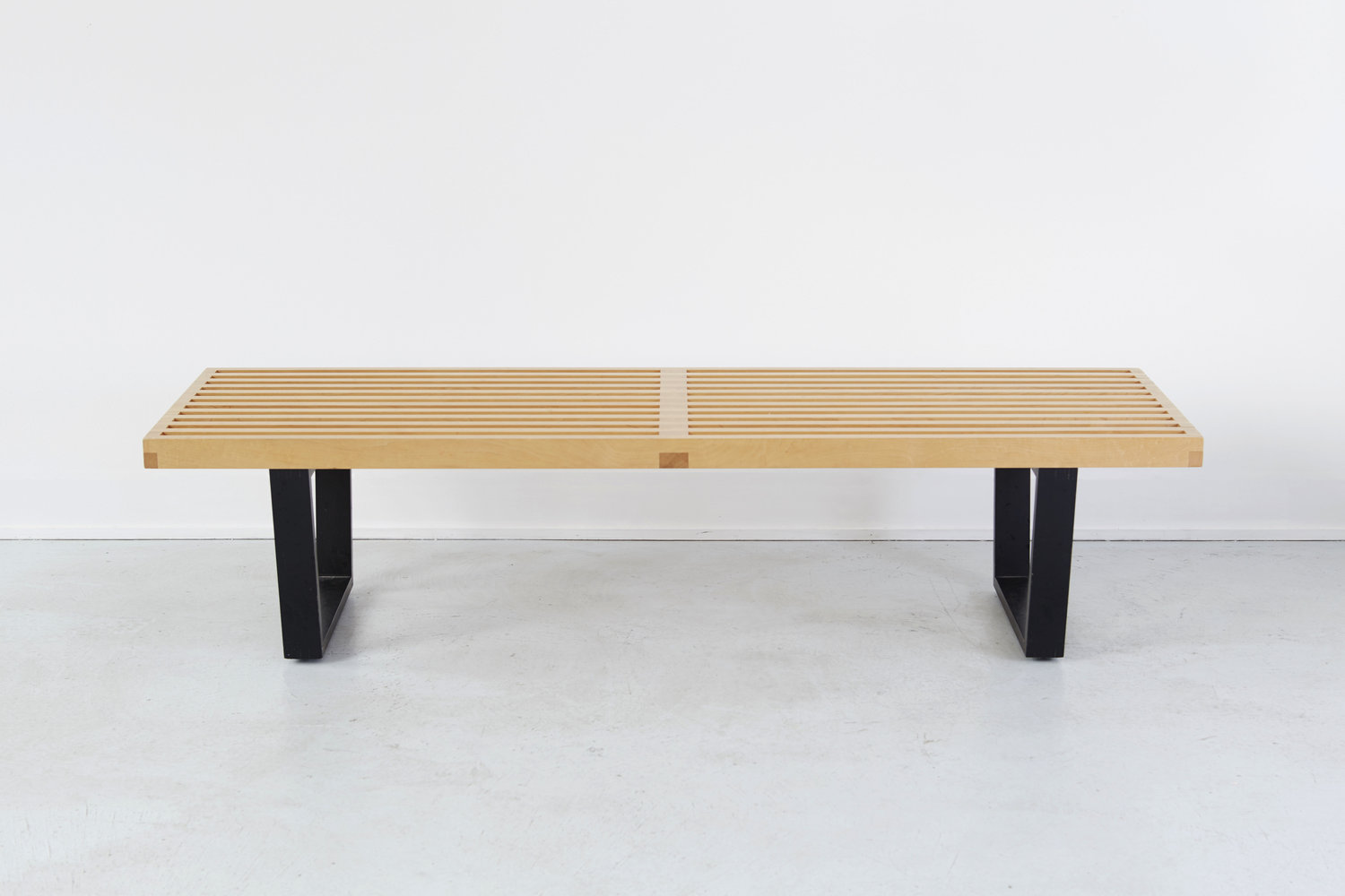
George Nelson's Platform Bench for Herman Miller. Photograph courtesy of the gallery.

George Nelson's Platform Bench for Herman Miller. Photograph courtesy of the gallery.

George Nelson's Slat Bench for Herman Miller. Photograph courtesy of the gallery.

George Nelson's Slat Bench for Herman Miller. Photograph courtesy of the gallery.

   Rohde died in 1944 and De Pree hired George Nelson to be the new Design Director after seeing Life Magazine’s article on Nelson and his Storagewall Design. Pinnacles of American modernism followed in the next few years, contributing to the canonical design movement, Mid-Century Modern. Nelson created the Platform Bench to be straightforward and versatile.

   Herman Miller’s primary focus of the 90s was producing the Aeron chair. In 1994, Bill Stumpf and Don Chadwick designed this chair to be made out of 94 percent recyclable material. The Aeron chair created a revolution in the workplace. What differentiates this chair is its focus on good posture while providing lower back support alleviating the back pain arising from sitting in an office all day. It has no foam, fabric or leather.

A peek at the Living Office at Herman Miller's Design Yard. Fabric panels and designs by Alexander Girard are sprinkled throughout the space. Photograph by Martha Morimoto.

A peek at the Living Office at Herman Miller's Design Yard. Fabric panels and designs by Alexander Girard are sprinkled throughout the space. Photograph by Martha Morimoto.

Our set of Alexander Girard + Peter Protzman dining chairs designed for Herman Miller, c 1960s. Original upholstery. Photograph courtesy of the gallery.

Our set of Alexander Girard + Peter Protzman dining chairs designed for Herman Miller, c 1960s. Original upholstery. Photograph courtesy of the gallery.

    We learned about Herman Miller's on-going project: redefining the American work office. How we work and interact with one another is constantly changing. The office environment should be a reflection of these changes. Living Office is Herman Miller's philosophy of a high-performing office space which creates a free-flowing efficient work experience. The urge towards innovation works in the company's spirit of creating a better suited environment for the needs of American working class.

      Upon leaving the premises, we were gifted an unexpected present.

   In 1995, Herman Miller opened a new manufacturing facility in Michigan. Built in the middle of lush meadows and flora, the facility dubbed The Greenhouse was an example of the company's move to sustainable environmental building practices. In 2000, things weren't looking that great. Paper wasps, known for their aggressive nature, had invaded the facility. The flowers weren't blossoming as expected. In a last effort to save the wilting project and in compliance of the Greenhouse's no-pesticides policy, honeybees were introduced. Not only did they cross-pollinate the flowers, they also took over the wasps' main food source.

    A beautiful, unexpected by-product of their presence no one had considered initially? Honey. Our trip ended on a sweet note.

Guest User