FEATURED IN MAY

ISAMU NOGUCHI IN-50 COFFEE TABLE

"In art, one does not aim for simplicity. One achieves it unintentionally as one gets closer to the real meaning of things." -Constantin Brancusi

Isamu Noguchi’s iconic coffee table is comprised of two pieces of solid wood, interlocking into each other to form a tripod base for the glass above. Constantin Brancusi’s influence is apparent in this work, through Noguchi’s time as Brancusi’s apprentice, with the use of organic shapes and assemblage. This sculptural design has proven the test of time through its unity of harmony, balance, and durability.

EDWARD WORMLEY PYRAMID FLOATING BOOKCASE

Edward Wormley was a longtime director of the Dunbar furniture company, and brought modern design into midcentury residential homes. He had a deep appreciation for traditional design and impeccable craftsmanship. The Pyramid Floating Bookcase can be utilized against a wall or floating in a room to add more dimensionality to put your collection of books and objects on display.

UNTITLED BY SHINNOSUKE MIYAKE

Untitled beautifully captures an instantaneous moment and invites the viewer to be immersed in Miyake’s brushstrokes. The artist’s trust in his impulsive decisions is definite, bringing concrete yet fluid motions to the surface. Read Japanese artist Shinnosuke Miyake’s bio and view his other works here.

How Chicago, Mies van der Rohe’s Adopted Home, Remembers the Architect

The Windy City's Matthew Rachman Gallery takes a deep dive into the designer's practice.

by Thomas Connors | April 28, 2019

1stdibs: Introspective Magazine

2_SMALL.jpg

Less is more,” that inescapable quote attributed to Mies van der Rohe, has long been modernism’s tagline. But when it comes to this year’s observances of the 100th anniversary of the Bauhaus, where Mies was the final director, more is more. Two new museums are opening in Germany dedicated to the history and legacy of the forward-looking art and design institution. And special exhibitions are popping up from São Paolo to Tel Aviv that shine a spotlight on its faculty and students, who broke the barriers between artist and artisan, articulated a new partnership of form and function and reshaped the built environment. Of particular note is “Mies van der Rohe: Chicago Blues and Beyond,” running through July 21 at the Matthew Rachman Gallery in Chicago, where the designer settled after leaving Germany.

The Nazis closed the Bauhaus in 1933, but Mies soldiered on in Berlin for another five years before emigrating to the U.S., where, in 1938, he became director of the school of architecture at Chicago’s Armour Institute, now the Illinois Institute of Technology, or IIT. From this academic perch, he profoundly influenced the course of architectural practice internationally. And from his own drafting table, he changed the look of his adopted city, completing such now-iconic projects as the 860-880 Lake Shore Drive apartment towers, the Chicago Federal Center and One IBM Plaza, as well as the IIT campus.

The show includes a Barcelona chair with a prototype cushion that Mies designed for his towers at 860–880 Lake Shore Drive. The chair, as well as never-before-seen ephemera, is on loan from T. Paul Young, an architect who worked in Mies’s studio.

The show includes a Barcelona chair with a prototype cushion that Mies designed for his towers at 860–880 Lake Shore Drive. The chair, as well as never-before-seen ephemera, is on loan from T. Paul Young, an architect who worked in Mies’s studio.

Rachman — who last year mounted a show of works by Charlotte Perriand focused on Les Arcs, the ski resort she designed in the French Alps — has previously hosted two benefits in support of Mies’s Farnsworth House. (The “Chicago Blues and Beyond” opening, with architect Dirk Lohan, Mies’s grandson, on hand, was also a fundraiser for the Farnsworth House, which has been a house museum owned and operated by the National Trust for Historic Preservation since 2003.) With the Bauhaus anniversary approaching, he decided to build an exhibition around a cache of the designer’s blueprints he acquired several years ago. Now for sale, the blueprints are actual working documents used by junior and senior architects in Mies’s office. Some have never before been seen publicly.

A dozen clipboards hold working documents and correspondence related to the studio’s projects.

A dozen clipboards hold working documents and correspondence related to the studio’s projects.

Among the plans, examples of which measure as large as 48 by 32 inches, is one for the Barcelona chair, done for the Wells Furniture Company, which manufactured the piece in the 1930s before Knoll began production. There are also drawings for architectural projects, including One Charles Center and the Highfield House condominium, both in Baltimore; 111 E. Wacker Drive, in Chicago, now home to the Chicago Architecture Center; and IIT’s Crown Hall, whose massive, column-free span epitomizes Mies’s embrace of utterly adaptable, universal space. It was built to house the Department of Architecture and Institute of Design.

These projects represented a leap forward in the architect’s career, an opportunity to build at a scale he had only imagined before the war. Advances in technology, access to materials and the willingness of American developers and corporations to get on board with modern design propelled him to a period of great creativity and success.

Rachman has taken a contextual approach to his installation of the blueprints on offer, interspersing the display with furniture and ephemera, much of it on loan from architect T. Paul Young, who at 17 became an office boy in Mies’s firm. “I’d pick up his cigars at Dunhill, organize files, things like that,” recalls Young, who advanced through the ranks to work on structures like the unrealized Mansion House Square, in London (his last project at the firm). “The office had a studio atmosphere, and there were long racks of blueprints of all of Mies’s projects. All the architects in the office would use those as reference. If they were designing louvers or a curtain-wall detail, they would be able to look at other buildings to see what was done and make it even better.”

Mies used these textile samples when designing the interiors of the Arts Club of Chicago in the early 1950s.

Mies used these textile samples when designing the interiors of the Arts Club of Chicago in the early 1950s.

Among the materials from Young’s archive in the show are fabric swatches from the Farnsworth House and Mies’s sole interior-only project, the Arts Club of Chicago (razed in 1995); a rare bronze-frame version of the Brno chair manufactured by Brueton; a sales brochure for the 860-880 residences (“Mutual Ownership Offering Stability at the Lowest Possible Cost”); construction documents; and images produced by Hedrich-Blessing Photographers, the renowned architectural photography firm founded in Chicago in 1929. In addition, Rachman has on display and for sale two key pieces of furniture: an MR chaise longue, circa 1970, reupholstered in Brazilian cowhide but retaining the original strapping; and a Barcelona couch.  “We want people to see the different materials Mies used and to better understand these pieces — which they have seen many times in various settings — within the bigger picture of Mies’s work,” says Rachman.

Although later, less artful interpretations of the architect’s aesthetic contributed to the perception of modernism as manipulative and soulless (a critique initially applied to the master’s own work), he remains a giant in the history of the built environment, a man whose philosophy is, perhaps, as significant as the structures he designed. “In 1939, Mies gave a lecture to students in which he discussed designing a house,” notes Young, who serves as executive director of the Bauhaus Chicago Foundation. “He said that coming to the house, the front door, was the most important thing to consider. And as he concluded, he said, ‘The house is really the shell, and the life lived therein, is the bloom.’ And that was true whether he was designing a home or an office building or Crown Hall. He was setting a stage for living.”

Read the full article here.

Connors, Thomas. “How Chicago, Mies Van Der Rohe's Adopted Home, Remembers the Architect.” 1stdibs Introspective, 28 Apr. 2019, www.1stdibs.com/introspective-magazine/ludwig-mies-van-der-rohe/.

FEATURED IN MARCH

GRETE JALK COFFEE TABLE

Harmonious use of material, form, and utility are all evident in this coffee table designed by female Danish designer, Grete Jalk. Here, she uses teak, a hardwood known for its durability and resistance to water, while adding elements of modularity. Jalk, famously known for her thoughtful use of clean and comfortable lines, bevels the table top to add volume to the overall rectangular shape. Her design answers to the user’s needs for storage, allowing the coffee table to serve more than one purpose.

OFFICE PARTY BY KATE McCARTHY

Australian artist, Kate McCarthy, uses bright and bold colors that one associates with childhood. The usage of nostalgic patterns, scribbles and polkadots, brings the viewer into a mode of reflection. Playful and vibrant, McCarthy’s work combines high-spirited brushstrokes of color with elements of familiarity.

PAIR OF VLADIMIR KAGAN CRESCENT CHAIRS

We’ve taken Vladimir Kagan’s Crescent Chairs and have reupholstered them in mohair, pairing it beautifully with brass. Though his father was a sculptor and cabinetmaker whose motto was “measure everything three times and cut once,” Kagan liked the freedom to repeatedly cut without any precise measurements. The playfulness of the designer is apparent in the chairs, though its texture and form.

Guest User
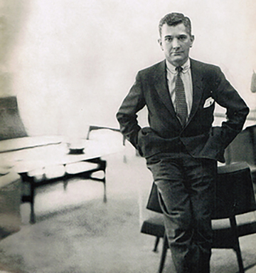
February’s Feature: Jens Risom
 
Young-Jens-Risom-1060.jpg

Jens Risom introduced Scandinavian design to the United States in 1939. He was one of

the first designers to bring Mid Century style to the US. Risom was born in

Copenhagen, Denmark and began designing at a very young age. He was heavily influenced

by his father, an architect, and pursued his studies at the Copenhagen School of Industrial

Arts and Design. Risom’s designs are considered modern classics and he has many furniture

pieces on display throughout the United States.

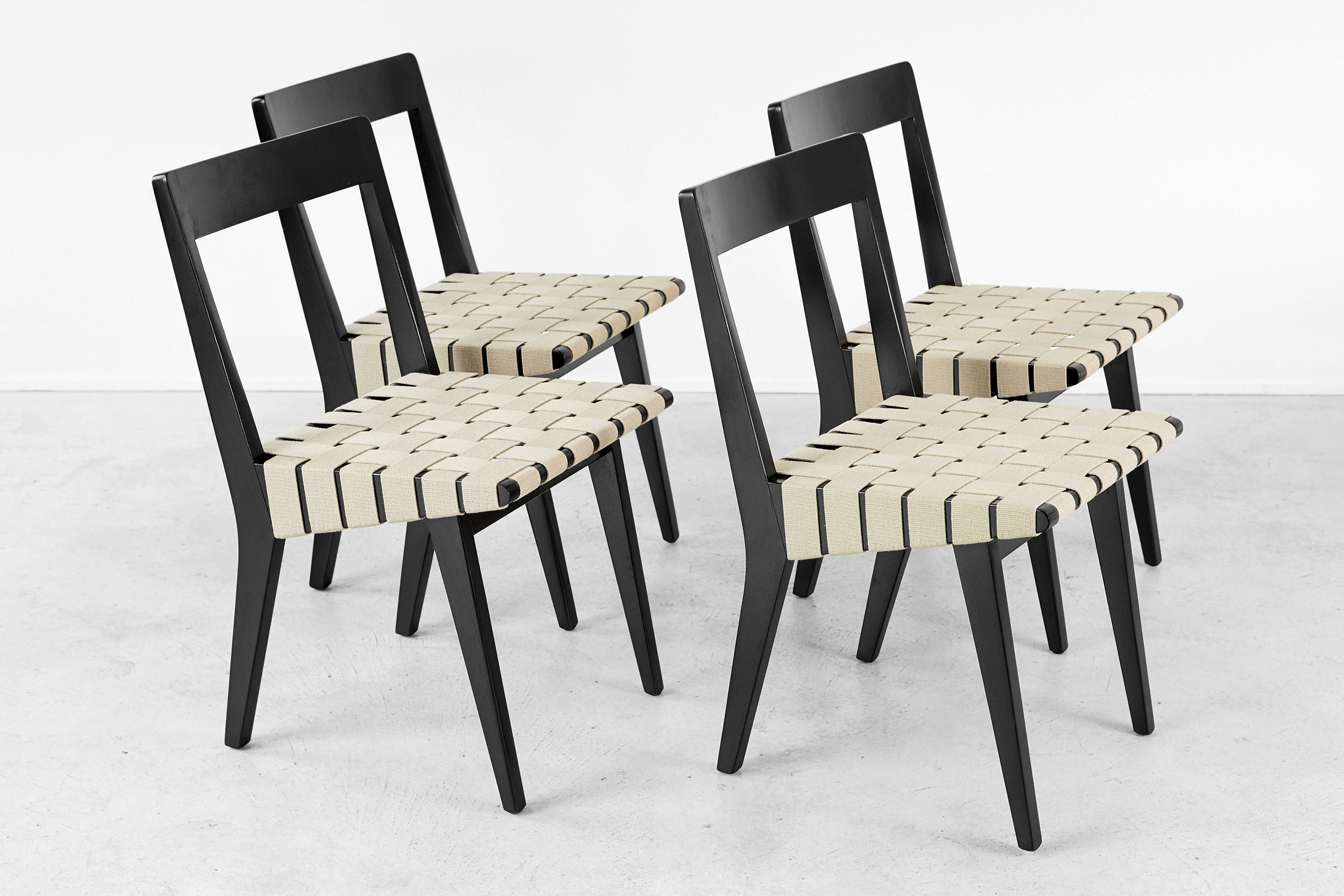
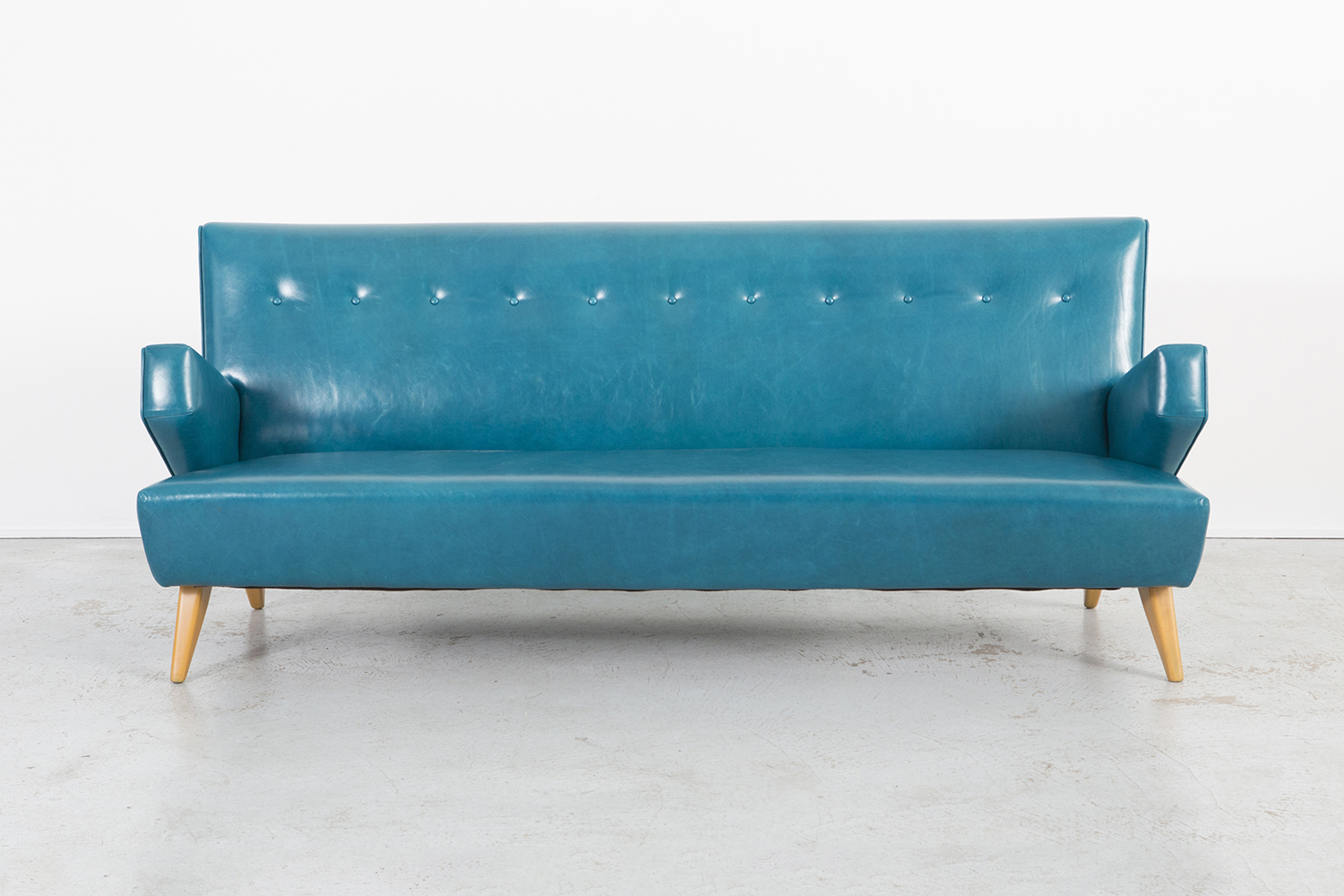
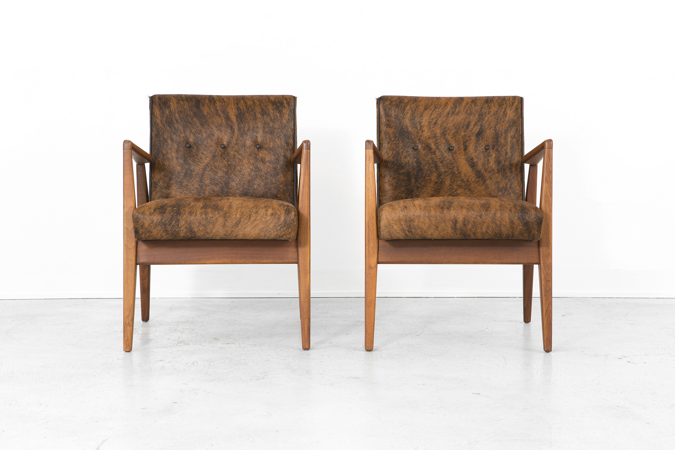
His designs are timeless and practical. He is known for his unique shapes and strong parallel

lines. The designs are effortlessly beautiful and still relevant to this day. Risom partnered with

entrepreneur Hans Knoll in 1941, and in 1942 they launched the Hans Knoll Furniture

Company. There were about 20 pieces designed for Risom’s inaugural “600” line.

Below are key examples of iconic Risom designs featured at Matthew Rachman Gallery.

marlee power
ARTIST FEATURE: SLATER SOUSLEY
Untitled, Slater Sousley

Untitled, Slater Sousley

Slater Sousley received his BFA from the School of the Art Institute of Chicago in May 2017 and is currently enrolled in an MA program at Eastern Illinois University.

MRG: How did your time in Chicago affect your practice? 

SS: It’s hard to know where to begin when assessing the impact of my four years living and studying in Chicago, not only on my practice, but also on my life as an artist. I grew up in the suburbs of Kansas City, so, the exposure to city living certainly gave me a new perspective. The views of the city, its congested streets, and public transportation systems were fascinating to me and became the inspiration for a few of my paintings that depict crowds in urban spaces. 

While the city was an inspiration, it was extremely draining – a fact that I embraced in my painting. Yet, I relied on retreats home, as well as to my family’s farm in rural Missouri, to recharge. 

MRG: How has your work evolved since leaving Chicago?

SS: After graduation, I completed a working residency in the Italian countryside where, the year prior, I completed a study-abroad course through SAIC. Having had the experience of plein air painting in Italy for two consecutive summers, I came to understand the impact of studying and the pursuit of capturing the elusive experience of nature. Upon my return to America, I proposed to Matthew Rachman, my idea to immerse myself within the woods of mid-Missouri, to absorb the rhythms and patterns, the light and the shadows, the sounds and sensations of nature. 

My time spent in the woods working for the show, Still Moments, had an intense impact on my relationship towards painting, my understanding of perception, and the way in which painters work to translate the visual world. 

The Woods Beckon, Slater Sousley

The Woods Beckon, Slater Sousley

November Brush, Slater Sousley

November Brush, Slater Sousley

MRG: Do you see your mainly figurative studio works as complimentary to your plein air work, or do you see them as separate entities? 

SS: Just as I pushed myself outside, I push myself in the studio. I constantly question visual realities and their impact on the viewer. In this regard, my plein air and my studio work are not different. However, the pace is markedly different. In the landscape I’m in a frenzy racing against the sun; I’m pulled in to the patterns of nature and grapple with untangling the visual maze of forestry; relentlessly reevaluating, reworking, shifting color from one stroke to the next. In my studio, I am afforded the luxury of time, of sitting and dwelling, of mulling over effects of gesture, representation and abstraction, color and form. 

MRG: Where do you see your practice going next? 

SS: Although I find myself pulled in various directions in terms of what to paint next - constantly pushing my ideas further, one imperative for me is the pursuit of an authentic and honest interpretation of experience. I think it is my role as an artist and a painter to seek to understand my experience and perception of the visual world, to start a dialogue about the shared experience of existence that is simultaneously unique and universal.  

If you are interested in viewing Slater Sousley’s work, please contact the gallery to set up an appointment. 

Treetops, Slater Sousley

Treetops, Slater Sousley

Hannah Unger